PilotUsability-CynthiaHsu
From CS 160 Fall 2008
Contents |
Introduction
The system being evaluated is Tamagassi, a serious game designed that encourages people to save gas by giving them a character whose well-being is connected to the efficiency of their gas usage. The game is self-contained on a mobile device, such that the features of the game can be accessed at any time, but also to take advantage of technology such as accelerometers and GPS that enable the real world data to relate to the game. Gameplay is patterned to have a goal and reward system (being able to purchase items and equip your character and the general well-being of your character). The game also has features that facilitate carpooling; taking advantage of these will also increase the available rewards.
The purpose of the pilot usability study is to test the completeness of our prototype with a small group of people before investing time in a more complete study with a larger group of people.
Implementation and Improvements
One major difference between the interactive prototype demonstrated in our presentation on October 31, 2008 and in the current version used in the pilot study is that our current prototype is implemented in Flash instead of HTML. There were two motivations for this. First, this gives the interface a more finished and high-fidelity appearance than the rudimentary appearance of our HTML prototype, adding visual affordance through clickable text boxes and buttons that appear to have the texture of buttons on a traditional cell phone keypad. Secondly, this also added more flexibility for creating a dynamic interface that will respond differently depending on what the user/interviewee inputs.
Improvements
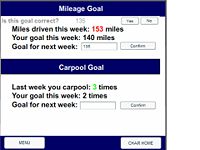
In Set Goals, the user is provided with an extra confirmation step that asks the user to click [YES] or [NO] in response to the question, “Is this goal correct?”. This allows the user to recover from errors made by slips such as in typing.
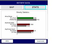
In Review Data, information on numerical statistics was added on the suggestion of the professor – the user can now click on “Stats” instead of “Map”, which will show the miles driven, average acceleration, and average speed. A cyan selector box is used to indicate the system state (which screen you are currently on).
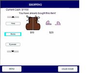
In Shopping, a cyan selector box is placed behind the buttons in order to also provide feedback regarding which “area” of the “store” you are currently looking at – hats, boots, or eyeglasses. The dynamic flexibility of the store has also been increased. You may buy any item on display, and the price will be updated to reflect that. Moreover, if an item is purchased more than once, an error message will appear informing the user that this is not allowed.
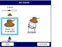
The My Items screen of our game was improved in several ways. First, a cyan selector box similar to that used in Review Data and Shopping was placed around the currently selected item, which was considerably larger than the previously selected items. In addition, the number of items is listed above the scrolling panel. The arrows are used to suggest first, the method of scrolling and selecting (which will be the same if a keypad functionality is implemented) and second, that there are more items that can be viewed. The instruction, “Press [OK] to equip” or “Press [OK] to de-equip” was placed directly under the selected item.
Additional Implementation
The collecting data interface was also implemented, although the actual means of data collection is still a Wizard of Oz functionality. As described in our low-fidelity prototype, the collecting data goes to a blank screen (presumably the home screen of the user’s cell phone) with a small status bar at the top. Upon clicking [STOP], the user will be taken to the Review Data screen, where they can decide to look at the data then or later.
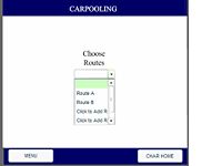
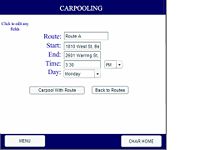
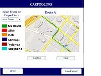
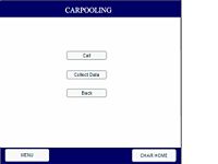
In addition, we chose to implement the Carpooling interface. This is a series of four screens, the first of which asks a user to select a route, the second which asks the user to either edit or confirm the route, the third which shows the most similar interfaces, and the fourth which shows three options – first, a [Call] button, used for making a phonecall, second, a [Collect Data] button, and lastly, a [Back] button. The last screen has not yet been made functional, but all the buttons are there.
Method
Participant
The participants were selected among various acquaintances after a cursory interview about their lifestyle, cell phone usage habits, driving habits, and miscellaneous interests.
I selected Vicky, a twenty-four year old law student in her third year at University of California, Hastings. There were several reasons why Vicky was an ideal interviewee. First, she did not come from any sort of computer science or engineering background, and while she did enjoy surfing the internet and was a casual gamer of simple flash games, she did not have extensive experience with role playing games, Tamagotchi, or the Sims, making her an ideal candidate for testing our product on a general user. She uses the cell phone primarily for calling, texting, the camera phone, and an alarm, which showed that despite her limited professional experience with technology, she was fairly well versed in the most basic functions of a cell phone. In addition, having an interest in visual design as demonstrated through her previous hobbies such as writing and drawing comic books and set design and art direction for independent films made her standards for design very high, which would give her fairly insightful opinions as to how our interface might be changed. Lastly, her busy lifestyle (in terms of school, hobbies, and social life) made her typical of the target user group of any cell phone or driving game, as our contextual inquiry found that people who drive are often in a hurry. While she is a casual driver during the school year, she has had to commute in Los Angeles County traffic during the past few summers, so she has experiences which encompass those that we envisioned for two different types of personas we had in mind when designing our interface.
Apparatus
To minimize the discomfort for the interviewee (Vicky), the interviewee was allowed to choose the place and time of her interview – Sunday evening in her apartment. The interviewer’s laptop was placed on Vicky’s desk, while the interviewer sat on an adjacent stool. The test of the interface was conducted using the flash movie saved on the interviewer’s computer. A small analog clock for measuring completion time for the taskwas placed on the desk behind a tissue box, such that Vicky’s view of the clock would be obstructed. Notes were taken by hand on a notebook.
Tasks
The primary tasks associated with our game are as follows: (1) setting goals, (2) collecting data, (3) reviewing data, (4) demonstrating good driving behavior, (5) carpooling, and (6) customizing the character. For the purposes of the pilot usability study, we chose to use Setting Goals as a demonstration task, collecting and reviewing data was combined for the first task, character customization (broken up to shopping and equipping the character) was the second task, and carpooling was the third task.
Demonstration Task – Setting Goals
Setting goals was selected as our demonstration task for two reasons. First, although we listed this as a moderately difficult task, this was largely based on the fact that the user would have difficulty setting both effective and realistic goals; the user interface required for it is actually rather simple. Secondly, setting driving goals and meeting them is central to the purpose of our serious game, so we hoped that by introducing this as our demonstration task it would help the user better understand the context in which other game elements were used.
Easy Task - Collecting/Reviewing Data
Collecting data is a task to be performed shortly before the user begins to drive. The level of interaction required for this task was deliberately set to be minimal, as users may often be in a rush during this phase of the game. We felt it important to test this aspect of the user interface first to ascertain whether it was as straightforward as the designers assumed, and secondly because it is a crucial, though easy, in-game task.
Originally, reviewing data was considered a separate task. However, our user interface is designed such that there are two ways to review the data - the user can choose to review the data either following data collection, at the conclusion of their drive, or to return to the game (and the review data screen) at a later time at his or her leisure. Because ending data collection would jump to the review data screen, the interview seemed to run much more smoothly if we allowed the interviewee to examine the collected data immediately after it was collected, instead of asking them to exit the device and return to the review data screen at a separate time. We found during our low-fidelity prototype testing that the majority of users would not think in the context of possibly being in a rush when driving out of a car, and instead simply accept that the default sequence of events and begin reviewing data immediately after collecting it.
While collecting data is fairly straightforward from a user interface point of view, reviewing data was not - during our low-fidelity prototype, most of the users complained about too much text. During our interactive prototype presentation, Professor Canny suggested statistical data as well as data associated with the map.
Moderate Task – Character Customization
Items can be purchased from the store using "cash" acquired by minimizing acceleration. The store can be accessed from the main menu, where the amount of cash is visible in the upper left hand corner. Although this feature is currently not implemented, we intended for the items purchased in the store to be saved in the inventory. To dress the character, the interface is similar, but with only one level to the menu - hats are sorted linearly, one after the other, after which there are boots, then eye wear.
We hoped that testing the character customization task (using the shopping and my item screens) would help us determine how navigable the menus on these screens were, as they have minimal text, and how enjoyable in general these tasks were, since they are the primary sources of reward.
Difficult task – Carpooling
Of the difficult tasks, carpooling was the obvious choice, since the driving component of the game involves virtually no user interface (except for the collecting data aspect described above). We had hoped that our user interface would provide an effective means of carpooling, as it would store recently traveled routes, allow the routes to be edited, identify who among the users' friends had similar routes, and allow the user to collect "cash" (reward points) when carpooling.
Procedure
Prior to the interview, a consent form and a script detailing the context of the pilot study were composed jointly by the entire group. In addition, the group also decided what tasks would be best suited to test the interface and suitable test measures.
During this time, the interviewee was determined based on a brief cursory interview of acquaintances to determine their interests and hobbies, their educational background, and technological and driving habits.
Once the interviewer arrived at the site of the interview, the interviewee was asked to leave the room briefly (less than five minutes) while it was arranged appropriately as described in the section above (“Apparatus”).
The introduction script was read to the interviewee, after which the interviewee was asked to sign the consent form. Then, the demonstration task, Set Goals, was demonstrated with a minimal level of explanation, to minimize the amount of information given away.
Next, the first task was read aloud to the user, and the user would proceed to perform the task using the interface and, if necessary, prompted to verbalize her thoughts. This was repeated for the second and third tasks. If a user skipped a crucial part of a task during the procedure, he or she would be allowed to complete the task, then asked if he or she had considered an alternative means of completing the task.
At the end of the experiment, there was a brief debriefing session in which the interviewer asked the interviewee about her general impressions of the interface, how it might be improved, and what she liked and disliked about it.
Test Measures
To maintain consistency across all pilot usability studies performed, our group chose four quantitative test measures in addition to a list of critical incidents:
- 1. The length of time for completion of the task.
- 2. The number of errors in each task.
- 3. The number of times the user showed noticeable hesitation.
- 4. The number of times the user reported something positive about the prototype.
The length of time and the number of errors were chosen because they are two standard measures of a user interface that relate directly to the model human processor. The number of times a user showed noticeable hesitation, while related to the length of time for completing a task, helps to offset possible error by breaking down a difficult task into another number, such that a task with a single bottleneck might be distinguished from one in which there are several usability flaws that cause hesitation. The number of times during which a user reported something positive about a prototype was selected because
Results
Test Measures
(s = seconds, e = errors for the task, h=hesitancy, p=positive statement):
- Collecting/Reviewing Data: 7s/0e/0h/1p
- Customizing/Shopping: 15s/1e/0h/1p
- Carpooling: 15s/3e/0h/0p
Critical Incidents
Task 1 (Collecting/Reviewing Data)
- 1. Skipped clicking on the bubbles on the Review Data Map that yielded speed/acceleration data - later revealed that this was because user felt that delay in clicking through individual bubbles was not worth investment. Severity = 3
Positive:
- Was able to narrarate a "storyboard" - "Okay, so I've stopped driving now so I'm going to stop collecting data." Appeared to appreciate the value of having the data collection present.
Task 2 (Character Customization)
- 1. Was disappointed that an item could not be bought more than once. Severity = 0
- 2. Repeatedly went to Options when trying to equip the character. Severity = 2 (No one else tested had this problem).
- 3. Felt that going from Store to My Items was too many levels of indirection. Severity = 2 (No one else tested had this problem).
- 4. Was disappointed by the fact that the character home did not show the equipped character. Severity = 4 (Central to the conceptual model of the game).
Positive:
- Enjoyed scrolling through all available items in the store.
Suggestions:
- Mentioned that "Closet" was more specific than "My Items".
Task 3 (Carpooling)
- 1. Thought that first task was to set carpooling goals. Severity = 3 (Possibly stems of lack of feedback about cash).
- 2. When setting carpooling goals, did not notice yes/no confirmation of goals. Instead, repeatedly clicked "Confirm", and when no feedback was received, set goals for mileage, and did not notice feedback window until then. Severity = 3 (Caused a large amount of inconvenience; should be straightforward to fix).
- 3. After setting carpooling goals, went to character home and clicked collecting data, without navigating through the carpool menu. Had to be asked to repeat test more carefully. Severity = 3 (A major problem, but may be related to a lack of careful thought on the part of the interviewer.)
- 4. When asked to select a carpool, clicked "Confirm" to carpool with "Most Similar", instead of carpooling with a specific friend. Severity =3
- 5. Complained that there were too many button clicks involved, and there was too much information for a cell phone device. Severity = 2
General Comments
- Too many key clicks made game a little annoying; would probably not be playable on a keypad interface. Severity = 4
- Need instant feedback - how do you know where you are with respect to your goal? Severity = 4
- Quantitation of feedback - more cash needs to feel attainble to user. Severity = 3
- Animation may increase the appeal of the game. Severity = 1
Discussion
Changes to the Experimental Design
There were several interesting features of our experimental design during the pilot study that may need to be revised for a full scale pilot study.
First, the variability between the time needed to complete the tasks for the different subjects was interesting, but also too wide to be able to draw statistic results from. This suggests that the time needed to complete tasks might need to be converted into a control variable, such that some people are asked to perform the tasks under a particular time limit to mimic the adrenaline rush associated with people being in a rush (which may be true of some of our users, especially with respect to the Collecting/Reviewing Data aspects of the task). Moreover, the errors produced by someone in a rush (taking at most 15 seconds per task) were rather different from those of someone who took over a minute for each task. The contextual storyboard might affect the way this data is interpreted as well. Similarly, a between subjects study might be necessary to take advantage of the different personas (for instance, commuters versus casual drivers) that might be playing the game.
Second, an interesting confound to "time" as a task measure is that Customization(Shopping/My Items) took Kumar's subject the longest, but had more positive remarks and fewer errors and periods of hesitation than carpooling. My subject spent the same amount of time on carpooling as on character customization, but made much fewer errors during character customization. This suggests the possibility that a subject may spend more time on a task because it's more fun, not because it is confusing. An additional useful task measure may be to ask the users to rate how easy a task was for them to complete or how enjoyable it was.
Third, set goals, as simple as it seems, needs to be tested in a pilot study - had my particular interviewee not made the mistake of setting carpool goals prior to carpooling, the unobtrusiveness of our confirmation messages may have gone unnoticed.
A fourth change that might be interesting to implement on an actual experiment at a larger scale is to add several additional control variables, thus that the pros and cons of different layouts (especially for complicated screens like the Review Data-Statistics and Carpooling).
In general, however, there are significant changes that are necessary in our interface in addition to those to our experimental design; several additional rounds of pilot usability studies must be completed before embarking on a high cost general usability study.
Changes to the Interface
As mentioned by Kumar, having fewer Wizard of Oz techniques is necessary for keeping the subject focused more on the aspects of the interface instead of bugs in our implementation. This includes connecting shop to my items, maintaining the equipped status of the character throughout the different scenes of the game, adding some indication of our character's status on the Review Data/Statistics page, and relating the review data statistics to the goals.
Based on all of the subjects interviewed by our group, major changes need to be made to the Carpooling interface. These include possibly labeling the map more visibly (such that the title says not only Route A but the person that you are carpooling with), making the instructions larger, and changing the coloration of the different routes.
Minor changes include the visibility of the feedback in Set Goals and possibly Shopping, in addition to the labels in Review Data.
A major change that will need to be tested is the implementation of a keypad interface.
Appendices
Materials
- Script with Task Prompts
- Consent Form: Image:ConsentForm.doc
Raw data
During Task 1 (Collecting/Reviewing Data)
- 1. Skipped clicking on the bubbles on the Review Data Map that yielded speed/acceleration data - later revealed that this was because user felt that delay in clicking through individual bubbles was not worth investment.
- 2. Was able to narrarate a "storyboard" - "Okay, so I've stopped driving now so I'm going to stop collecting data."
~ 7s.
During Task 2 (Character Customization)
- 1. Enjoyed scrolling through all available items in the store.
- 2. Was disappointed that an item could not be bought more than once.
- 3. Repeatedly went to Options when trying to equip the character.
- 4. Mentioned that "Closet" was more specific than "My Items".
- 5. Felt that going from Store to My Items was too many levels of indirection
- 6. Was disappointed by the fact that the character home did not show the equipped character.
~ 15s.
During Task 3 (Carpooling)
- 1. Thought that first task was to set carpooling goals.
- 2. When setting carpooling goals, did not notice yes/no confirmation of goals. Instead, repeatedly clicked "Confirm", and when no feedback was received, set goals for mileage, and did not notice feedback window until then.
- 3. After setting carpooling goals, went to character home and clicked collecting data, without navigating through the carpool menu. Had to be asked to repeat test more carefully.
- 4. When asked to select a carpool, clicked "Confirm" to carpool with "Most Similar", instead of carpooling with a specific friend.
- 5. Complained that there were too many button clicks involved.
15s: ~7s (for steps 1 and 2), ~8s (for steps 3-5).
General Comments:
- Too many key clicks made game annoying.
- Need instant feedback - how do you know where you are with respect to your goal?
- Quantitation of feedback - more cash needs to feel attainble to user.
