PilotStudy-Group:4-Kai Lin Huang
From CS 160 Fall 2008
Contents |
Introduction (5 points)
A Brief Introduction to the Game
Programming4Lyfe is an educational game designed to assist people learning basic programming concepts and practice basic programming skills. By providing some help and examples, players are expected to learn, identify and fill in small parts of Java code to gain some exposure to programming in our serious game. We incorporated game elements that add fun and excitement in learning progress.
Purpose and Rationale of the Experiment
The purpose of the experiment is to observe how a typical user would use and learn from our game. In the experiment, we chose three representative concepts: data types, syntax style and debugging. We hope to improve the game’s usability, including intuitiveness and ease of use, by analyzing the observations; we also want to test out whether our design is fun to play and did actually help users learn some important concepts in programming since users' feedback is far more accurate than running heuristic evaluation alone.
Implementation and Improvements(15 points)
Since submitting the interactive prototype, we have made a lot of significant changes in the game.
- In “What Goes There”
- Tutorial was added and revised twice after adding it.
- Pause, replay and help buttons and functions were added to the game play screen.
- Location of the cross mark is changed because it was unnoticeable by the users in our previous experiment.
- In “Datris”
- Tutorial was added and revised once after adding it.
- The bucket’ shape was changed to match the shape of a bucket in the real life because we received feedback about that the original bucket’s shape might confuse players.
- Revision of the help document because we received feedback about the help document was too lengthy from the heuristic evaluation.
- If the block was dropped into the right bucket type, a green check mark pops up, and the ding sound is played if the sound is turned on.
- If the block was dropped into the wrong bucket type, a red cross mark pops up, and the buzz sound is played if the sound is turned on.
- In “Bug-A-Boo”
- Game format changed for aesthetic design and excitement of playing.
- Tutorial was added and revised once after adding it.
- Sound added for the excitement of playing it; it also provides a better feedback for the player of an important event in the game.
- Pause button will hide the gaming content so that the player will not be able to cheat.
- Animation added if the jet crashes on a balloon.
- The jet will be repositioned at the origin if it crashes at a balloon.
- The three balloons are programmed with an algorithm so that they will avoid overlapping on each other.
Method (10 points)
Participant
The participant in my study was a male student randomly selected during a lecture of my Economics class. He will be referred as AL. AL is a junior majoring in Economics and is interested in investment and he is watching the stock market regularly. Usually he monitors the stock market using a free version of a programmable commercial software, so he would like to be able to write small functions that helps him monitor the stock market better. He also has some knowledge in computer programming because he has taken an introductory programming class in college.
Apparatus
The participant tried the game interface under a screen resolution of 1280x800 using my laptop, which runs on an Intel Core 2 Duo CPU with 2GB of RAM with Windows Vista operating system. I typed notes in Office Word with one of my group member’s laptop which has a similar CPU speed and RAM with Windows XP operating system. I asked the participant whether it would be okay to record audio during the test, but he did not prefer his speech to be recorded.
Tasks
The participant will click on the icon or the name of each respective task in the game selection menu, and then a tutorial will be displayed. The participant can decide whether to read and follow it or to skip it by clicking “Ready to Start” button.
In both “Datris” and “Bug-A-Boo” (the easy and the difficult tasks), the initial score will be zero, the initial number of hearts will be four and the initial level will be one. The highest level will be nine for each game. For each correct match, the user will be rewarded 5 points. Every time the user accumulates a multiple of 20 points, the game level will increase by one, and the game will be more difficult as the user levels up.
- The user will win after scoring 100 points in any of the game.
- The user will lose after losing all 4 hearts in any of the game.
(The winning/losing conditions of the medium task, “What Goes There”, are described in its own section.)
For all the tasks, I will look for the time elapsed for the participant to complete the tasks (winning the games), and the number of usability and other errors that he made in each task. I will also take note his comment, mumbling and speech while he is trying to complete the task.
Easy Task - “Datris”
Task Goal: Identify correct data type buckets and move falling data bricks to the corresponding data type bucket.
This task helps users to learn programming data type while playing the Datris game. After starting the game, the user will use arrow keys on the keyboard to move a dropping data block of certain data type to the corresponding data type bucket one at a time. As the user earns more points, the game will get harder by increasing the dropping speed of the data block. The data types used in this game are from Java, including integer, string, floating point number, Boolean values (true and false).
While the participant is completing this task, I will look for the following:
- the cause of that his dropping the data block to the wrong bucket if there is any.
- Whether he checks out the help document or not.
- Whether he checks out the pause button or not.
- The frequency of his eyeball drops (how often his eyes looking from top to bottom or left to right, or vice versa, on the screen). It means that our user interface is inconvenient if the user move his eyes for the purpose of finding help.
Game Screenshot
 1.Datris title page |
 2*. First Datris tutorial page. |
 3*. Second Datris tutorial page. |
 4*. Third Datris tutorial page. |
 5*.After "Close Tutorial" button is clicked, this screen will show. |
 6*. When a brick is sorted in the correct bucket, a green checkmark appears, coupled with a 'ding' sound. |
 7*. When a brick is sorted in the incorrect bucket, a red cross appears, coupled with a 'buzz' sound. |
 8*. The game is won when the player earns 100 points. |
 9*. The game is over when the player loses all four Health Points. |
*Credit: This screenshot is uploaded by Karen Tran
Medium Task - “What Goes There”
Task Goal: Based on the output of a small program with looping statement and the given programming codes, fill in the missing code.
The participant will fill in the blanks of a short code fragment in Java so that the output of the code will match the desired output in the “What We Want” section. The initial score will be zero and the time given will be 3 minutes. As the participant fills out the blank, the game will display either a red cross mark or a green check mark to indicate whether that his output matches the desired output. If so, the player will gain 20 points. Otherwise, the player can fix the code as long as there is time left. There are unlimited chances for the user to try within the three minute time frame. If the player completes the task in less than three minutes, the remaining time will be awarded to the player as "bonus points," which will encourage the user to play and practice a bit more if the user chooses to “play again”.
While the participant is completing this task, I will look for the following:
- How he approaches the correct answers if he does get to that.
- Whether he checks out the help document or not.
- Whether he checks out the pause button or not.
- The frequency of his eyes moving across the whole screen (or how often his eyes looking from top to bottom or left to right, or vice versa, on the screen). It means our user interface is inconvenient if the user move his eyes for the purpose of finding help.
Game Screenshot
 1*. The title screen of What Goes There. |
 2*. First What Goes There? Tutorial Page. |
 3*. Second What Goes There? Tutorial Page. |
 4*. Third What Goes There? Tutorial Page. |
 5*. When tutorial is complete, player is asked if s/he is ready to play. |
 6*. If all the blanks are filled in correctly, a green checkmark appears at the Output window. |
 7*. If the blanks have not been filled in correctly, a red cross appears at the Output window. |
 8*. If the player could not fill in the blanks correctly within the time limit, the game is lost. |
 9*. If all the blanks have been filled out correctly before timer expires, the game is won with the remaining time converted into bonus points. |
*Credit: These screenshots are uploaded by Karen Tran
Difficult Task - “Bug-A-Boo”
Task Goal: In this game the user will have to visually "hunt" for the buggy lines of code.
This task will help users to get familiar with common mistakes, writing incorrect statement, in programming. It will help user practice identifying bugs quickly. This After clicking the start button, the jet will appear on the left hand side and facing three balloons flying towards it from the right hand side of the gaming screen. Each balloon carries a programming statement on its top, and those statements are either right or wrong. The user needs to fire at the balloons with incorrect statements by pressing Space bar on the keyboard.
- If the statement is indeed correct, a message “NO BUG” will appear as the balloon breaks.
- If the statement is incorrect, a message “BUG” will appear as the balloon breaks.
- If the jet hits (touches) any balloon, it will explode and be repositioned to the starting position. The balloons will not be restarted.
While the participant is completing this task, I will look for the following:
- Whether he will shoot at all balloons or just the balloons with incorrect statements. I look for this because right after we implemented the new interface and rules using the balloons instead of circle targets without a tutorial, we tested it on an EECS student and he shoots all the balloons without looking at the programming statement. We hope to see an improvement after we added the tutorial.
- Whether he checks out the help document or not.
- Whether he checks out the pause button or not.
- The frequency of his eyes moving across the whole screen from top to bottom to find help. It means our user interface is inconvenient if this happens.
Game Screenshots
 1. The title page of the game. |
 2. The first tutorial page. |
 3. The second tutorial page. |
 4. The third tutorial page. |
 5*. After user clicks "Close the tutorial", the Start page for the game is shown. |
 6*. If the jet fires a buggy hot-air balloon, the "BUG!" message appears and a 'ding' sound follows. |
7*. If the jet incorrectly fires a non-buggy balloon, the "NO BUG!" message appears and a 'buzz' sound follows. |
 8*. After firing 4 non-buggy balloons, the game is lost. |
*Credit: This screenshot is uploaded by Karen Tran
Procedure
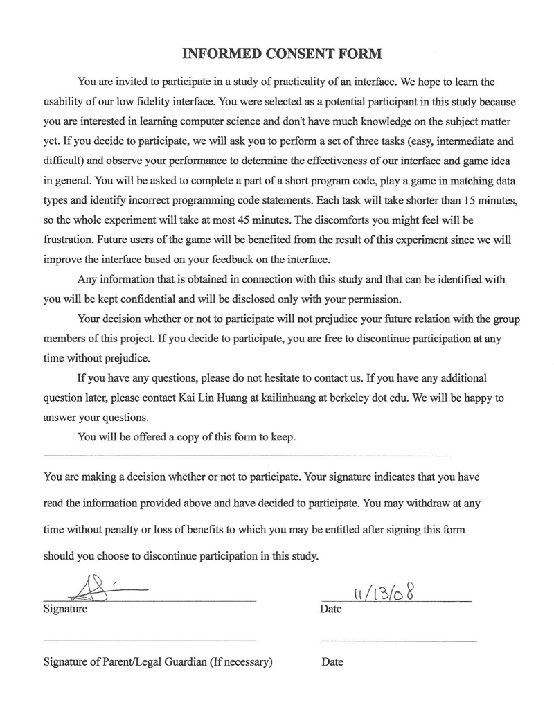
The experiment was conducted in Free Speech Movement Café. I informed the participant that doing this experiment was totally voluntary, and that I would not release his identity information such as name or contact information. Then I asked the participant to read and sign the informed consent form if he decided to participant in the experiment. I used a modified version of the informed consent form from the one we made for our low-fidelity prototype.
After getting his consent, I showed him by briefly navigated through the games one at a time in the order of increasing difficulty without going into detail. Before starting the experiment, I asked the participant to think aloud and ask questions when he played the game.
I kept track of the qualitative measurement while I was taking notes at the same time. The time was kept track by recording the start time and the end time of the duration in which the participant played the game. The start time was recorded at which the participant clicked on the respective task button in the task selection menu; the end time was recorded at which the participant clicked on the “Return to Main Menu” or the close button at the upper right corner. Then we subtract the start time from the end time to calculate the time elapsed for the respective task.
While the participant was playing the game in order to complete the tasks, I observed how the participant navigated and reacted to the game; I also took notes if I observed behaviors and reactions that potentially reveal a problem in the interface design. Whenever the participant asked questions on how to do something in the game, I told him to try what he thought would work.
Between each task, I gave the option for the participant to take a short break. After the participant finished all the tasks, I asked for a short debrief section in which he was asked to give any feedback that he had. The participant was encouraged to share his confusion and give suggestions for the game.
Test Measures (5 points)
Quantitative
In the experiment, I measured the following variables:
- Dependent Variables
- Time elapsed for each task: It is based on my computer’s clock because I did not have access to a stopwatch. The errors of the time I kept track would be +/- 10 seconds because I needed to take notes and kept track of the time at the same time.
- The number of errors that the users made both on the user interface and in the game. The details of this term and the two categories (usability and other) will be explained later in this section.
- Number of Times Played: This is the number of times the user attempted to succeed in each task.
- Number of Times Played to Win: This is the number of times it takes for the user to win the game.
- Independent variables
- User’s age: 20
- User’s years in education: 14.5 years
- User’s gender: male
Rationale
Time Elapsed
I measured the time elapsed in order to determine the efficiency of navigating through the game interface for users, and the level of difficulty of each task.
The numbers of errors
The numbers of errors that I measured for each task were to find out the number of usability problems. Because there is no explicitly defined guideline on error categories in this particular assignment description, I will define two categories of errors: usability and other.
A usability error is an error or mistake that the participant encountered due to the game interface design; they should be preventable by modifying the user interface. Other error category includes errors that the participant made when playing the game due to inadequate or unfamiliar knowledge of the game context. It also includes human mistakes that are only related to the participant’s performance. For example, if the participant had successfully dropping the same type of data block into the right bucket but failed to do so at a later time, it would be considered to be a mistake. A mistake is not preventable by modifying the user interface. Therefore, I will be able to distinguish them for the purpose of identifying problems in the game’s user interface.
Number of Times Played
This could measure the difficulty and fun of each task.
Number of Times Played to Win
This could measure the difficulty of each task. It is also weakly related to the severeness of usability problems in each task.
Qualitative
I also took notes on the participant’s thoughts and comments during the experiment. Another immeasurable variable is the environment where I ran the experiment in, which is a Café with some people around.
Rationale
What the participant has to say about the user interface would potentially reveal a problem or suggest a good design. The participant’s mumbling would reveal unnoticeable problems that the participant (and maybe the UI designers) was unaware of but can be important. The environment may as well affect the outcome of the experiment. I think a very quiet environment would decrease the participant’s tendency to talk, so I chose a Café to conduct the experiment. However, a Café may have negative impact on the sound effect in the game so that the feedback from sound is not as good as in a quiet environment.
Results (10 points)
Summary
| Task | Time Elapsed (hr:min:sec)* | # of Times Played | # of Usability Errors | # of Other Errors | # of Times Played to Win |
|---|---|---|---|---|---|
| Easy Task: Datris | 00:01:30 | 2 | 1 | 3 | 2 |
| Medium Task: What Goes There | 00:01:55 | 1 | 1 | 3 | 1 |
| Difficult Task: Bug-A-Boo | 00:04:45 | 5 | 1 | 20 | N/A |
| Total | 00:08:00** | 8 | 3 | 26 | N/A |
* This is the total time spent in a particular task including replay.
** The total time did not include the break time between tasks.
Details of the Results
Easy Task: Datris
- Observation
- The participant was motivated to play the game again because he lost in the first round.
- The participant did not use Help button even though sometimes he was not sure about a type.
- The participant did not use Pause button.
- There was not obvious/significant eye movement except for the purpose of matching buckets and the dropping data block while he played this game.
- Usability Errors
- The last level went too fast for the participant so that the participant missed the last few data blocks.
- The size of the game screen is too big that some lines were invisible if the participant played it in a browser with the same screen resolution as this experiment ran on.
- Other Errors
- The participant identified a few data blocks incorrectly and thus put them into the wrong bucket .
- Participant’s Comment
- The last two levels of the game went too fast that he could not even have a chance to see the line, or even if he sees the line, he did not have enough time to move the block fast enough before it dropped to the wrong bucket.
- The second page of the tutorial seemed to be unnecessary because those buttons are more or less about intuition.
Medium Task: What Goes There
- Observation
- The participant got the output successfully matching the desired output within 3 minutes, so after he noticed the second round had the same content, he did not replay the game.
- The participant did not use Help button.
- The participant did not use Pause button.
- The participant approached the right answer by trying out all sorts of numbers and compared the output of his input with the number he entered. He adjusted the number as soon as he found the pattern.
- His eyes move up and down often because the main coding area and the output area are located in a top-bottom layout. He did not move his eyes between left and right. He did not seem to care the timer that much.
- Usability Errors
- Participant did not understand what i was.
- Other Errors
- The participant inputted a wrong incremental number for a few times before he got to the correct one.
- Participant’s Comment
- The tutorial helps a little bit on how to play this game.
- In the “Play again?” dialog after finishing the task, “Not Yet” seems unclear in terms of what it will do if the participant clicks on it.
Difficult Task: Bug-A-Boo
- Observation
- The participant carefully read all the programming statements above balloons before he shot at any of them.
- He used a strategy of avoiding balloons that he did not have enough time to read, which turned out to be an effective strategy.
- The participant realized that crashing the jet would be deducted points because the jet was burnt right after.
- He asked what “string” meant.
- He was motivated to play the game again because he lost in the first round.
- He did not use Help button even though he had questions.
- He did not use Pause button.
- He attempted to win the task and played it five times, but he did not win.
- His eyes did not seem to move up and down a lot to look for help. (A series of help statements are located on the bottom of the gaming screen.)
- Usability Errors
- The participant did not understand what “bool” means because it was not explained in the tutorial and it is not a common knowledge known for average people.
- The participant felt surprised when he shot a wrong balloon and there was no feedback on why it was wrong at the end of the game.
- Other Errors
- The participant inputted a wrong incremental number for a few times before he got to the correct one.
- Participant’s Comment
- The tutorial helps a little bit.
- In the “Play again?” dialog after finishing the task, “Not Yet” seems unclear in terms of what it will do if he clicks on it.
Debrief
The participant did better after playing each game for one more time (except “What goes there” because he only played it once.)
- I asked why he did not use the help button, and he said he knew it was there but he did not like reading help document in general.
- The participant suggested to have more questions and variety of data type and bugs in this game because he got bored after finding out the questions, data and bugs repeated.
- The participant suggested to change the background color of the main menu.
- One thing to note is that my participant did not mumble during the experiment process. It may due to his personality that he wouldn’t mind speaking what he thought aloud, or due to that the experiment was conducted in a Café.
Discussion (15 points)
- What you learned from the pilot run what you might change for the "real" experiment?
- What you might change in your interface from these results alone?
Overall
The results of the Pilot Usability Study show a significant improvement in our game's user interface. The participant asked fewer questions than the previously conducted test on our game Programming4Lyfe. Adding tutorials greatly minimize the confusion and frustration that the previous test runs had. The addition of sound effects also improves the user experience of receiving feedback although it was not so obvious in my experiment because it was conducted in a noisy environment.
In the real experiment, we may want to try to pick a place to conduct it so that there will be a little bit noise to induce participants to talk, and also not so noisy that they cannot hear the gaming sound well.
Easy Task: Datris
Similar to what we had from the previous feedback in Heuristic Evaluation, my participant did not get into a lot of usability problems in the Datris task. To find out the reason for my participant in particular, I asked the participant whether he played Tetris before and received a positive answer. Therefore, I believe it is partially due to the participant’s familiarity with the traditional Tetris game.
On the speed design of this task, the participant had difficulties with identifying the Boolean expressions when those blocks drop a little bit faster, and he could not really identify the dropping blocks at the last level because it was faster than a normal human’s reaction time. Based on the user’s feedback, We will need to either decrease the difficulty of the last few levels or give the users some help in the game. One of the possible solutions can be slowing down the last level of Datris slightly so that the duration of a dropping data block is long enough for average users, who played the game many times, to identify the data types and make the move. According to the Human Information Processor model, the time for average human to recognize and act is between 180ms-980ms. Therefore, to make the last level plausible and a little bit challenging, the duration of appearance for each data block should be absolutely no less than 180ms. In addition, the data block should hang around a little bit longer than 180ms so that the user will be able to move a block from the center to the leftmost or rightmost bucket.
The participant's comment of the Datris from the debrief session about the unnecessary tutorial page (the second page) pointed out that some buttons are self-explanatory, so users can figure out the meaning by themselves. Thus that particular page will be removed to avoid redundancy unless future study is against that.
The gaming feedback aspect of "Datris" will be discussed together in the "Bug-A-Boo" section.
Medium Task: What Goes There
In “What goes there”, I observed that game feedback helped the participant a lot in finding the right number to fill in the blank. It took my participant a few attempts to get the output right, and the attempts were mostly changing the looping number in the looping statement. This feedback output of user’s current input stayed there until the user changes it to a new one, so it gives the user some time to think about why he was wrong and provides information for the user to approach the right answer. The fact that this game does not have a programmer-expected-run-button did not hurt the participant's progress of learning at all, and actually the progressive feedback (output showed as user typed) was very effective in telling him what his input produced. Although matching the real world is an important principle in user interface design, the progressive feedback output justifies the goal of helping users learn using the looping statement.
My observation of user's eye moving around to check his output and compare to his code tells that the input window and the output window are a little bit far away from each other. However, it is not counter-intuitive that user read from the top to the bottom, which is a very accustomed reading order of a page. Since most of my group members did not seem to have the same usability problem in their pilot usability study, its severity can be either very minor or just cosmetic.
Also, the participant’s comment about that “Not Yet” option in the “Play Again?” dialog seemed irrelevant was valid because it reuses the button from the “Start the Game” dialog. Even though user may recognize this button, it can cause some confusion of "what will happen if I click on it?". It will need to be modified to such as “No” or “Go back to main menu”.
Furthermore, the participant felt that the tutorial in "What goes there" only gave him a sense of what the game will look like. He did not learn looping statement and what "i" means from the tutorial. He actually reached the correct answer solely based on the game feedback, the output of his code. We will need to add some explanation of each line of the sample question in the tutorial.
Difficult Task: Bug-A-Boo
In the Bug-A-Boo task, the benefit of having a tutorial now totally shows up: AJ shot at balloons with incorrect statements because he learned it from the tutorial, whereas in an earlier experiment we conducted with another user using an earlier version with the old tutorial, that user shot at all the balloons no matter what came towards the jet.
As I mentioned earlier in "What Goes There", feedback of the game helped my participant learn from mistakes and get to the right answers in that task. Therefore, feedback about whether users identify the bug and data type correctly will be crucial for users to learn. We have provided immediate feedback on whether the user did correctly in the current item. However, due to the way we implement the game data, such as the dropping data blocks and the programming statements, and the time constraint, yet we were unable to provide a detail feedback at the end of these two game, such as showing a list of items that the user did wrong on. We have added sound effects to signify if the user makes a mistake in the game play, which will be better than using visual graphics alone because the user has been visually paying a lot of attention to the programming statements in the game. It will be nice to have a summary of errors at the end of the "Datris" and "Bug-a-boo" tasks, but again, we will need to see whether countering the implementation difficulties outweighs the benefit of it.
The Bug-A-Boo task did have a lot more excitement and challenge than other tasks. AJ played it 5 times before he finally gave up on winning it. It seemed to him that this game was impossible to win because he did not do significant better each time he played. The highest score he got was 25, which is very far away from the winning 100. However, his jet was able to stay alive for longer each additional time he played, and his scores were in an increasing trend. Usually debugging takes more time than writing a piece of code, so this floating balloons may be too challenge for programming newbie. On the other hand, debugging may not be an easy task even for experienced programmers because mistakes can always sneak in due to all types of factors. As from the results from one of our group member, Karen Tran, her experiment participant was also improving over time after he replayed the game for a few times. As a conclusion on the difficulty of Bug-A-Boo, I would say it is fair to leave the difficulty as it is now, and some minor fixes may be able to make the game challenge while manageable, such as adding resources in the game to give the user a helping hand. An example of resources is putting some heart floating object that can help users to earn some HP to survive longer in the game, so the users can taste some success while enjoying the challenge.
