LoFi-Group:Orquesta
From CS 160 Fall 2008
Instructions
The goal of this assignment is to learn how to use low-fidelity prototyping in the early stages of UI design. You will first build a low-fi prototype and then perform a simple usability test. You will incorporate the results of the test into design changes in your prototype for the next assignment.
You will submit your printed essay of roughly 6-10 pages through the wiki and in class as described below. Your writeup should follow the outline below and will be graded using the writing and experimentation guidelines detailed below.
Hand in Printout in Class
Print your assignment and hand it in at the begining of class on October 15th.
Add Link to Your Finished Assignment
One you are finished editing the page, add a link to it here with your group name as the title link. The wiki syntax will look like this: *[[LoFi-Group:ExampleGroup|Group:ExampleGroup]]. Hit the edit button for this section to see how I created the link for the ExampleGroup.
Each team member’s name and role in this assignment
Describe the role of each team member for this assignment.
- Stuart
- Built instruction screens and error dialogs
- Test Facilitator
- Method write-up
- Anthony
- Built main, mode, and credit screens
- Test Observer/Photographer
- Discussion write-up
- Jimmy
- Built game screen
- Test Greeter/Observer
- Introduction & Appendix sections
- Vedran
- Built statistics/save screens
- Test Observer
- Results write-up
- Greg
- Built game screen
- Test Computer
- Method Tasks write-up
Introduction and Mission Statement (6 pts; 1/4 page)
Now that you have had a chance to work with your teammates and develop your project idea, create a team mission statement that describes your goal for the project.
Briefly introduce the system being evaluated. State the purpose and rationale behind the project as well as the experiment you are conducting. Then, present your mission statement. The mission statement should represent the common purpose and goal of the project. Each member of the team should agree on and be committed to achieving the mission statement.
Becoming a DJ is not a simple task. To become a successful disc jockey, you need to have extensive musical background, lots of creativity and plenty of experience. Creativity comes with experience, but to get started and into the whole aspect of DJ-ing is the hardest part. A problem for many people is that to get introduced to art, you would need lots of expensive equipment and/or software, and by the time you start, you do not know where to start with or you just may not enjoy it. The learning curve can be steep, especially with intimidating equipment (mixers, synthesizers) or interfaces.
The purpose of our game is to allow people to give an introductory and fun interface for people to get into DJ'ing. Users can experiment with multiple layers of musical tracks without having to use the pricey software and equipment. In addition, as a functionality intended for the beginners with less musical background, the purpose of the game is to score points by being able to toggle tracks on beat, as opposed to whenever they want to hear a song, thus completing a successful transition. The more plentiful and sophisticated the transitions, the better. This forces the target user to be acquainted with tempo and timing, which are basically the most essential tools a DJ needs. Users can also progress and eventually, they will be able to experiment with individual volume levels and different instruments, and other features.
Mission Statement: As a group, our mission statement is to create an interesting game in which the inexperienced and inspiring DJ's can get some exposure to the world of DJ-ing by providing them with an intuitive, yet interesting and "cool" user interface.
Prototype description, with sketches and a picture of the entire system (12 points; 1-2 pages)
In this assignment you will design a low-fidelity prototype to handle these three tasks and then test your prototype design with a set of users.
Use the techniques described in the "Prototyping for Tiny Fingers" paper as a guideline. You should design your prototype using paper and other simple materials commonly used in grade-school art classes. Half an index card or a large Post-it is a close approximation of the screen size of a mobile device and prototyping with these can give a good sense of the limited screen real estate you'll have on a real device.
Describe your prototype. Reference sketches of the interface screens in your description. Finally, submit a image file of the entire system with all of its elements laid out.
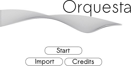
Main Screen
This is the main screen the user sees upon application startup. The buttons function as follows:
- Start Dialog box will appear, for the user to choose which mode they would like to play
- Import Dialog appears to import a previously saved composition
- Credits Screen attributing the designers of the serious game
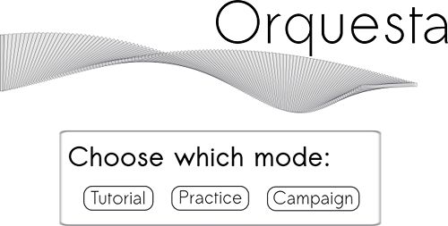
Mode Screen
Here the user may select which mode they would like to play:
- Tutorial
- Practice
- Campaign
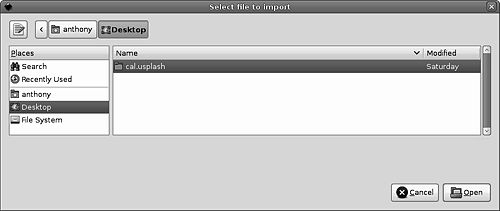
Import Screen
Dialog appears to load a new instrument sample.
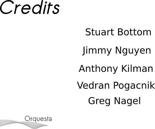
Credits Screen
Screen attributing the designers of the serious game.
Instructions Screen
This screen includes brief text describing how the game is played. It should contain:
- Definitions of applicable terms used in the game
- Objectives of the level the user is about to play
- Time constraints
- Number of required beat changes
- Tips/tricks if the level is a particularly hard one
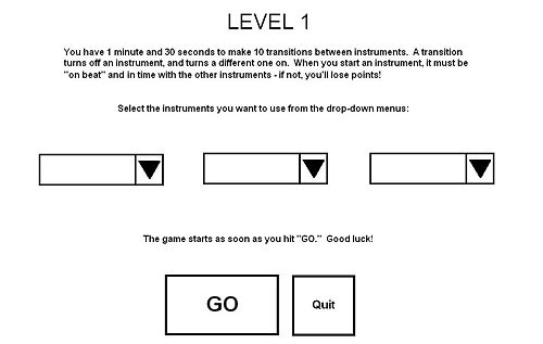
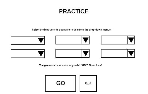
- Instrument selection - drop-down menus select which instruments will be included
- GO button - immediately opens the Game Screen, starts the countdown, and begins playing the base beat track.
- Quit button - returns the player to the main screen.
Which instruction screen is loaded depends on which mode has been selected: Campaign or Practice. Note that Practice Mode has more instruments available in it than the first level of Campaign Mode. The "drop-down menu" appears whenever the user wants to select an instrument, and their choice (once selected) is reflected in the corresponding drop-down box on the instructions screen. A user cannot select identical instruments for each drop-down box: there must only be one instance of each instrument at a time (otherwise an error message appears). This is to enforce the core DJ concept of "transitioning" between different instruments.
Game Screen
The game screen appears different depending on which mode is chosen, either Practice Mode, Campaign Mode or Tutorial Mode.
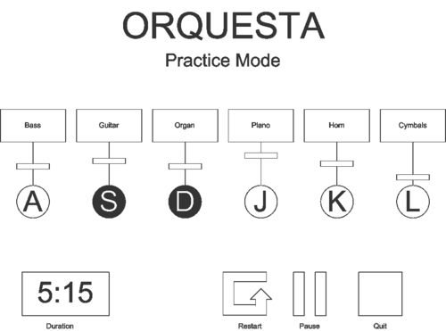
Practice Mode
In practice mode, the player can get a feel for the system without any constraints.
- Instruments: The player can mix these freely.
- Volume control: Each instrument has a separate volume slider.
- On/Off button: Each instrument can be toggled on or off, with keyboard or mouse.
- Duration: The amount of time since the song began.
- Restart: Start over (useful when recording songs).
- Pause: Allows the user to pause the game.
- Quit: Asks the player if she wants to save the song or cancel, then returns to the main screen.
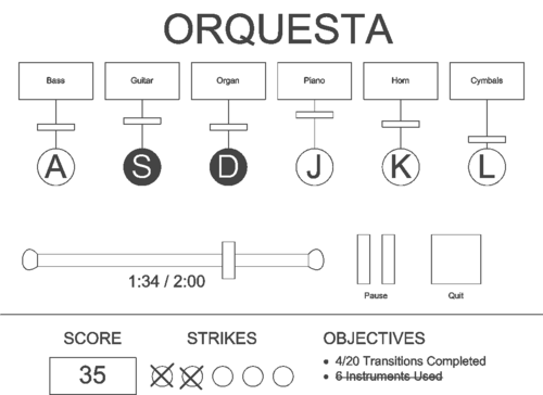
Campaign Mode
In campaign mode, the player has specific objectives to fill.
- Instruments: As above, the player has up to 6 instruments with volume controls.
- On earlier levels, some instruments or the volume controls may be absent.
- Time slider: Each level has a time limit. The slider bar and digital display underneath indicate the time remaining.
- Pause: As above, this button allows the user to pause the game.
- Quit: This button confirms the intent to quit and goes to the main menu.
- Score: Based upon good transitions and objectives accomplished, the player receives a score. The number is updated as the player gains points.
- Strikes: The player can only mess up a certain number of transitions before failing the level.
- Objectives: Here a textual representation of the level's objectives is given. When part of an objective is accomplished, its description updates. When the objective is fully accomplished, it is crossed out.
Tutorial Mode
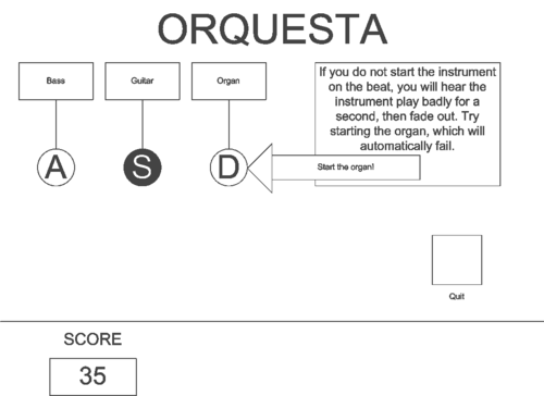
Tutorial mode is an interactive video that explains how to use the controls. Parts of the interface are hidden until they are explained. Furthermore, the user has to try all game features to complete the tutorial, each of which is explained and pointed at as shown in the sketch below. The first button explained is the quit button, so that the user can quit the tutorial at any time.
Statistics
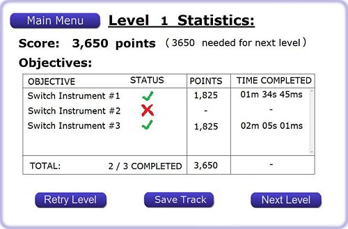
Once the player finishes a level, the statistics will be displayed. That is a mid-point between levels.
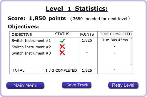
- Level Score: The score is calculated by adding the points gained by completing specific goals for that level. Goals that were not completed are not awarded any points.
- Objectives: Objectives will be listed in a table that holds the objective’s completion status, points awarded for that objective, and the time instance in the composition when the completion occurred.
- Main Menu: By pressing the “Main Menu” button the player will be able to directly (without being prompted for confirmation) return to the game’s main menu, which is displayed on the welcome screen.
- Next Level / Retry Level: The player will be able to directly advance to the next level if his score meets the minimum score requirement of that level. If the score meets the passing criteria, a “Next Level” button will appear. If the score is below the threshold, the player cannot advance to the next level, but can retry the previously played one by clicking on the “Retry” button.
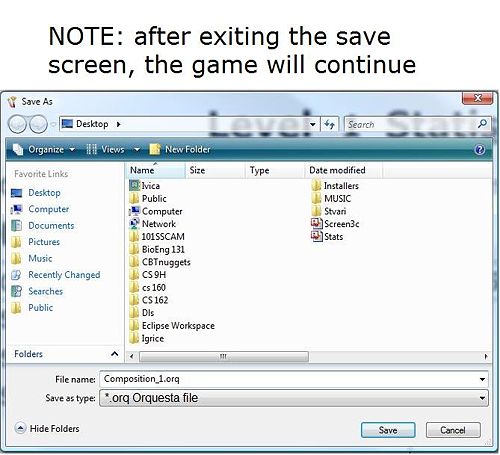
- Saving: The player has the option to save his composition by clicking on “Save Track” button. If the player doesn’t want to save his composition, he needn’t do anything. Upon pressing the “Save Track” button, a “save as” menu will appear (figure Statistics_Save_Dialog), where his options are to save the file or and return to Level Statistics.
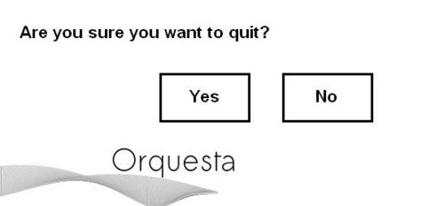
Quit Dialog
Asks the player if they are sure they want to quit Orquesta.
Method (12 pts)
Participants (1 paragraph)
Once you have developed the prototype you will find at least three participants to work through your benchmark tasks. The ideal participants will be members of your specific target user group. Your participants cannot be in this class and they should not be your friends. You should get them to sign an informed consent form explaining the test. Remember it must be voluntary. Click here for a more information on informed consent.
Describe the participants in the experiment and how they were selected.
We selected three participants to evaluate our lo-fi prototype. The first evaluator was an experienced DJ who has worked many professional gigs - we were interested in her opinion as someone who would likely play our game more for the fun of being a DJ than for specific skill development. The second evaluator was what we would term an "experienced amateur / novice pro" - he has used a wide variety of DJ equipment and software, but hasn't done much professional DJ work. We wanted his opinion as someone who "knew the lingo" of DJ's, but whose skills were still developing. The third and final user was completely inexperienced in DJ matters, but definitely a "gamer" - we knew we could count on him to give realistic feedback about the pure "game" appeal of Orquesta.
Environment (1 paragraph)
Also describe the testing environment and how the prototype and any other equipment were set up.
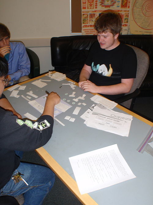
We arranged our testing environment for optimal user comfort. The "computer" sat across a table from the user, who was seated in a comfortable chair. The facilitator was seated at right angles to the user and their left, with a clear view of the user/computer/prototype interactions. The table was large enough so that the "computer" could lay out the pieces of the prototype in front of him even when they weren't in use. The user had a blank "screen" of paper in front of him/her, on which the prototype elements were placed as needed. Below the screen was a small, simplified "keyboard", with only the six keys needed by our application (QWERTY). The user interactions with the application were all done by touching elements on the "screen", and pressing the keys on the "keyboard."
Tasks (1 page)
Consider the three tasks you developed in the last assignment. These benchmark tasks should include 1 easy task, 1 moderate task, and 1 hard task and they should give good coverage of your interface.
For the tasks required during the lo-fi prototype test, we modified those listed in our contextual inquiry to suit the flow of our application better. The three tasks were then presented to the tester in order of difficulty. The tester was not given the next task until they completed the one they were on - this allowed them to focus on the task at hand. We assigned the tasks as follows:
Complete the tutorial (Easy)
This step merely required the evaluator to complete Orquesta's built-in tutorial, in order to familiarize himself/herself with the application. The evaluator had to step through each stage of the tutorial and demonstrate each GUI component.
The evaluator starts at the main screen and has to select "Start," which brings up a dialog asking for "Tutorial," "Practice," or "Campaign" mode. The evaluator selects "Tutorial," which loads the tutorial.
The tutorial works as an interactive video. Each step has a small description and either a button with the description, "To continue, (click here)." or an arrow pointing to an interface element the user must demonstrate. See the video in the appendix for a rough demonstration.
Successfully complete two transitions in campaign mode (Medium)
This task required the user to complete at least two transitions (that is, turning one instrument off and another instrument on) in Orquesta's "Campaign" mode.
The evaluator once again starts at the main screen and has to select "Start," bringing up the "Tutorial," "Practice," or "Campaign" mode. Then, the evaluator selects "Campaign" to start the game.
Music immediately begins playing, which we emulated with samples playing from a computer. The first level was a simple one with the target goal of completing 10 transitions, and 3 instruments to transition with. To complete the task, the evaluator must complete 2 transitions, so the evaluator did not have to complete the level.
Transitions are accomplished by switching in samples on-beat. The music changes whenever the evaluator successfully completes a transition, the score goes up, and the objectives are updated to reflect a successful transition. When the evaluator fails to complete a transition, the evaluator hears the sample start off-beat and then fade out. A strike is marked.
The level ends when either the the user quits prematurely, strikes are used up, or time runs out. The user can quit at any time by pressing the well-marked quit button. Alternately, if all the strikes fill up, the game is ended early, and the user is presented the failure screen. Otherwise, if time runs out, the evaluator is presented with the success or failure screen depending upon whether all the objectives were accomplished. The success and failure screens summarize the evaluator's performance and offer options to save the sample or quit the game. The success screen allows the player to move on to the next level, while the failure screen allows the player to retry the current level.
The task is complete when the user completes two transitions and navigates successfully back to the main screen.
Save a music file (Hard)
This required the evaluator to save a music file to disk after "recording" it in "Campaign" mode. This was a relatively simple task, provided the user completed the first level of the campaign, but we discovered it could otherwise be very confusing.
When the evaluator reaches the success or failure screens, he or she is offered the option to save the file. We at first believed this to be an easy task, but reaching one of these screens was non-trivial. Either the evaluator has to use up all the strikes, of which there were plenty, or stick around in the campaign mode long enough for time to run out. We made no provision for saving in practice mode or when a campaign mode level was ended early. This problem is further discussed in the results section.
Procedure (1 page)
Describe some details of your testing procedure. This should include the roles of each member of the team. To prepare for the experiment, you should assign team members to the different tasks (i.e., greeter, computer, facilitator, observer, etc.) and practice with someone playing the participant.
During the experiment, you should make a log of critical incidents (both positive and negative events). For example, the user might make a mistake or they might see something they like and say, "cool". Write it down along with a description of what was going on. Collect all the incidents first (all observers do this). Then go over them again as a group to assign severity ratings. The ratings scale looks like this:
- I don’t agree this is a usability problem.
- Cosmetic problem
- Minor usability problem
- Major usability problem: important to fix
- Usability catastrophe: imperative to fix
Each participant will perform all 3 tasks. You will want to keep the data separate for each task and participant.
You should write up a script of your demonstration and follow the same script with each participant. Once you have shown participants the demo, explain the first task. Tell them what they must achieve, but do not explain how to perform the task. When they are finished, you will explain the next task and so on.
Have one of your teammates demo the system to show each real participant how they would interact with your prototyped system to complete a simple task (don't use one of your three tasks in this initial explanation). Show participants how the system works in general.
Before allowing users to actually evaluate the prototype, we ran through it ourselves "live" with the "computer," to work out any bugs. We assigned Greg to be the computer, Vedran and Anthony as observers, Jimmy as the greeter and an observer, and Stuart as the facilitator. Additionally, Anthony handled the occasional tweaking of our "background music:" a beatmixed track intended to simulate what the actual game might sound like (though for the lo-fi evaluation we asked the user to concentrate entirely on the visual UI, see below). We made sure to cover these main points when introducing the evaluator to the testing environment:
Evaluator Introduction
- Thanks for agreeing to help us out
- Why we are doing this
- Part of a class project
- We want to have a design that is intuitive and easy to use
- YOU are key to making it happen!
- Background on the application
- Serious game
- Training for DJ's
- We want to make it fun!
- How the test will function
- This is not a test of you, it is a test of US - our design is being tested by you
- We will give a list of tasks for you to accomplish
- We are looking for your evaluation of the experience
- It's a paper prototype, because we're not worried about the details - just the overall experience
- We want to take pictures - is that ok? (Ask to sign release form)
- How to act during the test
- We encourage you to give feedback in real-time
- Facilitator is the only one who can answer questions
- Can't answer ones about how to accomplish tasks
- Not to be mean, simply because we want to know if it isn't easy
- Computer can't talk to you - he's a computer
- Observers are only there to observe
- We want you to be hard on us
- It's ok to be critical, we need to know how to improve
- If you see things you like, we want to know about those too!
- Will have a chance to give more feedback at the end
- How to use the "computer"
- Touchscreen
- Keyboard
- Sorry, we have to "fudge" the audio
- Even though part of gameplay is audio-based, we are focusing on the flow through the visual UI for this evaluation
- You just have to try to imagine the beats for now (aided by our background music)
After the introduction, we again encouraged the user to speak up at any time about whatever they were thinking, then dove right into the first task. Once the tasks were completed, we conducted a "post-mortem" analysis with the user, following the general format listed below.
Evaluator Post-Mortem Analysis / Interview
- Went back to times when the observers saw a notable evaluator reaction, and asked for commentary on why it occurred
- Asked the evaluator to talk about how they felt about the process of accomplishing each of the tasks
- Asked how evaluator felt the process of accomplishing said tasks could be made smoother
- Asked how the user felt about the "game-ness" of the application: how can we make it less of an app and more of a game
- Asked for any other user comments
- THANK evaluator again for their great help
Test Measures (1/2 page)
The test measures detail what you looked for or measured during the experiment. You should concentrate on process data (i.e., what is happening in the big picture) in addition to bottom-line data (i.e., time or number of errors).
During the experiment and post-mortem analysis, the observers noted the following:
- Ease with which the user completed the required tasks
- How long it took the user to complete each task
- Any sticking points within the task
- Times when the user was trying to find a button but couldn't
- User's facial expressions of confusion, excitement, or disgust
- Any verbal user comments
- Evaluator suggestions for improvements
We placed the most emphasis on the user's reflections on our UI design after the actual experiment was over. This gave them a chance to reflect on their overall impressions of the interface, and time to think of any suggested improvements.
Results (12 points; 1 page)
Major usability problems: The principal problem with our application was saving a track. Previously, the game could only be saved after it has been played (i.e. once the Statistics Screen was displayed), and only in “campaign” mode. Also, it wasn’t clear whether “saving” meant saving your current progress in the campaign, or saving the track, in part due to the ambiguity whether the track was being recorded to begin with. Therefore, we clarified “saving” as solely a mean to save your track. The way this is achieved is that the save menu clarifies that the game will continue upon “save” or “cancel” action. The save button is added to the main screen in both practice and campaign modes. We introduced checkpoints to save the campaign progress, in the form of a level code. Now there is a clear indication on the main screen that the sound is being recorded.
Another problem was the objective logic (so far there is only one objective in only one level): What we perceived as “transitions” (switching from one instrument to the other) must have been initiated “on beat”, which we perceived to be measures of a particular cycle (highest to next highest peak in the waveform). The interviews unveiled that DJ practice needn’t adhere to these constraints, so we decided to scrap that rule. Also, we clarified that “transitions” are just turning one instrument off and another one on (implementation might have the fade-in and fade-out delays).
Minor usability problem: Out subjects noticed about a big lack of visual feedback in our game. That was largely due to the static nature of the lo-fi prototype, but certain dynamic (moving) elements were added to help the interface be more intuitive. They include pulsating (to the beat)/ inactive buttons, spinning LP’s, and a track waveform that presents overlaid instruments.
The lack of subjects’ interest was noted in all interviews. That issue is subjective and depends on the individual’s motivation for mixing music through a computer application.
Cosmetic problems: The scoring criteria were also an issue. Even though the tutorial describes the scoring system, the player would have had a hard time stumbling upon the logic intuitively, that is without going through the tutorial. Therefore, we introduced a system of strikes: a wrong action adds one strike in each category, a right action removes one. Also, the number of strikes in each category is set to ten, so the player has a lot of room for trial and error guessing.
There was a number of smaller issues, like adding confirmation dialogues, clarifying the tutorial explanations, adding labels to some buttons, displays, and sections, or adding links (in the form of buttons) to screens. Those are the “save track” and “replay level” buttons
Not a Usability problem: Some of our subjects noted that the logic might be too complicated, and therefore hinders the experience.
Discussion (12 points; 3/4 page)
Discuss your results
For the low-fidelity prototype interviews, we successfully gathered a group of subjects representing a wide range of DJ experience: experienced, novice, and beginner (referred to as subject 1, 2, and 3 respectively). Each subject provided valuable insight into our product's strengths and weaknesses, in addition to providing numerous suggestions which will distinctly impact our design for the next iteration. Although we originally attempted to cater to a user base with a wide-range of experience reflecting that of our interviewees', we realized that (1) we must further restrict our audience based on experience and (2) the user interface should better reflect the experience of our audience with DJ applications.
What did you learn from the experiment?
At the end of the first two interviews, we realized that our product should cater primarily to the beginning and the novice DJ. While following the script through the low-fidelity prototype was relatively straightforward for the interview subjects, the suggestions were a clear indication that we needed to restrict our audience. Both subjects with DJ experience wanted to see features that would allow more creative expression, similar to those of a traditional DJ application. Subject 1 indicated that perhaps some kind of on-screen turn-table could be used to modify the tempo of a track the way a DJ would in a live setting. Subject 2 suggested that perhaps the user would want to use several instances of the same track, and overlay them in a fashion for different audio effects. Although a mere subset of the myriad of suggestions offered, they made it clear that as a semester long project we must not grow too ambitious and consequently must restrict our target audience. This reaffirmed that our current design is more suited for the non-expert disc jockey, and that our product's functionality should accurately reflect the experience of our audience.
How will the results change the design of your interface?
Our interviews have shown that for the most part our design is on the right track, with the exception of a few cosmetic changes regarding visual feedback, and saving a composition. Each of our users noted that there was no indication that a track was playing on the user interface. Although it could be argued that this was a consequence of the low-fidelity interface, it was duly noted that we should maybe incorporate some indicator such as a waveform or pulsing light as an indicator. There was also some confusion regarding what precisely saving meant. Whether it be saving progress in a campaign or saving the track itself. To resolve this ambiguity, saving is explicitly defined as saving a track via the save dialog.
Was there anything that the experiment could not reveal?
The low-fidelity interview process provided much needed user feedback for our next iteration; however this information is likely to only cover a subset of user issues we will encounter. This is precisely why user interface design is an iterative process, because in a real-world scenario a product will continually be refined with each pass; addressing interface issues as they arise.
Appendices (as many pages as necessary - link from text into the appendices; 6 points)
The appendix should include copies of all materials involved in the experiment. This includes your consent form, demo script, and any instructions or task descriptions you handed out or read out loud to your participants. Finally, it should include all the raw data you gathered during the experiment. Merge the critical incidents logged by the observers and list them here. The appendix materials and screenshots do not count in your 6-10 page total.
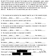
Consent Form
A sample of our consent form appears to the right. To protect the identity and privacy of our evaluator, the name and signature have been obscured.
Demo Scripts
Something along the lines of:
"Thank you for helping us out. This is our interface for the game that we are making for our CS160 User Interfaces class. We are trying to make a serious game that will teach people how to become a DJ and we would like you to go through our low fidelity prototype as if it were an actual computer game. We are not testing you at all, but rather ourselves and our interface. You can click anywhere you would like and type anything you'd like using our qwerty 'keyboard'. Feel free to explore any facets you would like, but your goal will be complete three tasks that we will be giving you. If you don't mind, please also sign the consent form, which will allow us to take pictures of you during the process. We will not include your face and your name and identity will be anonymous."
"We encourage you not to ask us questions, but feel free to explore the interface and layout and talk us through your thoughts. This will provide great feedback for us."
"You will be given three tasks and you can do whatever you want to try and accomplish those three tasks. If you have no further questions, we will begin. Your first task is to: Complete Tutorial Mode"
"Your second task: successfully complete a level of the game."
"Your third task: successfully save a song"
Additional Instructions
Your job is to use this game to complete these 3 tasks:
- The first thing you want to do is to complete tutorial mode
- Next, successfully complete 2 transitions in campaign mode
- Lastly, please save a song/composition
Interviewee Notes
Subject 1: Experienced DJ
Issues
- It not clear how to save. Also need to enable Practice Mode saving
- Need to emphasize that it's recording during the process
- Need to work on exactly what the transition concept is... not clear
- Needs to be on beat.. what exactly is this? Should have a better explanation
- Maybe emphasize the background track? And have sub tracks, or instruments??
- Need to label timer.
- Interest... doesn't seem like a game
Suggestions
- For the save dialog, we should have a 'return to playing' option
- Prompt to make sure user wants to quit would be useful.
- Visual sound representation
- Turntables: Some kind of additional interface to modify the music. Tempo adjustment as well.
Subject 2: Novice DJ
Issues
- We should have a way to indicate a button is in fact pressed. Goes back to visual indicator per track.
- Not clear if saving means saving your current progress in the campaign, versus saving the composition.
- VISUAL FEEDBACK
Suggestions
- Garage band, wave-length that corresponds to each instrument
- Hover over a track for preview
Subject 3: Non DJ
Issues
- TRANSITIONS are again an issue. Not clear to user.
- Not clear on the notion of what a strike or failure to make a transition means
- Again SAVING IN PRACTICE MODE
- Not clear how to save. We should have a more clear way to indicate this
- No justification for why the second transition automatically "fails" during the tutorial
Suggestions
- Asked if we can have multiple instances of a track? Potentially increase tempo...? Gotta have more cowbell..
- Do we want to layer musical tracks or sounds
- The ability to adjust the tempo
- Make it more like a drum machine.
- It would be cool if our interface supported multi-touch, like the ability to adjust two volume sliders at the same time (can't do with only one mouse pointer)
- Don't make it too complicated
Process
Check out a video (in hyperspeed) of a user going through tutorial mode.
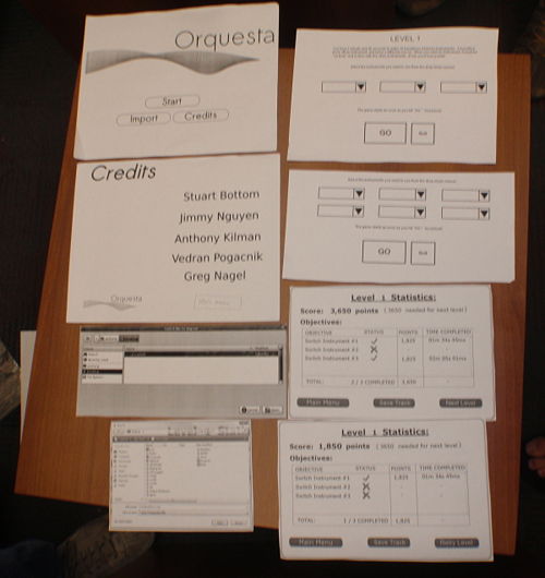
This is a snapshot of all the different screens that we run through from menu to menu.
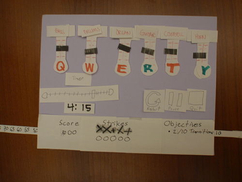
Our actual interface in which the user goes through, whether it's tutorial, practice or campaign mode. This is the "DJ Mixer"
Our "computer" is doing the work moving around all the different facets of the interface.
