LoFi-Group:Group 4
From CS 160 Fall 2008
Contents |
Team Members
- Witton Chou - Introduction and Mission Statement, Discussion, various prototype design input
- Kai Lin Huang - Computer, facilitator, observer, Methods
- Volodymyr Kalish - Computer, facilitator, Results
- Karen Tran - Observer, facilitator, Results
- Trinh Vo - Prototype description, prototype design, facilitator
Introduction and Mission Statement
The system being tested is a game that will help players learn and practice programming. Our low fidelity prototype aims to test how well users can employ newly learned concepts through a interactive interfaces. Users will be asked to perform various tasks that reflect common programming practices. Our goal is to facilitate the learning process of computer science through the use of a game that introduces new concepts in a way that is not intimidating yet effectively eases the player into the programming world.
Prototype
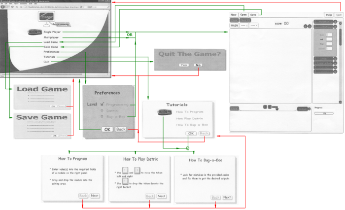
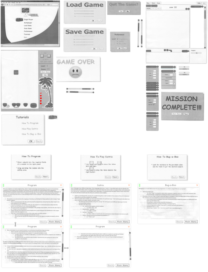
Main Menu:
- The user has 7 options:
- 1. Single player:
- The user works alone without a partner or enemy.
- 2. Multiplayer:
- The user works with a partner or against an enemy.
- 3. Load Game:
- The user can load old game where he/she left from the last time by selecting a saved game slot. There are only 3 slots.
- This mode only works for Single Player
- 4. Save Game:
- The user can save current game. There are only 3 slots. Used slots will be overwritten
- This mode only works for Single Player
- 5. Preferences:
- The user can choose one of 3 different tasks, which are Programming, Datrix, and Bug-a-Boo, to start with.
- By default, the selected task is Programming.
- 6. Tutorials:
- There are 3 tutorials for the 3 tasks. These tutorials will instruct the user how to program, how to play datrix which is similar to the famous Tetris game.
- Through these tutorials, programming materials will be introduced to the user as well.
- 7. Quit:
- Quit the game
Programming: (Programming and Bug-a-Boo options)
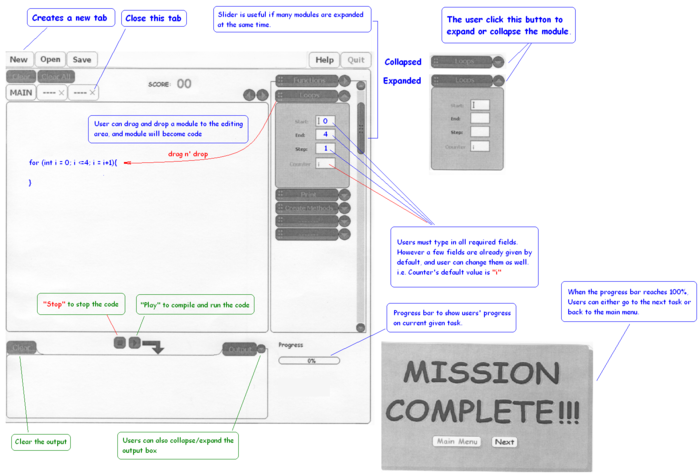
- After selecting Programming option (with multiplayer mode), the user will be taken to the editing screen. On the right panel, there are list of drag-and-drop pre-defined function modules. These modules can also be expanded or collapsed to save space.
- After typing in all required fields for a module, the user can drag and drop this module into the text area in the middle. This module will become code, so users don't have to remember any syntax
- To provide more space for editing, users can click "New" to create new tabs. Tabs can be closed except the "MAIN" one. Both editing area and output area can be resized, and scroll-bars (horizontally or vertically) will automatically appear if the code or output are too long to fit in one view page.
- On top of tabs, there are two buttons: "Clear", and "Clear All" which are used to a part of clear users' codes or to clear all user's codes respectively.
- On the bottom is the output, it can also be expanded or collapsed to give users more space for editing. Users can also clear the output area if it gets messy.
- At the bottom right corner is the progress bar which shows user's progress of the current task. In Multiplayer mode, there will 2 progress bars, one is for the user another one is for his/her partner (in brown color) or his/her enemy (in red color).
- If users forget any programming concept or the current task objective, they can click Help, which is on the right corner of the screen, to refresh their memory.
- To compile and run the code, users simply click the "Play" button right on the top of the output box. For many reason, users can hit the "Stop" button to stop running.
Datrix:
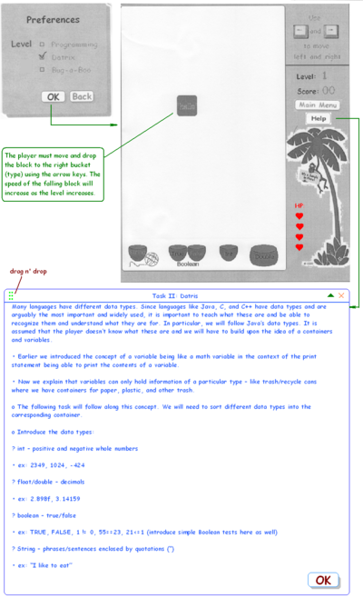
- Java is a strong data type language, so the Datrix game will greatly help users improve their understanding of data type by moving (to left & right) and drop the falling block into the right bucket at the bottom.
- If users need a refresher of data type, they can click help. A help window will pop out. This help window can be also expanded or collapsed, and dragged as well. It's designed this way to help users play the game and conveniently review data type materials at the same time.
- Users are given 4 chances to guess. If all the chances are used up, the "GAME OVER" window will pop out. Users then either click "Replay" to start the game over or click "Main Menu" to get back to the main menu.
Tutorials:
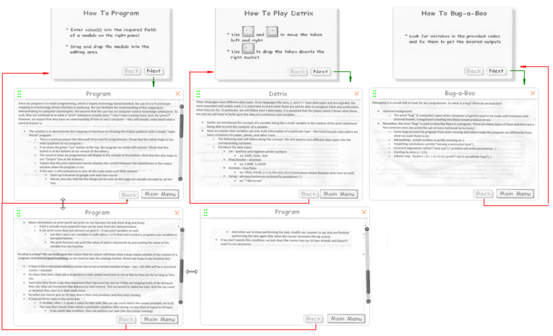
- Before starting to play any game, users are encouraged to see tutorials on how to operate the games. These tutorials cover some basic and helpful programming concepts that are frequently used throughout the games.
- There are 3 main tutorials: "How to program", "How to play Datrix", and "How to Bug-a-Boo". They were written as concise as possible to help user quickly grab the materials.
- Users can conveniently go back to previous window or to Main Menu by clicking "Back" or "Main Menu."
All Elements Laid Out
- First Prototype:
Method
Participants
We ran the experiment on three volunteer test users. We selected our participants based on how much they knew about programming. (The less, the better) All of them are UC Berkeley undergraduate or graduate students studying various majors, excluding EE or CS majors because they are not our application’s target users.
A: A is a science major who does not have any experience in computer programming, and A may need some knowledge in it for research in the future.
B: B is a liberal art major who has never learned programming concepts, but B understands abstract terms such as Boolean values.
C: C is a graduate student in science.
Any other information about participants is omitted to protect their privacy.
Environment
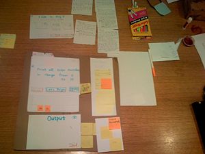
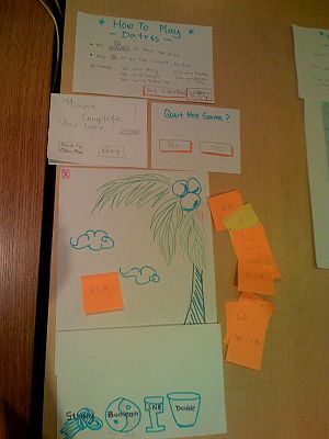
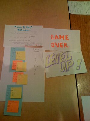
The experiments took place on the 6th floor of Soda Hall in the evening when it was quiet and empty, so test users would not get disrupted during the experiment. All of the smaller parts of the interface were grouped and laid out on the table, while the currently active pieces of Low-Fi interface were placed on a piece of cardboard (representing screen).
We grouped our user interface pieces for each sub-game so that we could quickly switch one game to another when the user chose to end one game. The person acting computer sat next to the user and reacted when the user tried to do something with the “application”. The facilitator sat on the other side of the user. Observers sat on the opposite side of the table and took notes during each experiment.
Tasks
Each participant was asked to perform the following three tasks:
Easy: {Coding}
After a small demonstration on how to print a sentence using "loops" and "print" statements, modify given codes to print all even numbers in range [0 - 10], one per line.
For this task, user needs to know or will learn how to:
- Expand and minimize the function bars.
- Drag and drop functions from the function column the the main coding window.
- Move functions around in the main coding area.
- Run the code
- Understand the output with the code
Intermediate: {Datris}
After a brief explanation of various data types, match an instance of data type with its type.
For this task, user needs to know or will learn how to:
- Identify different data types: Integer, Double, String and Boolean
- Play data type version of Tetris
- Evaluate Boolean expressions in their head and use their result in playing the Datris game
Difficult: {Bugaboo}
Modify given buggy code so the output produced by it matches the desired output.
For this task, in addition to all the skills and knowledge from the Easy and Intermediate tasks, user needs to know or will learn how to:
- Simple debugging
- Understanding of simple codes and syntax in Java
Procedure
First of all, the greeter greeted the interviewees, and the group thanked them for volunteering to help our experiment.
Second, we demonstrated step by step for the coding game of how we would click on each element on the interface in order to achieve a similar task to the one we were going to give them. The procedure in our demonstration put a few predefined functions together into a piece of code that prints from 1 to 10.
Third, we showed our task windows from our interface to start the experiment of the game. For example, in the coding game, the task is to print all the even numbers in the range between 1 to 10. We did not elaborate the descriptions on our UI of task descriptions unless the user could not progress to the next step otherwise. By doing this, we could learn what have made users confused. The observers recorded the questions users asked during this process.
Lastly, we let the users do whatever they thought that would finish this specified tasks. Because we would like to see what a user would react without guidance of a facilitator, we did not give much help unless they asked the facilitator questions. Meanwhile, our observers observed the user's behaviors and typed notes on their laptops based on how the test users reacted or questioned to our application interface..
Every time something was not clear and the user got stuck, the facilitator would try his best to give minimal advise, while observers would record all the problems and possible reasons of why did user get stuck. We also put down and discussed what might be changed to prevent the same problem and improve our user interface in the future.
During or after an interview, the project group members would ask for user's feedback, opinions and suggestions on our user interface for improvements. And in some cases, users were asked for opinions and thoughts on the things they got wrong and for what would have worked with reasons. Observers also took notes on them.
At the end of each interview the team expressed gratitude towards the interviewee for helping out again.
Roles
We rotated roles in each experiment so that each member in our group could have a chance of working on different role.
- Greeter: Witton Chou
The greeter greeted the test users, explained the procedure and the purpose of this test run of the Low-Fi prototype. The greeter also introduced each group members and their roles, and clarified that the group would give minimum guidance on the usage of the user interface. Furthermore, the greeter asked the test users to fill out the consent form.
- Computer (< 1Hz): Kai Lin Huang, Volodymyr Kalish
The computer is responsible for giving the subsequent window actions such as error messages, window appearing and disappearing when the users interacted with the interface. The computer did not talk or instruct how the user should use the interface. The computer is allowed to blow out if there were unexpected actions performed. As a note, the computer did not respond if the user only instructed orally that he/she expected something to happen to follow the flow of the application interface.
- Facilitator: Trinh Vo, Volodymyr Kalish, Karen Tran, Witton Chou
The facilitator demonstrated things that were necessary to use the paper interface because it was very unintuitive for the users. The facilitator explained what he/she did to make the flow in the demonstration. The facilitator usually did not tell the user how to do in order to accomplish the task, but he/she would give some limited guidance if the users did not know what to do at all.
- Observer: Karen Tran, Kai Lin Huang, Trinh Vo
The observers were the human camcorders for the test run of this prototype. They did not discuss or suggest anything regarding the interface or how the users would go for something. They recorded the problems and the progress of how a test user reacted or got frustrated. The observers are also responsible for the user's reaction time on places where it took the users a long while to understand or make progress.
Played a participant in a dry run: Volodymyr Kalish
A dry run is to mimic a test run with a group member.
Test Measures
Because the application interface that we were working on would be extremely confusing for a computer programming newbie, we focus on a few aspects of the test run.
First of all, we paid attention to whether each user could understand what we were asking them to do and whether they found our interface self explanatory and intuitive enough. We measured it by the user's "delay time". If the user stops for a long time and staring at a couple of pieces on the interface, we could tell that the user was confused and actually not really sure what to use next in order to complete the task.
The success of each experimental run was also determined on how many imperfections we could find in our interface and game play design. If we did not find a lot of problems, it would be either the interface is extremely easy to use and well-designed. However, this could also be that the observers did not record all they have seen.
The number of questions that the test users ask is a quantitative measurement that we could pay attention to for the usability of our application UI. However, because of that our test users have different backgrounds, the number and types of questions they ask vary and not quite parallel comparable. Therefore, we will not compare the number of questions that each test user ask as a primary indicator of how well the design is.
We also determined the completeness of our UI design by the amount of time each participant took to complete a task; the number of errors and misunderstandings each user experienced; positive and negative feedbacks from every user.
Results
- User 1:
- Problem: "variable" construct of graphical language was confusing to the user (before they played Datris game)
- Solution: remove it (maybe temporarily, until higher levels)
- Rating: usability problem (too hard of a concept to grasp at the beginning)
- Problem: user didn't know how to delete extra code snippets
- Solution: need to add a "trash can" for drag and drop (also, as an option have "Clear" and "Clear All" buttons)
- Rating: usability problem
- Problem: user didn't know how to use arrays and what they are (indexes start from 0)
- Solution: give explanation and example (follow Java's arrays)
- Rating: usability problem
- Problem: user didn't know how to save modified array
- Solution: add a "save" button and "discard without changes"
- Rating: more of a cosmetic problem than usability
- Problem: creating a new method and calling it was confusing
- Solution: decided too introduce methods on higher levels of the game and switch the hard task from "method use" to "debugging" (aka Bugaboo) and deal with this problem later
- Rating: usability problem (too hard of a concept to grasp at the beginning)
- User suggestions:
- Suggestion: limit to number of misses in Datris game
- Solution: 5 misses is the limit
- Suggestion: separate Boolean "true" and "false" expressions into two separate buckets
- Suggestion: add an "exit" button
- Solution: placed an "x" button in the top-left corner
- NOTE: as a result of this experiment, the tasks were changed a little for the next interviewee
- User 2:
- Problem: it takes too much time to read the description of each graphical language construct
- Solution: make it interactive and more concise with a link for more detailed explanation
- Rating: cosmetic problem
- Problem: even after reading all the explanation, the user was still confused on how to use the interface
- Solution: need to include a demo and a brief tutorial
- Rating: usability problem
- Problem: user was confused about what was a variable, how to work with variables, what can be stored in variable
- Solution: map the concept of variable to Math and scientific calculators (something the users could have had experience with before); have a "more" link to contain a more tedious explanation.
- Rating: cosmetic problem
- Problem: user was not clear why to use (check) a newline and other fields in "print"
- Solution: make the interface more intuitive by placing the newline check mark at the end of "print" input field and have a picture of "carriage return" key.
- Rating: cosmetic problem
- Problem: user didn't know what step in a "for" loop was
- Solution: need to put a pop-up explanation
- Rating: cosmetic problem
- Problem: user was unclear if anything would tell them if they completed the task correctly or are they off
- Solution: green light indicator (and/or sound) to indicate that the task was completed and a red light indicator to signal that something was still wrong.
- Rating: cosmetic problem
- Problem: user doesn't know what's wrong when they get into an infinite loop
- Solution: have a "Running" text blinking; also have a RUN/STOP buttons
- Rating: cosmetic problem
- Problem: after some time user forgot what was the task that they were supposed to do
- Solution: have the task description visible somewhere at all times or have a button that will display (remind) the user what was that they were supposed to do
- Rating: usability problem (people have limited attention span)
- Problem: user didn't know what "double" data type was
- Solution: map "double" to "decimal"
- Rating: usability problem
- Problems: what is a bug; how to fix it; the buggy code is more complicated; don't have an incentive
- Solution (that solves all the problems stated 1 line above): as an incentive, unlock the next levels as user gets more advanced; and advanced users shouldn't have the other stated problems
- Rating: usability problem
- User suggestions:
- Suggestion: indicate whether the code is running
- Solution: have a "Running" text blinking when the code is running.
- Suggestion: explain Boolean using true/false types of expressions (using math symbols and operators)
- Solution: can't fall for user's preferences because we need to teach users "CS style" symbols and operators
- Suggestion: have more examples of expressions
- Solution: can be one of the user's preferences or options in a demo window
- Suggestion: need a reference for data types
- Solution: place a "reference" or "help" button that pauses the games and shows user the data types definitions and examples
- Suggestion: increase difficulty of falling expressions and the speed they are falling down with after every "Level Up"
- Solution: working on it; and it is hard to show with lo-fi
- Question to user: would you want to save your work?
- Answer: not really...
- Group members' ideas: users would probably want to access the old code for references, but they wouldn't know that they need to save it, so need to make completed (solved) tasks available for references.
- User 3:
- Problem: beginning tutorial demo is too long - user suggests that the demo can be overwhelming.
- Solution: break demo down into smaller ones, each of which will display when the user glides the mouse over a tab. Program should be "in demo" mode - distinguish "in demo" mode from regular mode by displaying "DEMO" in the main window
- Rating: cosmetic problem
- Problem: graphical interface gets confusing when used with loop - placing multiple graphical windows inside one makes the window looks too clobbered
- Solution: showing the code version (= translation) of the graphical interface proves less troublesome, while serves the education purpose of introducing the user to coding style
- Rating: cosmetic problem
- Problem: when having multiple 'functions' in the main windows, all of them gets compiled and executed and displayed in the output console, making the output hard to read
- Solution: when possible, color-code the result of each function to match the code and function
- Rating: cosmetic problem
- Problem: output console sometimes gets too clobbered (i.e. due to an infinite loop, etc) user would like to clean it
- Solution: add a clear button to the output console
- Rating: cosmetic problem
- Problem: method call" and "method new" tabs prove to be difficult to understand. User had trouble understanding why two separate steps (and tabs) have to go together when creating only a single new function
- Solution: user made sense. "method call" should be eliminated. when a new method is created with "method new", it should be able to be called via a simple drag and drop to the main window, just like the rest of the other functions
- Rating: usability problem
- Problem: in Datris, when player wanted to read the help menu, there's no pause button
- Solution: add a pause button next to the time display
- Rating: cosmetic problem
- Problem: when 'run' button is pressed, all the methods in the main window get executed, when user only wanted to run a particular method
- Solution: make the program more console-interactive (like stk for Scheme and Matlab environment) - create a right-click option where user can comment out the rest of the code
- Rating: usability problem
- User suggestions:
- Suggestion: should improve code readability because as function becomes more complicated, it's hard to 'debug'
- Solution: when multiples 'tabs' are dragged to the main window, the corresponding block of code version for each tab should be colored coded
- Suggestion: programming game needs to be more "exciting" - a game instead of a academic lesson
- Solution: the output console should be displaying animation of the result. ex: a loop resulting in a simple melody of several musical notes
- Suggestion: shouldn't force the user to start from the beginning each time the game is played
- Solution: allow users to create profiles, where the level of the user's programming skill is "measured"
- Suggestion: users are sometimes too stuck to move on, but don't want to quit (for bugaboo game)
- Solution: the game should detect if the user hadn't made a move in a certain time limit, it should make some suggestions (hints) on the next possible moves
Discussion
- There are too many programming paradigms to account for if we aim to teach general programming concepts without focusing on a particular language. Different languages are built differently and are, hence, used differently.
- We will be focusing on the Java programming language. The Java programming language is one of the most popular languages. It is clean and the programmer does not need to manage memory, making it a great introductory language that is representative of the style of many other popular languages.
- While the code generation task was simplified through our functions list and form fields, users still seemed confused. Even though we, as seasoned programmers, feel that some descriptions will suffice for describing the purpose of certain functions, it is not indicative of how the user will perceive the meaning of these descriptions. Descriptions that are really short may not provide enough detail as to how the function is used, while long, verbose descriptions can detract from focusing on the task at hand.
- Here, interactive demonstrations may be much more effective than words. The goal should be to teach the function to the user through visual associations to the function's usage. Visual references to key concepts will improve learning efficiency.
- Having the player put together several functions is still a higher level task. The user has to learn too many things at once: what a loop is, what an initial value is, what a step/increment is, what an end condition is, and that other functions can be performed inside the loop.
- We have to single out various functions and the usage of each part of the function.
- We can save putting together several functions for a higher level, but the general concept of this game must be reworked.
- Focus on particular functions first
- e.g. print: show that it can print a string in quotations; show it can print a variable; show it can print numbers; show the difference between print and println statements in succession.
- Although prior to the tasks, we had descriptions of how particular functions work, we forgot to provide access to that information after the user finished the "tutorial" phase.
- Simpling adding a "Help" button to open up to a menu of learned/usable functions manual will be useful to the player.
- In the Datris game, we did not have good visual/audio indicators to show whether the user made the right decision about where to drop objects into.
- We can possibly make the screen or bucket flash red indicating a wrong answer or green indicating a right answer when the user drops the data object into a bucket.
- Add a ding sound for correct and a buzzer sound for wrong.
- Our Datris game featured increasing difficulty through the use of faster drop rates of data objects as well as boolean expressions and equations that resulted in a different data return type.
- It may be better to separate these two types of difficulty changes into different levels.
- Players were confused as to the cause of bugs
- We can separate bug types and introduce them one by one and have them locate the same type of bug in different code snippets.
- Eventually we can allow them to find one bug from a snippet of code with only one bug without telling them what kind of bug to look for.
- Then after that we can inject even more bugs into short code snippets.
- Though the idea of multiplayer functionality was one we had discussed, this functionality was not included in our lo-fi prototype due to not being able to schedule multiple testees during the same time slot. We were also stumped at how to incorporate real time updates between two competitors
- We need to plan out interview times as early as possible to obtain the persona we're targeting at a time where we can test the functionality we plan to implement.
- Addressing real time updates can be done by a progress bar on each user's screen to see how fast they compare to their rivals in a set of tasks.
Appendix
Informed Consent Form
Informed Consent Form used during testing.
Informed Consent Form for participant 1 .
Informed Consent Form for participant 2 .
Informed Consent Form for participant 3 .
Data and Observation
Raw data from interview for participant 1 (part I)
Raw data from interview for participant 2
