PilotStudy-Group:Group Phi-tus-Xuexin Zhang
From CS 160 Fall 2008
Contents |
Introduction
Word Soup is a serious game system that designed to help players to improve their secondary language skills. The game is a blend of Pictionary®/Taboo® types of games -- as it would apply to learning a language. Our research has shown that the vast majority of the language-learning process involves verbal communication in the language in question. Our goal in this design is to bring this "best" aspect of learning into an environment where participants will try very hard to both speak and comprehend the language.
The purpose of the pilot usability study is looking feedback about the usability by average users and possibly to find any confusion from the user interface. Besides that, we would like to make sure from the pilot usability study that we have improved and fixed all the confusions or errors from the Heuristic Evaluation.
Implementation and Improvements
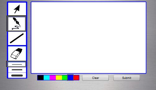
(1) In the drawer screen, there is no feedback when choosing drawing tools. So we have added a bold boarder on the selected drawing tool.
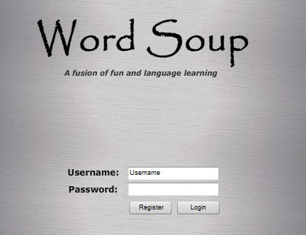
(2) From the heuristic evaluation, the other group suggested that the mission statement on the first screen is too small. So we changed the font size to a larger one.
(3) The user didn’t have the freedom to navigate back to the previous screen, so we added the back buttons to our system.
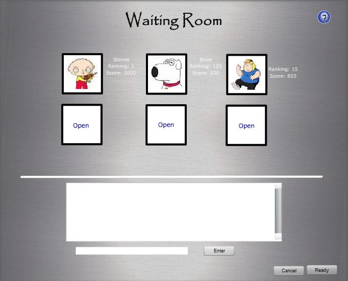
(4) From the heuristic evaluation feedback, the button in "the waiting room screen" showing start violates consistency. The buttons on the left side of the start button is being used for chatting. Users may be confused by different sort of button aligning in a straight line. We have changed the layout and alignment for the buttons.
(5) We also changed the link "create new account" in the main screen, to make it clickable.
Method
Participant
User J (22 years old), Berkeley Alumni 2008, is a male Chinese American that born in China and came to the United States after elementary school. The reason that I selected him is because that he had various experiences for learning foreign languages himself as well as tutoring other English-speaking students Chinese.
Apparatus
The study was done at facilitator’s home and having the participant sitting side by side together. I have used a laptop computer for the purpose of demonstration of the prototype in Flash. I used a paper pad for notes and a voice recording device for keeping a log of experiment. There is also a time device to keep track of the duration of the user performing different tasks.
Tasks
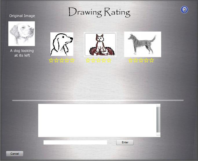
Rate the drawings (easy task): The user is simply presented with a screen showing all of the drawings that have been submitted from the last round with a set of unfilled stars used to perform the rating under each drawing. Therefore, the user must simply move the input device over the stars and once the amount of the stars is “filled”, the user then clicks to lock in the result. The user repeats this process over the number of drawings then selects the submit button for the results to be tallied.
Create a new game (moderate task): Game creation was chosen as our moderate task because it requires the user to interact with elements not used in other parts of the game; namely, the information form that is presented to users in order to choose the basic parameters of the game such as language and difficulty level. This form is reached by selecting the “create a new game” button form the main screen. Once here, the user chooses the game’s parameters, which are mainly guided through a set of drop down menus for easy setup. Once the user is satisfied with their choices they can click the “create” button and are then taken to the waiting room where they await other player to join their newly created game.
Draw a picture (difficult task): The screen we used is very simple and familiar to that of most drawing programs such as Photoshop but not nearly as robust. The task simply requires the user to select the mostly familiar tools in the left hand toolbar such as the shape or pencil tool and use them to draw a picture. The task of selecting the proper tools to create the desired effects was the crucial step for this task. Once the image is drawn, the user can either wait until the timer runs out or
Procedure
Step 1: Greeting the participant, and thanking him in advance for taking the time to participate this pilot usability study.
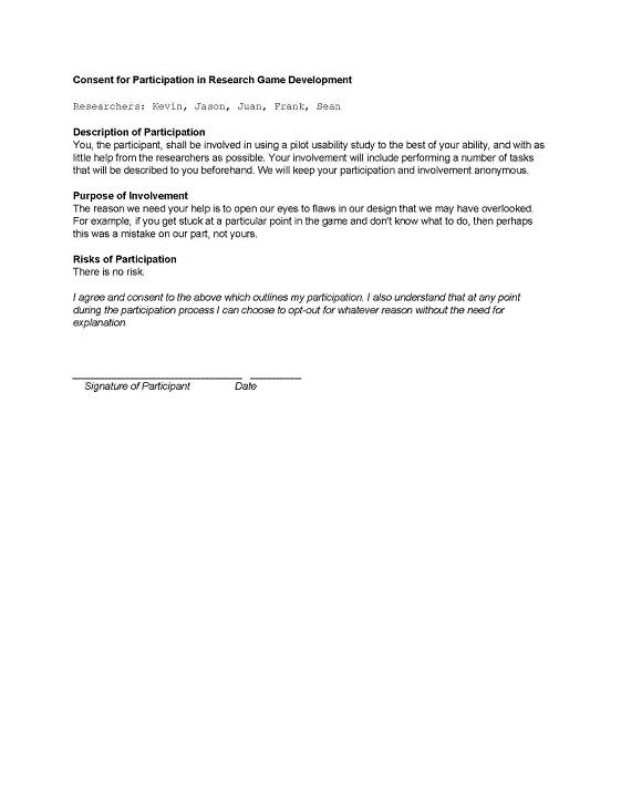
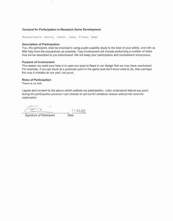
Step 2: I went over the idea of the pilot usability study and made sure that he understands the consent form and he is voluntarily doing the study and he could quit at any time. Then I asked the participant to sign the consent form.
Step 3: I started with giving the introduction of the study with overall idea of our serious game of “Word Soup” to the participant and the major functionalities it offers.
Step 4: I setup our Interactive prototype using Flash Player
Step 5: I gave a quick demo of the serious game with explanation to all the actions I did.
Step 6: I asked the participant if he has any questions regarding the interface then handed participant a list of tasks to perform.
Step 7: I recorded the test measures while the participant performed first task, and included any error, comment, or critical incidents on the notepad.
Step 8: After the first task, I repeated step 6 to make sure that user had no question about the interface before I assigned him the moderate task of creating a new game. While the user is performing the second task, I repeated step 7 to record the test measures.
Step 9: After the second task, I repeated step 6 again to make sure that user had no question about the interface before I assigned him the hard task of drawing a picture. While the user is performing the third task, I repeated step 7 to record the test measures.
Step 10: After participant finished the hard task, I asked him for comments and suggestions regarding our serious game.
Step 11: I thanked the participant again for taking part in our pilot usability study.
Test Measures
Track the time for each task
This time measurement indicated how fast each task can be done and indirectly reflected the usability of the user interface since we want to make sure that it doesn't take users too long to perform each task.
Track the number of actions to complete each task
This number of actions measurement is another indicator of how easy the user interface was designed. By keeping track of this number, we could learn what the users have to go through to complete each task.
Track the errors during each task
The error measurements indicated the flaws of our interface design and those errors should be a high priority issue to be fixed in later builds.
Track the confusions during each task
These confusions indicated that the user interface does not make sense to common average users and we should learn from the user's logic to improve the interface design.
Track the participant's mood during each task
By keep tracking the participant's mood, we could understand how well our interface design appeals to users and find possible flaws from our design.
Track the conversations with the participant about the program
By taking notes of the conversations with the participant, we could gather the participant's suggestions, comments, and other feedbacks.
Results
Rate the drawings (easy task):
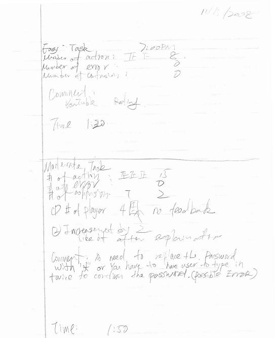
Task completion time: 1 min 20 sec
Number of actions: 8
Number of errors: 0
Number of confusions: 0
Participant's mood: no sign of frustration
After the user was given the task and the screen of the rating system, he easily figured out how to rate the drawings. One of his comments is that he found it very similar to the rating system of YouTube.
Create a new game (moderate task):
Task completion time: 1 min 50 sec
Number of actions: 15
Number of errors: 0
Number of confusions: 2
Participant's mood: no sign of frustration
The user started from the home screen of our serious game, after clicking the “Create a new game” button, he was able to fill out the game creation form with no outside help. One thing I noticed is that when he tried to decrease the number of the player to 2 from 4, our interface provides no feedback about that the minimal number of required players is 2. He first was confused at the up-down adjuster of number player because it increment or decrement by 2 with a single click, but he said he liked it after I repeated to him that this game requires even number of players. He gave a suggestion about the password field which could be implemented without using the * instead of the actual password for no one uses any sensitive password here.
Draw a picture (difficult task):
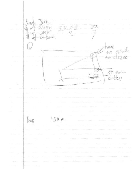
Task completion time: 1 min 50 sec
Number of actions: 20
Number of errors: 0
Number of confusions: 1
Participant's mood: no sign of frustration
After presented the task and the drawing screen, the user could quickly finished drawing a picture with no outside help. One of the confusions is that after clicking the help button on the top right, there was no visible close button. Then he tried to click the help button again to close the help pop-up window which works. He made a comment about the similarity between the drawing system and the Microsoft Paint.
Discussion
From the results of pilot usability study, I learned that users could easily and quickly figure out how to use the user interface by recognizing the design pattern which is similar to products they have used. While user J was performing the easy task of rate the drawings, he found out how to do so from his past experience with the rating system of YouTube. Besides that, I learned that sometimes the user interface designers could make some assumptions is not logically clear to users. In our user interface design, we made the assumption that the user could understand the 10 next to number of players mean the maximum number of players allowed, which caused a confusion of the user during the pilot usability study. Also, we provided users with little feedback of user actions, during the easy task, the user confused when he was not able to decrease the number of the players to 2 because 4 is the minimum number of players required. It will be very helpful if we could provide some visual feedback of the user action that informs the user why his or her action didn’t change anything of our serious game.
From this pilot usability study alone, I would like to change the game creation form to have extra text that indicates that the maximum number of players is 10, the minimum number of players is 4 and an even number of players is required. I would also like to add a form of feedback if the user action is not logically to our user interface. Besides, I would like to standardize the help menu that would contain close button at the bottom so the users will no longer be confused by our current method of closing the help menu by clicking the help button again.
Appendices
Greeting
Thank you for voluntarily participating in our pilot usability study, it should take no longer than 30 minutes of your time. Please be informed that this experiment is completely voluntary and you may quit this experiment at anytime with no explanation. I would like to ask you to sign the consent form to indicate that you have been informed about the nature of this experiment.
Consent form
Introduction
Our project’s name is Word Soup; it is a serious game system that designed to help players to improve their secondary language skills. The game is a blend of Pictionary®/Taboo® types of games -- as it would apply to learning a language. Our research has shown that the vast majority of the language-learning process involves verbal communication in the language in question. Our goal in this design is to bring this "best" aspect of learning into an environment where participants will try very hard to both speak and comprehend the language.
The purpose of this usability study is looking feedback about the usability by average users and possibly to find any confusion from the user interface.
Demo script
1) Login screen
Where the players login to the game
2) Home screen
Contains a list of existing games and could create a new game from this screen
3) Create new game screen
A form of information to be complete in order to create a game
4) Waiting room screen
Where the player waits and chats with other players when they are waiting for more players to join
5) Dictating screen
Where the dictator describes the object he or she sees to the drawer that was randomly assign to him or her in the foreign language
6) Drawing screen
Where the drawers draws the object that the dictator describes to him or her
7) Rating screen
Where the dictators rate the drawings and drawers could get real time feedback of their drawings
Task instructions
1. Rate the drawings (easy task):
Suppose that you are a dictator in the game, and you have finished dictating the drawer. You would like to rate all the drawings from all the drawers anonymously. Please give the drawing on the left a 5-stars rating, the middle drawing a 1-star rating, and the drawing on the right a 3-stars rating.
2. Create a new game (moderate task):
You want to practice your German and you think you are a beginner in that language. However, there is no existing game that matches your skill. Please create a new public game in German for beginners and you want to play with 5 other players.
3. Draw a picture (difficult task):
This is the final task, you are currently playing the game and it’s your turn to be the drawer. You are giving the instruction from the dictator that the object is a dog looking at its left. Please draw a picture on the drawing screen and submit it.
