PilotStudy-Group:Group Ate-NathanYan
From CS 160 Fall 2008
Nathan Yan
Pilot Study
Introduction (5 points)
The system being evaluated in this study is our dining simulator/etiquette training game, "Formal Logic". The game places the user in the role of a diner who is taking a "dining class" and receiving dining/etiquette lessons from an instructor. Specifically, the game will teach users how to choose the correct utensils for each hand, and to also keep in mind eating at a moderate pace, maintaining straight posture, and passing along condiments or food items around the table.
The purpose of this study is to test whether the game in its current form is intuitive and provides an error-free experience for the user, and if it does not, find out what areas the user encounters errors and how they run into them, so that these problem areas can be addressed. A secondary end-goal is also to test whether the game provides an engaging ("fun") experience and whether it is able to teach or impart any knowledge of dining etiquette to the user, although at this stage the primary concern is still set on ironing out the interface issues.
Implementation and Improvements(15 points)
- Describe all the functionality you have implemented and/or improved since submitting your interactive prototype (1 page).
Based on extended play-testing on our own and feedback from the heuristic evaluation, we identified a number of key areas that we addressed:
Lack of instruction/tutorial. One of the key areas lacking in our original prototype was any documentation or instruction for the user. While our goal was to make our interface as intuitive as possible, our initial testers became stuck at one point or another in the interface and struggled or even flat-out failed to grasp the interface. Even if our interface were perfectly intuitive, chances are that some users would still need some assistance in figuring out how to use it.
Another issue with our program was a lack of comprehensiveness/user immersion - users didn't feel as if they were learning anything particularly useful from the program, rather than simply going through the motions of clicks to complete the program tasks.
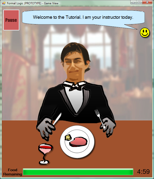
- To provide instruction, we implemented an additional "tutorial" game mode, which is a linear gameplay mode that walks the user through how to play the game, and what different symbols or user actions (ex. mouse clicks) in the game represented in real life. The tutorial introduces each element of the game, such as the eating process, correcting slouching or passing items, step-by-step, with icons indicating when and where a user should click to initiate the next action. This also serves to better explain what is going on in-game, so that the user will recognize the game less as mindless clicking and more as a set of procedures for eating food, and maintaining good dining etiquette.
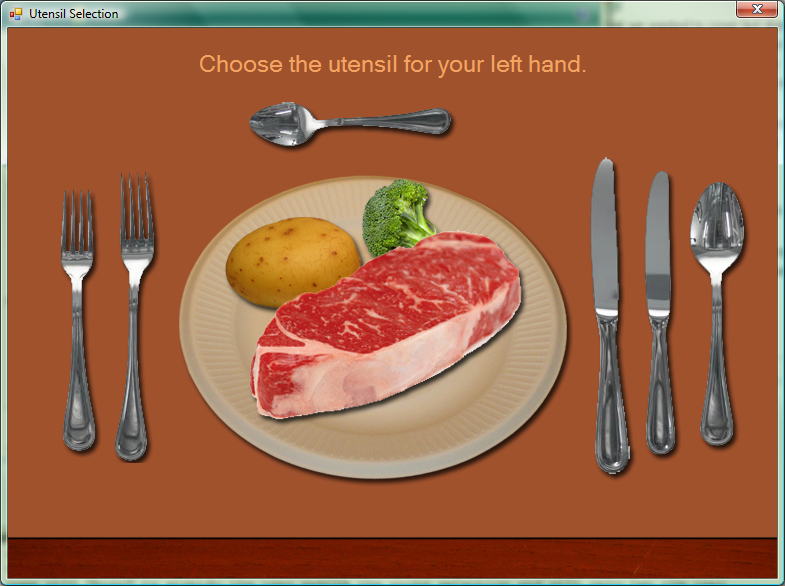
- We added a new stage in the game for selecting utensils, which was an important area of dining etiquette that we wanted to cover but didn't have time to in the interactive prototype. In this stage, the user is presented with a first-person view of their dining table, including the food they are currently eating and a set of utensils. Here they must identify the appropriate utensil to use for the type of food, and if more than one utensil is required, which utensil goes into which hand. The game will "buzz" to signify the user making the wrong selection and will only let the user progress to the eating stage after they have equipped the correct utensil in each hand.
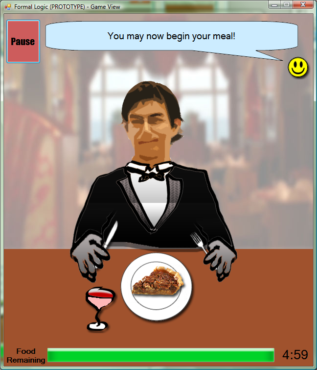
- To add variety and break up the monotony of the eating process for the steak meal, two additional meal types - salad and pie - were added. Gameplay-wise there is not too much difference - obstacles/distractions are still the same, though there is a different utensil selection for the type of food.
We also made a couple of minor changes to the program:
- Frequency of the obstacles such as slouching or passing food has been lowered. This was mostly an issue with our first prototype, which would pop up obstacles far more frequently than was realistic.
- Reversal of utensil-usage interface. Rather than the right-click utilizing the left-hand utensil (which is on the left of the screen) and vice versa, the right-click now utilizes the tool on the right hand (left side), and the left-click not utilizes the utensil on the left hand (right side of screen). This change was made in response to some users' confusion over which mouse click corresponded with which hand.
Method (10 points)
Participant (who -- demographics -- and how were they selected) (1 paragraph)
My participant is a 19-year-old UC Berkeley undergraduate male student named Alfred. Alfred is an undeclared major tending towards Nutritional Science, intending to eventually get into optometry. While not exactly a "hardcore gamer", Alfred plays a moderate amount of games (particularly first person shooters) and is fairly familiar with many of them, as well as the variety of mini-games that can often be found online. Alfred eats out on a regular basis, but seldom at higher-end restaurants like those addressed in the program.
Alfred was chosen at random out of people who were conveniently in my apartment.
Apparatus (describe the equipment you used and where) (1 paragraph)
The user was sitting at his desk in his apartment. We used the user's own computer to run and test the program. The program was started in the midst of the user doing general internet browsing, which matches the environments where the program would most typically be played (at home as users are looking for mini-games as distractions).
The user mostly controlled the game using a conventional wired optical mouse, rather than the laptop's trackpad.
I used a digital camera to record a video of the user. This also served as the timer for recording how long the user took at certain tasks. Aside from this, my notes were taken on plain pen and paper.
Tasks (1/2 page) [you should have this already from previous assignments, but you may wish to revise it] describe each task and what you looked for when those tasks were performed
Given the new features implemented since our original prototype, I revised our original tasks considerably.
Easy: Find, play through the tutorial
Task summary: In the latest version of the game, a "Tutorial Mode" is provided to introduce new users to the control scheme for the game, and also the mechanics of the gameplay. The task here is to simply start up the tutorial, and follow the tutorial's instructions to conclusion.
This task should be very simple - the user should be able to clearly follow the step-by-step instructions displayed. Any type of error (clicking the wrong area, for instance) or confusion on the part of the user would indicate a very serious problem, since the tutorial is designed to completely demonstrate the interface correctly.
Medium: Choosing the correct utensil
Task summary: Prior to the eating stage of the game, the user is presented with a set of utensils and must choose the correct utensil for each hand before starting the meal. A first person view is provided, and the user will first click on a utensil to select it for the left hand, and then click to select the utensil to be used on the right hand.
The design goal here would be to make sure that the user is aware of the current state and what choices they've made. It is OK for the user to choose the wrong set of utensils (the user is meant to learn the correct ones through this game, after all), but it should be clear to the user what utensil they've selected for which hand, and whether their choice is correct or not.
Hard: Successfully complete meal while dealing with environmental challenges
Task summary: The hard task remains the same as in our original design, which is to successfully complete a meal in its entirety while handling the obstacles that pop up to slow down the user.
The hard task is similar to the tutorial used in the easy task - essentially it puts all of the skills learned in the tutorial to use, except this time without a step-by-step walkthrough. Obstacles the user will face and must handle (all of which are covered in the tutorial):
Passing items
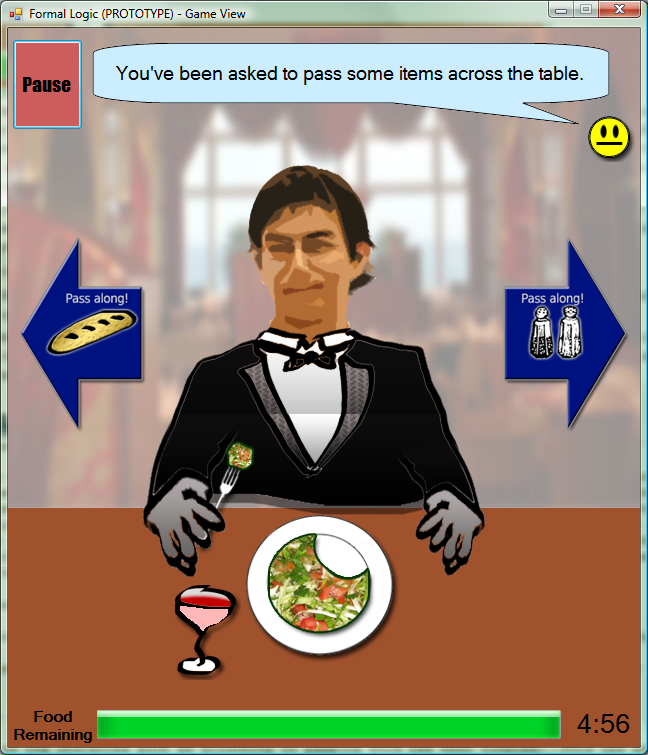
Guests at the dinner table often pass items such as condiments or bread around the perimeter of a table to get to the target - thus dinner guests should be aware of things that are being passed around and do their part by passing things on.
In the game, this appears as items on the sides of the table (for example a load of bread, or a salt shaker), with arrows indicating where they should be passed to. To pass the items along, the user simply needs to click on the arrows.
Ideally, the items should appear very prominently at the sides of the table and should be noticed by the user and reacted to as quickly as possible.
Posture
During the game, the user's in-game character will begin to develop a poor posture (slouch). The user will need to notice this (if the posture becomes very bad, the "instructor" may pop-up a dialog to tell the user explicitly) and correct the posture.
The control scheme for correcting posture is as follows:
- User mouses over the in-game character's body. The cursor should change from the utensil icon used on the table to a "finger pointing hand" icon that indicates a click is possible.
- The user can click any part of the character's body to fix the posture.
- The instructor will indicate his approval if the player fixes the posture and continue nagging if the player does not.
Ideally, the user should be able to easily notice when the character is slouched, and be able to take action as soon as possible to correct the slouching by clicking on the character.
Eating Pace
Another aspect of good dining etiquette is eating food at a similar pace as the rest of the table. The game interface will feature a "progress bar" for the amount of food that the character has eaten. If the user eats too fast, the instructor will pop-up a dialog to tell the user to slow down. If the user eats too slowly, he will not finish his meal, which will result in a poor end rating.
The user may not know how to pace themself directly at first, which is OK and part of the learning process. After being chided by the instructor character for being too slow or too fast, however, the user should be able to develop a feel for the correct pace, and ideally would not encounter any more warnings from the instructor about pacing.
Procedure (1 page) describe what you did and how
I went to the user's apartment, and gave a greeting to introduce myself and also explain the project that I was working on, and the purpose behind this user test. After this I had the user sign the consent form to acknowledge that he was participating in a study of our program, and that his identity and responses would not be publicly disclosed.
Once this was done, I booted up the Formal Logic program, and proceeded to instruct the user to go through each of the three tasks, in order:
- Play through the tutorial
- Start a regular game and select the correct utensil in the utensil screen
- Play through the eating portion of the game
I encouraged the user to think aloud as he completed each of the tasks, although I myself gave no further feedback or responses.
I recorded a video and took notes down for my own record purposes to help with writing this Pilot Study. I noted any problem areas where the user encountered and became stuck at, and also used the video to count the number of clicks and time taken at particular tasks (especially the problem areas).
Afterwards I sat down to do a question and answer session with the user to ask what areas of the program worked well and what could be improved, as well as his thoughts on some potential improvement/changes to the program.
Test Measures (5 points)
Describe what you measured and why (1/2 page)
My main measurement was to look out for incidents where the user became stuck or confused, noting where it occurred, what they were doing before they got there, and what steps did the user take to try to dig themselves out of the situation. While there are many other metrics that can also tell how efficient the interface is, I think the first and foremost step in the interface design is to make sure there are no spots that really trap the user, since these situations contribute most with users' frustration (and adversely affects their willingness to keep playing/play gain).
I also recorded a video which I used to measure time taken for tasks (mainly to note any abnormally long times taken on a task), and also number of clicks (especially incorrect ones). Both mostly relate to finding incidents where the user became stuck or confused - with the problems that still exist with the interface, I don't think efficiency metrics like number of clicks to complete a task (without getting stuck) were as important.
In the Q&A session with the user afterwards, I generally asked about parts of the program interface that were good and bad, and focused especially on the parts they thought were bad. I asked about their thought process once they got stuck into the situation, and how they proceeded through the steps that got them out of it.
Results (10 points)
- Results of the tests (1 page)
Task 1: Tutorial
Time to complete tutorial: 2 minutes, 31 seconds
The user initially thought the interface would be keyboard-based, but switched his hand to the mouse about 23 seconds into the tutorial.
The user erroneously attempted to click on the food and progress bar 3 times during the phase of the tutorial when the instructor is explaining the purposes of each. During this time the user also moused around the screen, looking for something to click.
Once the instructions came on to describe the eating process step-by-step, the user was able to follow the instructions very easily without error.
In the next screens that displayed the salad and pie, the user erroneously attempted to click these.
Subsequently the instructor introduced the passing items obstacle and slouching obstacles. The user responded quickly to both, correctly clicking the items or body within a couple of seconds.
The user was able to pause and then continue the game without problem. There is no dialog after pressing the Pause button telling the user to continue, but the user naturally assumed this.
Task 2: Choosing a utensil
- Time to complete (with salad): 19 seconds
- Time to complete (with steak): 8 seconds
- Time to complete (with pie): 8 seconds
In the first run, the user initially traced the text instructions with the mouse cursor (reading the text), then proceeded to try to select a utensil. The user's first choice (the larger fork) was incorrect, but the user was able to select the correct answer (smaller fork) about 5 seconds later.
The user chose the correct utensils for the stages with steak and pie and did not seem to have any difficulty.
Task 3: eating a meal with obstacles
- Time to complete (with salad): 31 seconds
- Time to complete (with steak): 1 minute, 3 seconds
- Time to complete (with pie): 1 minute, 27 seconds
The user completed the first meal with the salad without issue - the user was able to efficiently click through the eating process, but also noticed and correctly responded to obstacles (quickly clicked two passing items, and waited when the "pacing too fast" warning appeared).
When eating the steak, the user had a minor slip-up. After cutting the steak into a piece, the user started to mouse up to the mouth to consume the food, but then remembered he needed to pick up the food with the fork first. The user had no further problems with this meal, and was able to respond to all obstacles timely.
The user struggled a lot of the the last stage, eating a pie. The user's issues were mainly related to picking up a piece of pie to consume it.
After successfully cutting the pie with the first click, the user spent the next 32 seconds and 8 erroneous clicks attempting to figure out how to pick up the food and eat it. At first the user attempted to click on the pie to pick it up (3 clicks), then attempted to click (1 click) the user's face (presumably to eat, though nothing was on the fork), then attempted to pick up the food again (2 clicks) before clicking the face again (1 click). The last thing the user tried was to click on the fork hand, before going back to the food and this time successfully picking it up. The error was caused by the user not precisely clicking the cut-out pie piece.
After figuring out how to pick up the pie piece, the user was able to successfully finish the rest of the meal without error.
Discussion (15 points)
- What you learned from the pilot run (1 page) what you might change for the "real" experiment? what you might change in your interface from these results alone? If you'd like, you may include results and assumptions from other group members' tests here as well.
An issue that I didn't think to test, but could have, would be to run the user through the tasks multiple times. The user did encounter some errors, but in the case of the utensil selection, for example, the errors that were apparent in the first run-through seemed to disappear in subsequent run-throughs (thus 19 seconds for the first utensil selection vs. only 8 seconds for the subsequent ones).
Conversely, for the third task, eating a meal with obstacles, the first stage with the salad seemed very easy for the user, but subsequently that user struggled and became very stuck at stage 3, which took him nearly 3 times as long to complete.
Ideas for improvement to the interface (specifically addressing problems encountered):
- The user seemed somewhat confused about the exact state of the tutorial at any given moment. The user began clicking on objects that couldn't be clicked just yet, and initially started hovering around looking for something to click. Rather than having a set timing for each of the dialogs, it would be a good idea to provide a "next" button for the user to manually advance to the next step, so that users could go through the tutorial at their own pace. A "previous" button would also make sense, for users who want to go back a step.
- Currently, a blinking arrow is used in the tutorial to denote things that the user should pay attention to, and also things that can be clicked. This confused the user, who initially tried to click the food and progress bar when they were simply being pointed out in the beginning. The indicators for these should be different, and ideally should indicate the action (perhaps an eyeball for things the user should pay attention to, and a hand/finger for things the user should click? Or keep the arrow for things to pay attention to, and highlight/blink objects that should be clicked).
- My user did not have issues with the left-click/right-click control scheme after the tutorial, but this seems somewhat of a byproduct of taking the game very slowly, and in casual play-testing the scheme has at times been confusing, since the right-click corresponds to the utensil on the opposite side of the screen, and vice versa. Some ideas for changes to the interface (assuming that the original scheme of left-click=left-side utensil is deemed no better) would be a circular pop-out menu or right-click menu that simply displayed buttons for what could be done to the object clicked. This would require two clicks per action, but would significantly shift the interface to one based on recognition, rather than recall (the left-click/right-click control scheme could not be guessed without playing through the tutorial to explain it).
- The user reported the utensil selection seemed more like a guessing game. While this is somewhat the intent at first, afterwards the user simply falls into the step of memorizing which utensils matched with which foods. To improve the educational element, further feedback could be provided to explain exactly what kind of utensil each one is, and if a user chooses the incorrect one, explain why it is the incorrect choice. Another idea may be to simply allow the user to select and use the incorrect utensil, but have in-game penalties for pacing or the score.
- The user became stuck at picking up the piece of pie, which is understandable as the pie piece appears directly over the rest of the pie, making it difficult to pick out and click on. The pie piece should be moved onto an area of the plate distinctly separate from the rest of the pie.
- The user did not receive a good sense of how well he did, which is partially due to the Spartan feedback given at the end, which only gives a completion time and "rank". A feature that really should be implemented is a point system (as the rankings are somewhat unclear since they use less than common words like "Ruffian" or "Connoisseur" ), which can also report back to the user any mistakes they made with regards to the obstacles (pacing, posture, passing items).
- The user did not encounter this problem, but another still-missing feature is accessible help documentation. The tutorial is a passable resource for showing users how to play the game, although it is not quite as efficient for an experienced user who only wants to look up a single part rather than playing through the whole tutorial. The bigger issue is having help readily available - it would be OK for the tutorial to serve as help, but if that is the case then the user should be able to access it (say from the Pause menu) without having to quite the game.


