LoFi-Group:TBD
From CS 160 Fall 2008
Contents |
Team Members
- Kumar Garapaty wrote the introduction and mission statement and the discussion. He played the role of the Observerduring the interview/testing session.
- Cynthia Hsu wrote the task descriptions and described the procedure. She played the role of the Computer during the interview/testing session.
- Paul Im wrote the prototype description in collaboration with Shyam. He played the role of an Observer during the interview/testing session.
- Shyam Vijayakumar wrote the prototype description in collaboration with Paul. He played the role of the Greeter and the Facilitator during the interview/testing session.
- Wenda Zhao described the participants, the environment, and the task measures. He played the role of an Observer during the interview/testing session.
All members participated in the low-fidelity prototype design and helped summarize the results.
Introduction and Mission statement
The purpose of our project is to lower the gasoline usage for a user through the use of an avatar to motivate the individual to drive more efficiently and lower the amount of their driving as well as seek other modes of transportation such as carpooling to reduce their gasoline usage. Our mission statement is to improve individual energy consumption in a car. The system is a low fidelity prototype of our gasoline usage application, which we will use to test on various subjects to understand the various design flaws that exist within our prototype so that we won't run into the same design flaws in the high fidelity prototype. All of us were involved in building the low fidelity prototype. We split the various parts of the prototype and each individual completed a specific part. Then we came back together and evaluated the whole low fidelity prototype. In the experiments, Cynthia performed the function of computer, Shyam performed the funciton of facilitator, Paul performed the function of greeter and observer, Wenda performed the function of observer, and Kumar performed the function of observer as well.
Prototype description
For our application, we assume that every cell phone has the following basic keypad inputs:
- two SELECT buttons located directly below the screen
- TALK button
- END button (this button will quit the application at any time)
- arrow keypad (up/down/left/right buttons) with an OK button in the middle
- basic numerical keypad
Character Setup
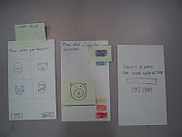
The first time a user opens our application, they will go through three basic setup procedures. The first is to select the type of character they wish to play, the second is to choose the color of their character, and lastly is to name their character. The user will select their character type and character color using the arrow keypad. The name of the character will be inputted using your standard numerical keypad. Also, in each of the screens, the user will have the option to press OK to advance to the next screen, or to EXIT the entire applications. As indicated, the OK and EXIT functionalities will be handled by the two SELECT buttons on the cellular phone.
Home Screen
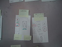
Once the character setup has been completed, the user can advance to the home screen. This will be the default startup screen once a character has been activated. The background will show the user’s character in its current state.
At the bottom of the Home Screen, there will be a MENU option as well as an EXIT option. These two options will be controlled by the two SELECT buttons. Pressing the EXIT button will exit the application. Pressing the MENU button will pop up a set of options that the user has access to. These options are: Review Data, Set Goal, Carpool, Shop, Your Items, and Options. The user can navigate through these options using the arrow keypad, and select their desired option with the OK button. Once this menu pops up however, the button that was previously ‘Menu’ now changes to ‘Quit Menu’. Not surprisingly, pressing this button brings the menu back down.
On a side note: in order to make navigation quicker and easier for the user, this ‘Menu’ button functionality will appear on every screen of our application. In addition, the ‘Exit’ button on this Home Screen changes to ‘Home’ on all other screens; the ‘Home’ button will allow the user to come back to this Home Screen.
At the top of the Home Screen, there will be a message indicating that the user should ‘Press OK to begin collecting data’. The OK button is the button in the middle of the arrow keys. Pressing this button before the user begins driving will start up the data collection process.
Set Goals
When the user is at the application home screen, he can go to the menu and choose the set goals option. A new screen will come up with information regarding goals that the user has set for himself and what he actually did. Specifically, it will let the user know how many miles the user has driven over the previous week. It will let the user know of the goal he had set for the previous week. It will also allow the user to set a goal for the current week. A picture of the character will also be displayed, which will let the user know how his character has changed based on his driving habits.
Collect Data
All of the data will be collected as a background process. This means that the user will be able to use his cell phone as normal with the data collection happening in the background. Once a user selects OK from the application’s home screen to begin collecting data, the screen will revert back to the user’s original default home screen for his cellular phone. However, there will be a message at the top of the screen indicating that the user should press the END button twice in order to stop the collection process. We have tried to make starting and stopping data collection as easy and convenient as possible for the user. Once the user is done driving and presses the END key twice, they are then directly taken to the Review Data page of our application.
Review Data
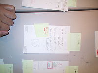
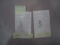
There are two screens in the Review Data section. The first screen displays the current route that the user just drove, and the second screen displays all the routes that have already been driven during the current week. The user can navigate through these screens using the left and right arrow keys. Both screens will have a map on the left side and statistics on the right. The box at the bottom will have a picture of the character’s facial expression.
On the current route screen, the map will display the user’s current route. On the weekly screen, the map will display all the routes for the week. Both maps will have color coded information regarding when a gasoline-wasting action was made. These gasoline-wasting actions will be numbered off by location. In order to see the statistics at a specific location, the user simply has to press the corresponding number on their numerical keypad. This will then populate the statistics box on the right side of the screen. The statistics box will have the following information: Your Acceleration, Ideal Acceleration, Your Speed, and Ideal Speed. The statistics box will allow the user to see whether they accelerated too quickly or they were simply driving too fast. Also, depending on how badly the user violated the ideal acceleration or ideal speed, the character’s facial expression at the bottom of the screen will change.
The main difference between the ‘Current Route’ screen and the ‘This Week’ screen is that there are only five locations to choose from on the current week’s map. These five locations are the top five danger areas that the user had wasted gas during the current week.
Carpooling
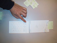
From the menu, the user can choose the carpooling option. Once that has been chosen, a screen appears where the user can input new routes or modify routes that he has taken. Specifically, a column will appear on the far left of the screen with a list of routes (Route A, Route B, etc). To the right of that, taking up a majority of the screen, will be a map with the inputted routes drawn out. From this list of routes, the user can scroll up or down to either input a new route or modify an already existing one. Suppose the user decides to input a new route. She will pick one of the empty slots in the list by scrolling to that part of the list and pressing the OK button on his cell phone. Once the user has done this, a new screen appears where the user can input various information pertaining to the routes and decide to explore his carpooling options for that route. Specifically, this new screen will contain four text fields. They are labeled "Start", "End", "Time", and "Day" from top to bottom. The user can scroll through these text fields with the cell phone's arrow keys. Once at a text field, the user can input the appropriate information. The "Time" and "Day" text fields have a list of options that the user can choose from. The user cannot input his own information for these two text fields.
Below these text fields, there are to buttons that the user can choose. On the left, there is a button labeled "Carpool With Route". On the right, there is a button labeled "Back to Routes". The user can again user the cell phone's arrow keys to arrive at the buttons and press OK to choose whichever button. If the user chooses the "Back to Routes" option, he can go back to the previous screen with the map of routes. If the user chooses the "Carpool With Route" option, a new screen appears which will let the user choose who he wants to carpool with. Specifically, on the right side of the screen, there is a column which contains a list of names. These are the names of the user's contacts who have the most similar route to the route that he has chosen to carpool with. This list is ranked based on the similarity of the route that the user has chosen. The top three names on the list are highlighted with different colors. At the bottom of this list, there is a "Back" button that the user can choose if he wants to go back to the previous screen. To the left of this column, there is a map of routes. Each route on the map is colored. The color of a specific route in the map corresponds to the color that the names on the list are highlighted with. Only the top three user's contacts who have the most similar route to the user will appear on the map. The user can again use the cell phone's arrow keys to scroll up and down the list of names. Once the user presses OK when at a certain contact name, another screen will appear, which will allow the user to actually set up the carpooling session.
This screen has a "Call" button, "Request Carpool Confirmation" button, and a "Back" button. If the user chooses the "Back" button, he will go back to the previous screen to the list of contacts. If the user chooses the "Call" button, the phone will make a call to the contact the user has chosen to carpool with. This will let the user talk to the other user who is using the same application and decide whether they actually want to carpool together. Once the call has ended, the user will go back to the screen with the "Call" button. At this point, the user has to choose the "Request Carpool Confirmation" button. This will result in another phone call to an automated service, which will ask the user to confirm that he wants to carpool with the chosen contact. The user will have to press 1 to confirm and press 0 to cancel. This will happen with the other user as well. Once both users have confirmed the carpooling session, they will be directed back to the collecting data screen. Once both users are in the same car, they can start collecting data as they would normally and the system will know that both users are carpooling.
Customize Character (Shop/Your Items)
There are two steps that must be taken in order to customize your character. The first is to buy items at the shop and the second is to equip them onto your character (in the Your Items screen).
The Shop is where a user can go to spend his hard-earned money on his character. The user’s current amount of cash is displayed at the top-left of the screen. Item genres are also located on the left, and the actual items for each genre (along with their corresponding prices), will populate on the right side of the screen. Directly underneath these items will be the user’s character. As the user scrolls through the available items, the character will model what it would look like if the item were to be equipped. The user can then decide whether or not he wishes to purchase this item. Three events will occur as a result of purchasing an item. 1. The user’s money will decrease by however much the item was worth. 2. The item will disappear from the shop screen. 3. The item will appear in the user’s inventory. If the user does not have enough money to purchase a certain item, a pop-up will be displayed indicating ‘Not Enough Funds’.
After purchasing items from the shop, the user can equip them on his character by going to the ‘Your Items’ screen. This screen will display all of the user’s current items on the left side, and their character on the right. Similar to the store screen, the character will change as the user scrolls through his inventory. However, a user can now equip an item by pressing the OK button. Once an item has been equipped, the user will see the word ‘Equipped’ at the top of the picture of the item. All the items that a user equips will be carried on to the Home Screen of the application.
Options
From the menu, the user can choose the "Options" button. This will result in a new screen which will enable the user to reset the game. Specifically, this screen will a "Save Image" button and a "Reset" button. If the user chooses the "Save Image" button, a popup on the same screen will prompt the user to type in the name of the image that he wants to save it as. The game will then save the image of the user's character to the location where all the other user's images are. This will enable the user to perhaps set that image as his wallpaper through his own cell phone's functionality. The "Reset" button will result in erasing all character related information in the system and allow the user to start over on a new character. Once the user chooses this button, a popup will appear on the same screen which will ask the user if he is sure that he wants to reset the game. If the user presses OK, then the game will be reset and the game will go back to the character setup screen.
Full Prototype
Method
12 pts, Describe the participants in the experiment and how they were selected. Also describe the testing environment and how the prototype and any other equipment were set up. Describe some details of your testing procedure. This should include the roles of each member of the team. To prepare for the experiment, you should assign team members to the different tasks (i.e., greeter, computer, facilitator, observer, etc.) and practice with someone playing the participant. The test measures detail what you looked for or measured during the experiment. You should concentrate on process data (i.e., what is happening in the big picture) in addition to bottom-line data (i.e., time or number of errors).
Participants
All of our participants are Berkeley students from different majors. Their are all around twenties. Two of them are guys and one is a girl. They are all randomly picked from moffit library. We generally asked anyone who passed by our table and asked them if they want to participant our low-fi prototype evaluation. Most of them were happy to participant.
Environment
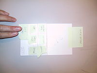
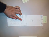
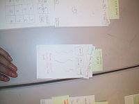
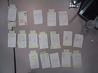
We interviewed the first participant in a study room of Main Stack and we interviewed the other two participants on the first floor of Moffit library. We got a big table in both places. The way we were setting up the interview were very similar. We asked the interviewee to sit in front of the table. And the person who played the computer role were sitting on the right side of the interviewee. He/She used a laptop as a screen to hide all the prototype index cards. The computer role would only bring out another index card if the user clicked on something that it was suppose to go to another menu. The facilitator stand on the left side of the user to communicate with the user. And all the observers stand behind the user.
Tasks
The primary tasks associated with our game are as follows: (1) selecting a character (2) setting goals, (3) collecting data, (4) reviewing data, (5) demonstrating good driving behavior, (6) carpooling, and (7) customizing the character.
Although we were only asked to test the user with three benchmark tasks, we felt that the diversity of features implemented in our low fidelity prototype required more than three tasks to be tested.
Demonstration Task – Setting Goals
Setting goals was selected as our demonstration task for two reasons. First, although we listed this as a moderately difficult task, this was largely based on the fact that the user would have difficulty setting both effective and realistic goals; the user interface required for it is actually rather simple. Secondly, setting driving goals and meeting them is central to the purpose of our serious game, so we hoped that by introducing this as our demonstration task it would help the user better understand the context in which other game elements were used.
Easy Task – Character Set-up
The character set-up should be fairly intuitive, as it is the first menu that appears when the game is played for the first time or after the character dies or is reset. The user uses the arrow keys to navigate through the different types of characters he or she can choose from, then colors, and then uses the keypad to name his or her character. Each screen shows up sequentially after data has been inputted to the previous screen.
Easy Task - Collecting/Reviewing Data
Collecting data is a task to be performed shortly before the user begins to drive. It involves pressing [OK] from the main screen. This jumps to the normal home screen of the phone, with a small bar at the top showing, "Currently collecting data. Press [END]x2 to stop." This allows the data collection to run in the background, leaving the phone free for other functions. Following this, the user is shown the "Review Data" screen in the game. The level of interaction required for this task was deliberately set to be minimal, as users may often be in a rush during this phase of the game. We felt it important to test this aspect of the user interface first to ascertain whether it was as straightforward as the designers assumed, and secondly because it is a crucial, though easy, in-game task.
Originally, reviewing data was considered a separate task. However, our user interface is designed such that there are two ways to review the data - the user can choose to review the data either following data collection, at the conclusion of their drive, or to return to the game (and the review data screen) at a later time at his or her leisure. Because ending data collection would jump to the review data screen, the interview seemed to run much more smoothly if we allowed the interviewee to examine the collected data immediately after it was collected, instead of asking them to exit the device and return to the review data screen at a separate time.
Moderate Task – Character Customization
Items can be purchased from the store using "cash" acquired by minimizing acceleration. The store can be accessed from the main menu, where the amount of cash is visible in the upper left hand corner. The different types of items (hats, scarves, boots, etc.) can be accessed by scrolling through the menu using the up and down arrows, and the specific hat or scarf desired can be selected by scrolling left or right once a particular type of item has been selected.
These items are saved to the inventory. To dress the character, the interface is similar, but with only one level to the menu - hats are sorted linearly, one after the other, after which there are scarves, then boots. The user selects an accoutrement for his or her character by clicking [OK] once the cursor is over the desired item.
Difficult task – Carpooling
Of the difficult tasks, carpooling was the obvious choice, since the driving component of the game involves virtually no user interface (except for the collecting data aspect described above).
Carpooling consists of two phases. First, the user must determine with whom carpooling is ideal. The ideal procedure is to enter the carpool menu, select a route, and if the user chooses to do so, edit it. The routes uploaded by other users are then displayed in order of closest match, and the user (A) can select the name of the other user (B) of choice. This returns a new screen that allows the user to either call or request confirmation. Because the other user (B) has not yet been notified of user A’s intentions to carpool, the user should click “Call”. This results in a standard cell phone call.
Secondly, the user must be able to receive cash points associated with carpooling. To do so, he or she must go through the process of selecting a route described above, then the person with whom he or she would like to carpool with. Instead of clicking the “Call” button, however, the user must click “Request Carpool Confirmation”. The other user (B) will receive an automated voice message asking to confirm that they are indeed carpooling with user A by pressing 1. This helps prevent cheating and encourage carpooling through the Law of Reciprocity and the Law of Conformity, as both users must agree to carpool before any benefits can be reaped.
Although carpooling is considered a single in-game task, the two distinct phases needed to complete the carpooling task required the facilitator to moderate the transitions. This is described in the Appendix.
Procedure
Prior to interviewing, the computer and facilitator rehearsed their roles, with each of the observers playing the role of the interviewee. The facilitator would practice reciting the script, and prefacing each step, while the computer would experiment with the best method of organizing the paper screens and make minor modifications to the prototype to increase the level of interactivity. Once operation of the computer ran smoothly, interviews with real subjects began.
As described in lecture and the reading (“Prototyping for Tiny Fingers,” by Marc Rettig), the procedure began with the greeter/facilitator expressing thanks for their willingness to participate, then giving the interviewee the context for the experiment. The user was then asked to sign a consent form, after which the goal of our serious game design was described in greater detail.
This was followed by the demonstration task, in which the facilitator instructed the user on an elementary task in the game, setting up driving goals for the week. This allowed the facilitator to provide a context in which the rest of the game tasks could be described.
Each task was verbally prefaced with a brief description of why a user would want to do it (in essence, describing the storyboard such that the interviewee would understand what he or she would be doing when he or she chose to do a particular task). The user was asked to navigate through the different menus using the keys on the cellphone. At each screen, the facilitator would ask the user to pause and remind him or her to verbalize their thoughts and opinions about that particular screen. The facilitator refrained from asking questions about erroneous uses of the interface until after the interviewee had finished each task. In some cases, when certain features of our user interface were left unexplored, the facilitator would lead the user, asking them if they noticed anything in particular about the user interface or why certain features (i.e., red on a map) were labeled in a certain way.
As described in lecture and in the Rettig text, the observers did not talk, and the computer only spoke to make brief comments to explain certain aspects of the low-fidelity prototype that may be hard to understand (“These boxes are editable text-fields”). One observer was assigned primarily to the task of recording the task measures (such as timing the tasks and noting the number of errors made), though high level observations were made by this observer as well. The others focused on high level details of the performance.
Test Measures
During the whole interview process, we generally measured two things. These were the time it takes user to complete the each task (representing the amount of hesitation the user expressed) and the number of errors each task users made (defined as when the user selected an inappropriate button). We believed that these stats will give us some useful feedback on the application. It will also help us to identify the shortcomings of our application.
Results
Task Measures for each Task
(s = seconds, e = errors for the task):
User 1
- Create Char: 50s/0e
- Collecting Data: 25s/0e
- Reviewing Data: 84s/0e
- Carpooling: 240s/0e
- Customizing/Shopping: 140s/0e
User 2
- Create Char: 45s/0e
- Collecting Data: 20s/0e
- Reviewing Data: 140s/1e
- Carpooling: 310s/0e
- Customizing/Shopping: 210s/0e
User 3
- Create Char: 55s/0e
- Collecting Data: 21s/0e
- Reviewing Data: 220s/1e
- Carpooling: 200s/0e
- Customizing/Shopping: 423s/2e
Character Set Up
User 1
No complaints
User 2
- The characters are too cute (1).
User 3
No complaints
Collecting/Reviewing Data
User 1
- End collecting data by clicking twice was a little confusing (3).
- Too much text (2).
- Make font colors for the numbers different from the text (2).
User 2
- Have a clear boundary between "Now collecting data bar" (2).
- Put character at the top of the screen instead of the bottom (3).
- Info on the map is not that clear (3).
- No users went to other numbers (4).
- No users thought to go to current week's data (4).
User 3
- Was confused about the map and what the map meant (3).
Character Customization
User 1
- "Your items" vs. "My items" (2).
- Buying items does not return feedback as to whether or not you buy something (3).
User 2
- Specify "Your money", instead of just having a number(2).
- Removing/De-equipping character was very unclear (3).
User 3
- Went to Options first for character customizing (3).
- Was looking for "Back" instead of "Menu" (3).
- Tried to reset her character as customization (4).
Carpooling
User 1
- Should have feedback saying that the option has been saved (1).
- Start collecting data - should differentiate between collecting data for carpool and collecting data for individuals (4).
- Did not understood ranking (3).
- Call, request confirmation should be an ordered process because many people chose to go to request confirmation before calling (5).
- Differentiation between driving, carpooling (2).
User 2
- Did not understood ranking (3).
- Call, request confirmation should be an ordered process because many people chose to go to request confirmation before calling (5).
- Differentiation between driving, carpooling (2).
User 3
- Did not understood ranking (3).
- Call, request confirmation should be an ordered process because many people chose to go to request confirmation before calling (5).
- Differentiation between driving, carpooling (2).
Discussion
We learned several things about the way we are performing our tasks through the testing sessions of our low fidelity prototype.
The shop and item task was probably the most confusing task to the user. When they first selected shop and they clicked on something to buy it and preview it, there was not enough feedback letting the individual know that they actually bought the item. The fact that the wearing of these items was a separate option also confused the subjects. Perhaps we can create one option to integrate both shopping and wearing the items bought to reduce the confusion and give additional feedback letting them know when they bought it and when they are wearing it. Also, the lack of continuous visibility of the avatar made it difficult for the subject to really try to relate to the avatar, and this might be an issue of the low fidelity prototype where the avatar is not dynamic/lively.
Carpooling was probably our most complicated task and required the most attention from the subject. When clicking one of the available routes and going to it to save or edit, there is not enough feedback showing that you have actually accomplished this editing or saving. The personal routes could also have been confused with the routes of friends and this can be clarified with better labeling. The subjects didn't really understand the ranking system of the carpooling system, where the highest person on the list matches on the highest number of streets with your route, until they were really aided by the facilitator. Another major lesson from the experiment was that we have to find a way to effectively confirm that two individuals are carpooling, better than the current system where the calling to the individual and the press 1 to confirm are on the same screen. Separate screens or separate options on the main screen could solve this situation.
There was a great deal of confusion with the collecting data bar and what is actually going on with that bar. This may have been the fault of low fidelity prototype, that the users couldn't see that collecting bar was actually running in the background. We also saw that the subjects don't really like to read too much, and usually tend to act upon instinct. For example, to stop they had to click it twice but they didn't because they assumed they had to click it only once. The data given that was under review was way too much and we have to find ways to condense this data. The picture of the avatar was at the bottom putting more emphasis on the text for the review data, but perhaps this is the wrong approach and the avatar should be on top. The maps confused all the subjects and this could be the fault of the low fidelity prototype and incorrect labeling.
In addition to all of this, we learned the advantages and disadvantages of having a low fidelity prototype. The combination of the prototype not being dynamic and the computer being slow meant there was some level of confusion during the testing session. The main advantage was that it revealed some serious design flaws before actually implementing it. For example, a revision of the way we implement of our shop/item tasks is going to be extremely important for us. Well things that the experiment could not reveal whether how this would actually affect an individual in the long term. Whether the game would be interesting enough to play for the long term, so that they can continuously try to improve themselves.
Appendices
Raw Data/Observations
Consent Forms
Image:TBDConsent1.pdf Image:TBDConsent2.pdf Image:TBDConsent3.pdf
