LoFi-Group:Lucky Seven
From CS 160 Fall 2008
Contents |
Group Members, contributions
The roles of each team member for this assignment are as follows:
- Michael Boulos Was an observer in all three of our user tests, helped tabulate our results, worked on the Prototype section of writeup, helped compile the appendix, contributed to results discussion
- Yuta Morimoto Role of computer in user tests, worked on the Prototype section of writeup, helped compile the appendix, contributed to results discussion
- Antony Setiawan Switched off between Observer and Facilitator in tests, worked on method section of prototype, contributed to results discussion
- James Yeh – Switched off between Facilitator and Observer in tests, worked on Introduction/Mission Statement and Results sections of writeup, contributed to results discussion
Introduction and Mission Statement
The system being evaluated is a low-fidelity prototype of a serious game. Our target user group is students who are interested in eating healthy, and our game design is based on the popular genre of defense games, in which the goal of the game is to defend a “home base” from being attacked by external objects. Gameplay consists of defending a human body from being harmed by unhealthy foods by eliminating, through clicks of a mouse, foods that might contribute to an unhealthy diet. In addition, our user interface allows the players to change control settings, submit a high score, and a variety of other options. The rationale behind such a game is to involve the player in fun and interesting gameplay while still conveying to them our message of choosing a balanced diet. Defense games are popular and addictive, while many students are worried about gaining weight in college (aka the Freshman 15)—thus we chose to model our game in a way that would make healthy learning fun.
The experiment we are conducting is testing a low-fidelity prototype on our target users. In particular, we want them to achieve three tasks that we have decided would thoroughly test the different aspects of our interface. We will ask our user to attempt to achieve these tasks; and while they are in the middle of this process, we will not answer any questions they have. The results we obtain from this experiment will be used to improve our design.
Our mission statement, or goal, for this project is to provide an entertaining but informative tool for users to learn about creating a healthy diet. We want our users to not only become more familiar with regulating a balanced daily intake of nutrients, but also be able to look at foods and recognize if they contribute to a balanced and healthy diet or not. We plan to achieve our goal through our gameplay; our user will be exposed to many different foods in our game, and as he or she plays the game more, he will become more familiar to which selections of foods contribute to an ideal healthy diet. Gameplay is very important to our goal, as we want our players to have fun, so that they will play the game more often and therefore retain our message better.
Prototype
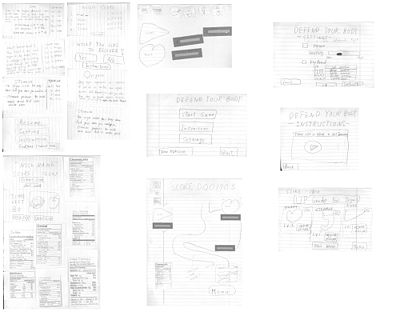
Our prototype consists of many screens drawn on paper. We will present each of the screens, and then provide a description for each image.
Over View
Main Menu
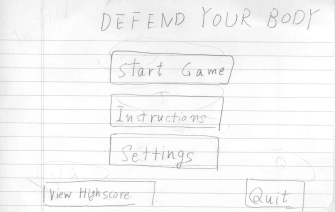
Any user starts from this screen. There are five buttons for user to proceed game. First of all, a user may not know about this game, so we need put the "Instruction” button. Second, this is a game, so a user wants to start game. Thus, we have to put the button of "Start :"Game", Furthermore, some users want or need to change the setting of game. So we put "Setting" button. An avid game player wants to know their score to compare other user. To meet the need, we prepare a function of score viewer which is realized by "View Score" button. Finally, since a user needs to quit this game, we must put the function of quit. To use this, the user can quit the game.
Settings Screen
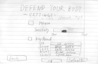
User who wants or needs to change setting of the game drops at this screen.
User can choose his/her input device by checking the check box next to the label of mouse and keyboard. The slider for the mouse sensitivity allows user to adjust mouse sensitivity.
The box next to the keyboard controllers when clicked can be edited for user’s preference control. The reset button allows the user to change the settings to the original settings.
The OK button allows user to confirm to change the setting what the user did..
The back button, because the user might want to change his/her mind after changing the settings and change it again. The back button will allow the user to go back to the main menu when s/he is sure that they want to go back.
Instructions Window
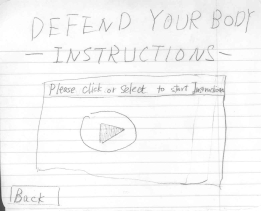
In Instructions window, there are some explanations. User can read them and see instruction movie. Since, a user who decides to play the game, may be stuck, so they are given the instruction movie.When we were building our prototype, we decided to have someone act out the instruction video when the user pressed play.
In-Game Window
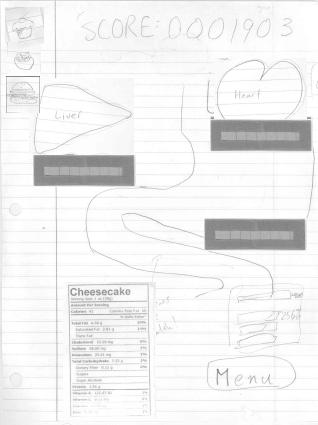
The gaming window consists of an image of the stomach and other major body organs. Each of the major body organs - heart, liver, and stomach - are cut out of a piece of paper and labeled. Under each organ, there will be a life gauge bar that we created by overlapping pieces of different colored construction contruction paper (see image). When the health goes to 0, the organ will die and lose its specific functionality in the game. If all organs die, the game is over.
Foods will enter through the top of the screen and go into the stomach. If the food is not eliminated while it is in the stomach, it will go through intestines, and eventually exit the intestines, damaging either of the three major organs. Also, whenever a new food enters stomach, the nutrition facts of the food will be added to the bottom left screen.
The Nutrition Goal information is nice and large, so that it is clearly visible to the user. On of the top left of the screen are the next three foods that are going to enter the body.
The menu button on screen, which allow the user to proceed to the pause window.
Pause Window
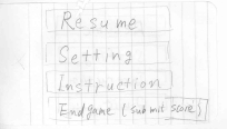
Pause window give user the four choices: 1- Resume 2- Settings 3- Instructions 4- Quit.
If user chooses the resume button, user is back to the windows before user visit this window.
If user chooses the setting button, user proceed setting window.
If user chooses the Instruction button, user proceed Instruction window.
If user chooses the quit button, game will be end.
Upgrade Screen
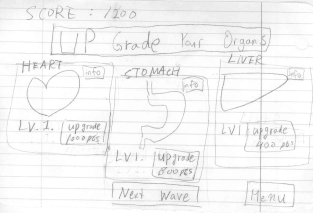
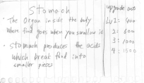
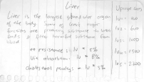
After we have tested our prototype with the users we found out that it was hard to understand the upgrade options and what was needed to upgrade to that organ, so we have changed the upgrade screen to include under each organ the points needed to upgrade that organ. And a button above the number of points, if they want to upgrade then they can press that which made it more concrete of how the upgrade process works. Also, there is an info button to the top right each organ. Clicking on any of the three info buttons will bring up a pop-up screen showing information about the organ:
Heart Pop up
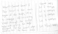
including it's in-game function, its function in reality, and and the upgrade costs for successive levels. Also if they click on the menu, it will prompt them with the menu screen, if they click on the next wave they will continue to play the game. So the user has the option to: 1)Upgrade Organs, 2)Continue Playing, and 3)See other Options (ie: Menu )
Submission of High Score

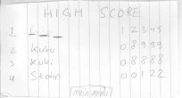
After the user has died they will be brought to a recover screen. We included an instructions button so that when clicked, it will provide information about how to recover. If the player clicks "no" on the recover screen, a new screen will pop up and ask him if he want to submit the high score; in this screen the user can choose to either submit a high score or dont submit and go back to the main menu. If they click the "submit score" button, they will be brought to the high score screen, where they can enter a three character nickname or initials. After they are done, they can click on "main menu" to go back to the main menu.
Nutrition facts

Nutrition facts show the nutrition information of food on the bottom left of screen of in-game windows. They describe the detail nutrition of food corresponding food icon passing through stomach. We used seven different foods to test our prototype. Out of the seven, only cereal was considered to contribute to a healthy diet - the user will supposed to figure this out by looking at the nutrition facts while playing the game.
Food icons
![]()
Food icon represents the food which is passing through the stomach and intestine. The seven food icons are paired correspondingly with the nutrition facts during gameplay. The user can remove the food icon by clicking on it three times while the food is passing through stomach. If food icon reaches the intestine, the user can not remove it and the nutrition facts of the food will be added to the wave (each wave corresponds to a day) total.
Method
Participants
Our team agreed to test our prototype against three participants. In order to get as much feedback as we can, we want to have two kinds of participants: the first type is people who have experience playing similar games and are interested in becoming healthier, while the second type is people who don't really have experience playing similar games and are also interested in becoming healthier. One main reason for choosing two different types of participants is so that we can evaluate how user-friendly our interfaces are for people who are not familiar with our interface, while in the other hand, getting more feedbacks from experienced player to improve our design. For that reason, our team decided to have one inexperienced player and two experienced players.Finding our target participants are done by randomly asking people around moffit library (because that's where we did our testing) and asking couple preliminary questions to eliminate non-target participants. If they fit the type of user we were looking for, we would then schedule the prototype testing with that person.
Environment
The environment that we set up for our testing session are as follows:
- A quiet place with a big table to set up our prototype. (we chose 1st floor on Moffit Library for our three sessions).
- Have two of our member acts as the computer and sits facing the participant (for better response time).
- One person sits beside the participants and acts as the facilitator.
- One person sits on the other side of the participants and acts as the observer.
Procedure
We based our testing procedure on the Prototyping for Tiny Fingers reading. More specifically, we split our group into the roles of facilitator, computer, and observer. Since we only have four members in our group, in this case the facilitator doubled as a greeter, so that we would have as many observers taking notes as possible. In addition, since one of our interface screens (the instruction screen) contained a video implementation of the instructions, we assigned one of the observers to enact the video in the case that our user decided to play it during testing. We shall call this extra role the “instruction giver” (which doubles as an observer). Our roles were assigned as follows (roles for the three tests are split by commas): James: Facilitator, Instruction giver, Facilitator Antony: Instruction giver, Facilitator, Instruction giver Yuta: Computer (for all three tests) Michael: Observer (for all three tests)
Before we began testing our users, we went through test runs to make sure that someone in the group would be able to understand how to operate the interface easily. We had each person in the group test out the interface (while someone else played computer), and only when we agreed that the menu switching system and other details went smoothly were we ready to test our prototype on real test users.
When we met with our test users, we greeted them warmly so that they would feel comfortable in the testing environment. Then, the facilitator would first introduce the background behind the test (i.e. explain the concept of a low-fi prototype, as well as explain the themes and goals of the cs160 class), and also elaborate on the purpose of the test, all the while asserting its confidentiality. After the user had a clear understanding of the circumstances of the test, the facilitator would explain and demonstrate how to use the interface we created, such as demoing a mock task (see appendix for demo script). Finally, we presented the user with the three tasks that we wanted them to accomplish, making sure they understood that any difficulty with achieving the tasks was not their fault, but rather a fault of the design.
Once the test was in session, the facilitator encouraged the user to express his or her thoughts, by asking questions such as, “What are you thinking right now?”, while the computer handled all the switching between menus. On the other hand, the observers were on the side watching for any critical incidents or anything that the user did well. After the test ended, we asked our user if he had any final comments or questions, also demonstrating any tasks that they were not able to achieve. Finally, when the user left, the observers shared their notes with the rest of the group and we all assessed the severity of each of our critical incidents, while coming with any changes/fixes to our interface that would solve the problems our test user had.
Test Measures
During all test sessions, we want to specifically focused on how well our test users perform tasks that are given to them. Hence, we assess variables such as the number of arising confusion and task completion time. These variables will help us to evaluate and even to improve our prototype design.
One of the main factor that affects the value of specified variables is familiarity. We believe that designing interface that are commonly used will boost the user's navigation and overall experience with the interfaces. For that reason, during the experiment, we have an observer records and measures the number of confusions and some unexpected behaviors that arises during the experiment. For example, if a users clicks on something and clicks the "back" button because the interface isn't the one that the user expects, we record that as a confusion that at the end of the experiment, we asked the user what confuses him/her. Each answer from the users will be recorded for evaluation puposes. Task completion time is then derived from the "confusion" variable and is used to show the overall effectiveness of the interaction between user and interfaces.
In addition to those variables, we also look for all feedback about our interface, which can be spontaneous or non-spontaneous. We believe that every reaction is important and is beneficial to improve our design. Therefore, we have the second observer observes carefully all kinds of reaction that the user makes during the experiment. The second observer in the end of each experiments also asks the user for any kind of feedback that the user have, be it positive feedback and negative feedback. All feedback is recorded and then is used to evaluate and improve our prototype design.
Tasks
Submitting Score [Easy]
Submitting score should be easy and pretty straightforward. There are two condition that has to be satisfied for a player to submit his/her score: either the player quits in the middle of the game or the player loses the game. If the player wants to quit in the middle of the game, the player will be given a choice to submit the score. Same screen are given to the player when he/she loses the game and decides not to continue the game. The actual process of submitting the score are done by typing the nickname/initial of the player and click submit button.
Upgrade the Organs [Moderate]
After each wave of foods, the player will be directed to an upgrade screen. Basically, this page contains the picture of organs that are upgradeable along with information and upgrade requirements for each of the upgradeable organ. Upgrading the organ is categorized as a moderate task because the player can't just upgrade whichever organ that is shown on the screen. The player has to thoroughly think about which organ to upgrade since the player can't undo the upgrade once it is done.
Playing the Game [Hard]
Playing the game is considered as the hardest task, as well as the main part of the game. Waves of foods is entering the body and follow the digestion path to the end of intestines. When a bad food passes through the intestines, some bad effect are applied to the body. The player needs to defend the body by eliminating all bad foods that goes into the body and let healthy foods get absorbed by intestines.
Results
Log of critical incidents and corresponding ratings in appendix #User Testing Notes
We started by interviewing a non-experienced player. So she had trouble with all the tasks that we asked her to do. This was partially due to our the usability problem in our design . Even though the instructions were clear not to eliminate the good food, the user eliminated everything, on the other hand the user let some of the food fall into the stomach to see if it will go through the intestines and see what happens out of curiosity. Even after the game has been played couple of times from the beginning, she also let the food pass through the intestines which hinted that the goal of having a healthy balanced diet was not met, or clearly understood by the player through the game or the the design. She also had trouble submitting the score, it was very confusing to her, because she expected that the quit button will quit the game without registering the current score.
On the other hand, she understood how to start playing the game, and knew how to go to the next wave after being prompted by the upgrade screen. She has also shown good perceptions of how to eliminate the foods, which was kind of obvious/natural to her as a non-experienced player.
The second interview was with an experienced player. The player started by going to the instructions menu and clicked on the video tutorial, this is when one of our team members showed the player how to play the game. After the video/instructions was over the player proceeded in playing the game. We noticed that he sometimes ignored the nutrition facts when he saw a familiar type of food thinking that he knew which items were healthy, unintentionally he eliminated a few healthy items when he ignored the nutrition facts. This was due to our bad judgement of presenting the nutrition facts. He always missed the info button on the upgrade screen, so he never knew how to upgrade correctly, so his technique was to upgrade any random organ without knowing the benefit of this upgrade.
This user also gave us some positive feedback about the interface, and about the initial screen. Also we noticed that he was able to understand and play the game effectively after watching the tutorial.
The third user was experienced player as well, so he gave us a lot of feedback, mostly on how to make the game more fun and interesting to the user to keep playing. The user wanted to see some goofy element in the game rather than a very serious task. The user expected something tragic to happen to the other organs once one organ dies. The reason behind this thought, is his belief that all the organs are connected, or correlated. The user went to change the settings of the game and when he clicked apply he wanted to go back to the main menu, but the game settings stayed still expecting him to click back. so he was confused and thought that the game menu doesn't work. He was also asked to submit the score in the middle of the game as a task, but he couldn't find the way to accomplish the task.
In looking through all of the interviews we have found that these problems were in common between all the users: the users ignored the nutrition facts due to its complexity and due to excessive display of information, the users had trouble submitting the scores in the middle of the game, and the users had trouble quitting the game.
Also we found out that the users were able to perform the following tasks without any problems or difficulties and were achieved by all of them: the users were able to start the game, the users were able to play the game, the users were able to survive couple waves and go to the next wave (ie: the next wave option was understandable), and the users were able to submit their scores after losing the game.
Discussion
Looking through the negative feedback, or from our observations, we decided to change multiple things.
1) The "pause" button in the game screen needed to be changed to a "menu" button, so that no confusion happens while looking at a way to exit the game. We also decided to add a "menu" button to the upgrade screen. In addition, we decided to rename the "quit" button in the menu pop-up screen to "exit (sumbit score)". This is because our test users had quite a bit of difficulty realizing they they either had to quit the game or lose the game to submit a high score. By making the "menu" button more accessible in both the gameplay and upgrade screens, and renaming "exit" to show the user that they will submit their highscore when they quit, our users should be able to figure out how to submit a high score more easily.
2) The stomach needs to be larger, since it is the only clickable area and the focus of the game. So we will emphasize on the stomach. Furthermore, based on the feedback from our test users, we felt it was not necessary to allow the users to click on the food while after it exited the stomach and entered the intestines. This way, we can show less of the intestines and more of the stomach; this makes the playable area of the gameplay screen larger.
3) The nutrition facts needs to be less cluttered, and to encourage the player to look at the nutrition facts we will reformulate the table as follows:
for example for the the current calorie count we will have a bar chart that is in blue and the new food coming into the stomach will be in red and will be added after the blue bar, if the food is passed the bar will become blue and the the next food will do the same, the goal is to reach the calorie count and not over shoot our calorie count, this will also be implemented for fat, cholesterol, carbohydrates, and proteins.

4) Instead of having to click the item multiple times to remove it, we need to find another way. So a new procedure is as follows: whenever the food comes in, when it is clicked it will break down into two smaller pieces. The smaller pieces might then break down into two even smaller pieces when clicked, etc. This would help increase the challenge and unpredictability of the game, since some of our test users had too easy of a time eliminating the food as it came in.
5) Since some of our users wer confused about what the functionalities of the organs were, iin the upgrade screen we will provide information displayed on the top right corner of the screen to explain to the user more about the organs. When the mouse has been hovered on that organ, detail information on organ is shown. Keeping the displayed info in the top right corner of the screen will ensure that the text does not block out any important buttons, or other text.
We learned from this experiment that while our design provided the basic functionalities of a serious game, our gameplay was too easy and upgrading organs and submitting a highscore could be confusing. Since it would be very time-consuming to include every facet of our gameplay in our low-fidelity prototype, we chose a simpler approach; however this imcomplete design sometimes either left our users confused, or the user would just not recognize certain aspects of our game at all (i.e. looking at the nutrition facts to determine whether or not to click the food). We felt that maybe if we emphasized certain parts of the gameplay in our instructions, the user would better understand the purpose of the game. Nevertheless, the design of our prototype still plays a large role determining what the user looks at, focuses on, and thinks about. Thus, even biased or skewed instructions would not be able to cover up a flawed design.
Because of time constraints, our lo-fi prototpe was generally more simplified than what we have envisioned for our actual game. Certain interactions in the gameplay had to be left out because the extra level of detail was not worth the time to implement them; as a result, users would not probably not have as much fun as they should have with our game. Thus, the "fun" factor of our design is hard to pinpoint with a lo-fi prototype. Another aspect that complicates the matter is that a tester only uses a lo-fi prototype once, whereas we want users to play our actual game over and over again. In other words, we cannot determine the replay value of our game with a prototype test. In addition to ambiguity about the attractiveness of our gameplay, it was hard to determine if our testers learned anything substantial from playing our game. Because we only saw them for a short window of time, we were not able to measure if our game affected their long-term eating habits, or how they felt about unhealthy foods. It would help if our testers could play the game more times and get more feedback about a healthy diet, but once again, a lo-fi prototype is only supposed to be tested by a person once.
Appendix
Consent form
Image:Lucky7 INFORMED CONSENT FORM.pdf
Demo Script
This experiment is for our CS160 User Interface class. The theme for this semester is to design a serious game, in which we go through the phases of brainstorming, selecting and interviewing a target user group, creating and testing a prototype, and finally building the entire product. We are currently in the phase of testing our low-fidelity, or paper prototype, and you have been selected as one the testers (whose identities will not be revealed). Based on your feedback, we will be able to make changes and improve upon our prototype to make our design more appealing.
Before you start this test, we want you to know that any difficulties or inconveniences you have with our prototype is not your fault, but the fault of our design. We will not be allowed to speak during the testing (as not to bias our testers), but feel free to voice your questions, thoughts, and suggestions while you are testing our prototype.
As you can see, the prototype we have designed is supposed to simulate a computer interface consisting of multiple screens, each with different buttons on them. During testing, you will be using a pen as a mouse. If you wish to click a button, hover your pen over the button and say “click”, and we will switch in the corresponding screen accordingly. Our interface is almost completely implemented, so you will have access to pretty much all the functionalities of the game.
The goal of our design is to see if our users can easily perform specific tasks. Thus, we will present you with three separate tasks that we want you to complete. We will present the tasks to you one at a time, and we want you to show us you know how to complete them by using our interface. Don’t feel bad if you are having trouble completing a task-that would be our fault for creating a poor design.
Any questions?
User Tasks
1: Play the game (hard) - show us you know how to play the game
2: Upgrade organs (moderate) - upgrade at least one of the body organs in the game
3: Submit your high score (easy) - submit your in-game high score
User Testing Notes
1st test user
Log of critical incidents (along with ratings):
- she clicked every food that entered the body
Rating:Major usability problem - this needs to be fixed
- she thought when she clicked “upgrade” on the upgrade screen, all the organs would be upgraded
Rating:Major usability problem - this needs to be fixed
- she didn’t know how to upgrade the organs (she didn’t understand how many points each upgrade cost)
Rating:Minor usability problem
- she doesn’t know how to submit a high score
Rating:Major usability problem - this needs to be fixed
- she randomly let foods pass through the body
Rating:Minor usability problem
Positive Occurences:
- she knows how to proceed to play the game
- she knows how to start the next wave from the upgrade screen
- she knew how to eliminate the foods from the stomach
2nd test user
Critical Indicents:
- The tester doesn't know how to submit the score in the middle of the game.
Rating: major usability problem - need to be fixed.
- Once the stomach dies, he basically gives up.
Rating: Not a usability problem
- The tester seldom take a look at nutrition facts
Rating: Major usability problem - need to be fixed.
- The tester said that the games is not that fun compared to other games, it's too serious.
Rating: major usability problem - need to be fixed.
- The tester missed the info button on upgrade screen.
Rating: cosmetic problem
- The tester gets confused by functions that each organ has.
Rating: Major usability problem - need to be fixed
- The tester wants some ingame on-the-fly tips.
Rating: minor usability problem
Positive Occurences:
- The user knows very well how to submit the score at after loses the game.
- The user able to eliminate the food in the first play.
- The user likes the interface of the main menu
- The user likes how the tutorial is presented
3rd test user
Critical Indicents:
- The tester only sees the upgrade info once then randomly upgrade the organs.
Rating: not a usability problem
- The tester clicks apply on the settings screen and he expects the screen to go back to the main screen.
Rating: Major usability problem - need to be fixed
- The tester wants goofy elements in the game.
Rating: cosmetic problem
- The tester wants funny food comes in
Rating: not a usability problem
- The tester thought the food got vomited instead of dissolved.
Rating: Major usability problem - need to be fixed.
- The tester only upgrades liver since it has more attributes.
Rating: minor usability problem.
- The tester expects some bad things happen when an organ dies.
Rating: Major usability problem - need to be fixed.
Positive Occurences:
- The tester looks on the nutrition fact and decide whether the food should be eliminated or not.
- The tester seems to navigate through interface without any problem.
- The tester likes the interface of the game screen.
- The player knows how to submit the score the game after he loses the game.
