LoFi-Group:!Xobile
From CS 160 Fall 2008
Contents |
Team
- Mu-Qing Jing
- Geoffrey Lee
- Perry Lee
- Shaharyar Muzaffar
- Bing Wang
Introduction and Mission Statement (6 pts) (1/4 page)
There is a significant problem in America when a large number of people do not prepare for retirement or put the majority of their liquid assets in simple checking or savings accounts. Not only do these funds generate very little in interest, but they might be outpaced by inflation. We believe that having a good sense of what each of these accounts provide is important for an individual to have a successful investment and retirement portfolios. Often times, people just listen to their advisers but do not really understand the benefits of these accounts. Therefore, in order to raise awareness regarding the different alternative investment accounts that are available that are more appropriate for retirement purposes, our solution will challenge the user to manage their own accounts to earn the most money over time.
The purpose (and mission) of our project is to raise working individuals' awareness of the different types of retirement options. Our game teaches players the larger picture rather than focusing on the specifics (e.g., what do you look for in a "good" stock?). In the course of our game, players are exposed to accounts they may not have previously been aware of (e.g., money market) and are taught the general trends, behaviors in terms of interest rates, volatility, and excitements, associated with each of these investment options. For example, whereas the interest rates are fairly low for a savings account (thereby resulting in slow growth), a savings account is not as volatile as investing in a stock, which can just as easily increase your money as decrease it.
After playing our game, working individual should feel more comfortable and knowledgeable of their options, and not feel confined to leaving their money in a savings account or in the stock market.
Perry
- Was the "greeter".
- Wrote the introduction and mission statement.
- Wrote the consent form.
- Gave feedback on the results and provided suggestions for improvement.
Bing
- Wrote the script.
- Demonstrated the system for the participant and observed.
- Finished up the method section of the deliverables.
Geoffrey
- Created the graphics for the low-fidelity prototype
- Was the "facilitator"
- Wrote the discussion section.
Shaharyar
- Was the "computer"
- Wrote the prototype section.
- Helped assemble prototype.
Mu-Qing
- Was the "observer"
- Took down notes of what the interviewees did and said.
- Wrote the results section.
Prototype (12 pts) (1-2 pages)
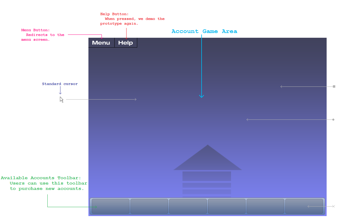
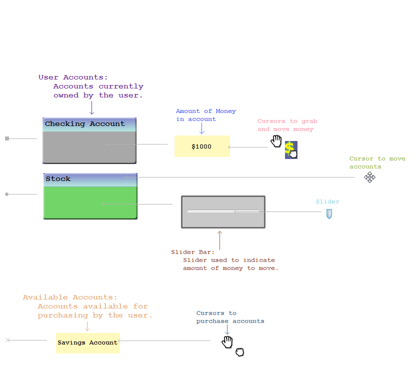
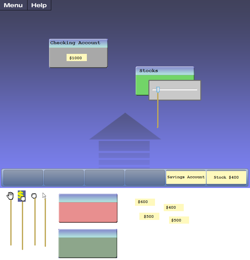
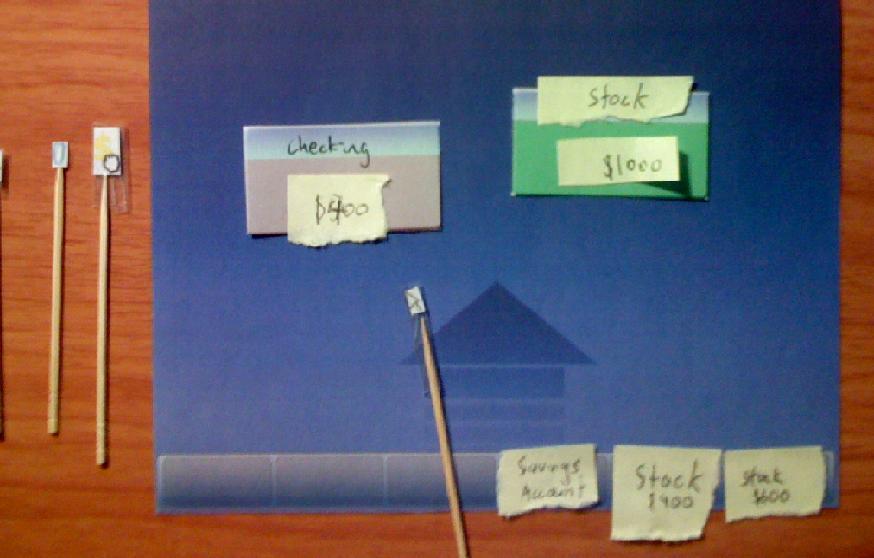
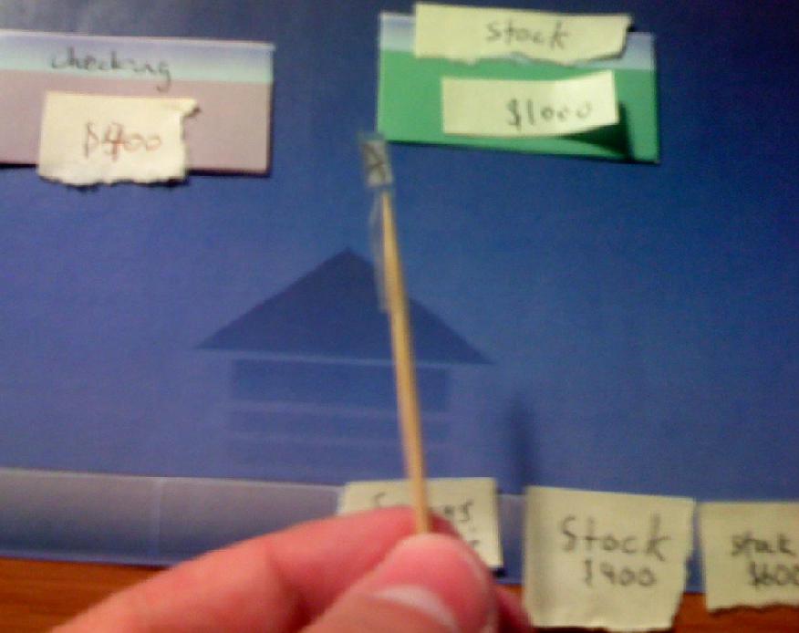
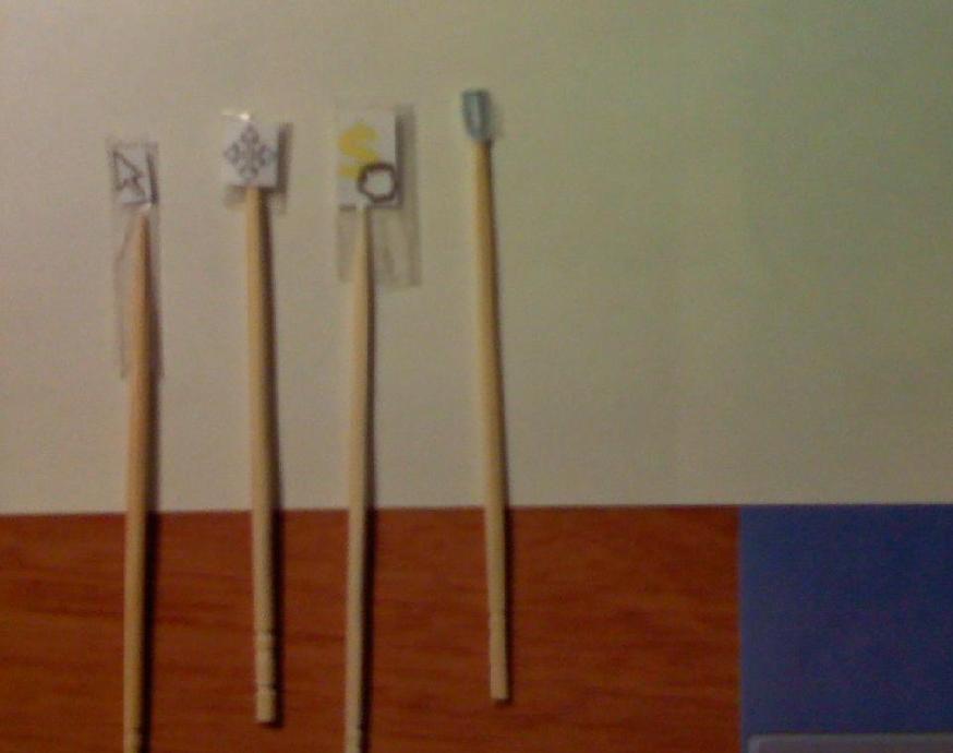
Our LoFi Prototype consisted of only the objects need during actual game play. These objects included the game screen background with the account purchasing toolbar, colored boxes for the user owned accounts, various cursor images for different actions, and movable money amounts. Most of the onscreen objects were cut outs of screens which were made using Photoshop. This allowed the computer to easily move the objects around as the user performed various actions. The cursors were all attached to toothpicks using tape to allow for ease of movement around the screen and to quickly switch between the different cursors. The money amounts were not screen print outs, but instead they were made from Post-It notes for quicker and simpler money exchanges.
The following images are screen concepts of our prototype. The colored arrows indicate which object the description is referring to while the grey lines show the location of the object while the user is in game.
Welcome Screen / Menu Screen / Out of the Game Screen:

Here is an screen image our prototype in use.
Method (12 pts)
Participants (1 paragraph)
Our main goals for the types of subjects we chose to interview was to ensure all subjects fit within our target age range, had a different field of study, and had different levels of experience with video games. Our target age range was 18 to 24, because at this age, most people are students in college or working at their first career job. We thought people in this age range would benefit most from our game, and also, most would already be familiar with flash games. We felt that the subject's specialization should be different, because people from different fields could interpret visual images differently. Also, their knowledge about financial investments would most likely be more different than those of the same field. Lastly, we wanted to include both people who were experienced with video games and people who were not because we wanted to ensure that we do not make the game or its interface too simple and boring, yet easy enough to learn.
Environment (1 paragraph)
We did the test at one of our group member's house. Since games are mostly played at home, we wanted to incorporate a home-like environment to our participants. The member who is the "computer" stands next to the participants as the facilitator sat across from the participants with observers taking two other sides. The study is done on a square table so everyone can easily observe what is happening. No other equipments were set up except laptops that we used to read off scripts and to take notes.
Tasks (1 page)
We asked our participants to perform three different game tasks that we deemed easy, medium, and hard. Those tasks were developed after the contextual inquiry phase of the development.
Creating an account (Easy task):
Creating account seems an easy task as the account has to be dragged from the bottom of the screen to the main screen. The players are given options of new accounts on the bottom of the screen. These accounts vary from savings account to 401K accounts. The player chooses to get a new account hoping that the new account would provide a different behavior than the accounts that they already own. On the purchasing section of the game board, each account is denoted with a value, they represent the initial value of each accounts. Players can purchase them as soon as they have enough capital to do so. The the player first hovers their mouse over an account which would turn into an open hand denoting a drag-and-drop operation. The player can then drag the account onto the main screen. After that, the player would be prompted with a slider bar to indicate the amount of investment they wish to contribute to the new account. In our task, the player has the choice of account type as well as the amount to put into the new account. It is also most logical to make it the first task as accounts have to be created before the game can be played.
Re-arranging the position of accounts on the screen (Medium task):
Re-arranging positions of different accounts on the screen should be a medium level task. We created our accounts with a blue bar on the top of the account, helping users recall the blue bar on top of most windowing systems. The users can move account to strategically position the accounts to minimize the amount of time spent while transferring money. To position accounts in different sectors, players can also group together accounts with different volatilities or other preferences of their choosing. To move the account, the player would move the mouse to the top of an account, and the mouse would transform into a directional pointer which indicates that the account can be moved around.
Moving money from one account to another (Difficult task):
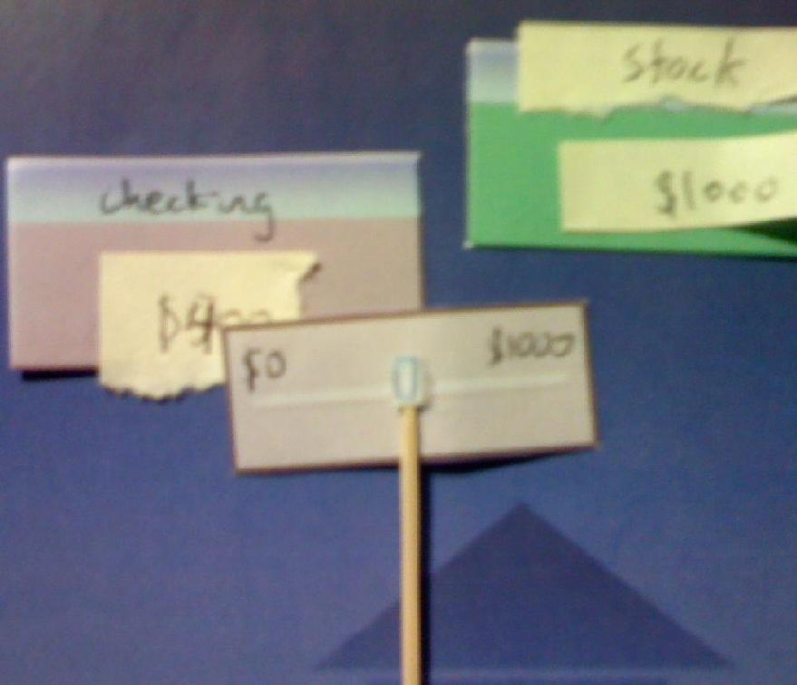
This is the main action that the player will do in our game, the players will constantly move money between different accounts to increase their exposure to investments with higher yield yet minimize the risk whenever needed. This is also the hardest of the three tasks. To transfer money between accounts, the player has to move the mouse over the dollar amount displayed in the accounts. The mouse pointer would transform into an open hand. By holding down the mouse, the player is able to grab the dollar. The player then moves and drops the dollar sign into another account. Money in the source account is then frozen so that the values displayed on the slider bar do not fluctuate. During this step, the mouse is locked onto the slider bar, and horizontal motion of the mouse will move the slider left-and-right. Limiting the control in this manner eliminates the opportunity for accidentally clicking in the wrong area. During this task, the player is free to transfer any amount that they would like, within the restrictions of the specific source and destination account types.
Procedure (1 page)
We followed the procedure learned in class and in the reading titled “Prototyping for Tiny Fingers” to carry out our lo-fi procedures. We divided 5 different roles amongst ourselves. Perry was the greeter, Geoffrey was the facilitator, Shaharyar was the computer, Mu was the observer and Bing doubled as an demo”er” and observer. We had an extra role of a demo”er” to be in line with the lecture and to show the participant how the system worked.
We rotated the roles to practice the procedure in order to facilitate our interaction with our participants during the study. We all took turns to be the participant with the exception of the computer as the computer should get as much practice to be a “computer” as possible. We focused our practices on the procedures rather than tasks as each of us know the task well and would seem a waste of time. We also tested out the paper prototypes that will be used for the study.
We followed the standard procedure described in the lecture notes. The greeter welcomed the participant and introduced everyone to make the participants relaxed. Then, the greeter read off the consent form and informed the participant about the study. In order not to put much pressure on the participant, we encouraged the participant to try his/her best but can quit at any time. We then described our roles to make the participant not feel awkward about having a “computer”. Afterwards, we told the participant to think out loud so that we know exactly what is going through their mind. Lastly, the greeter told the participants that no specific task related help can be offered during the game, and they had to explore through the game.
The greeter asked the participants to sign the consent form for their participation in this study. The Demo”er” demonstrated how the tasks should be carried out with the respect to the paper prototypes and the “computer”. The demo”er” showed off how to click on the menu screen of the game by moving around the game and saying “click” while hovering the mouse over the word “menu” (see attached prototype). The out of game menu screen then popped up. We then asked if the participant is ready for the real tasks and informed them that the interface is just a prototype and that there is a possibility that they find the task impossible due to a flawed design.
We asked them to demonstrate the three tasks that we mentioned in our task section with the facilitator reading the directions out loud. The “computer” changes the necessary mouse pointers as well as moved around the different screens as the study proceeded. The observer noted the confusion, frustration and errors that the participants made while the facilitator answered limited questions from the participants as we hope the participants would figure out the interface intuitively. At the end of the study, we inquired the participants regarding the overall structure of the user interface and asked them for suggestions. We gave them another chance to ask us questions and thanked them for their involvement.
Test Measures (1/2 page)
Our test measures focused on two factors. One focus is the three individual tasks that were assigned to the participants while the other being the overall view of the user interfaces. While asking the participants to complete the individual tasks, we record the number errors the participants make, the degree of confusion that they had with the system, the amount of question they asked as well as the number of times that they clicked on the help menu (Our help menu is just there to see if our user interface is intuitive enough for our participants that they do not need the help menu). We tallied up the amount of errors, time spent on each task and number of times help is clicked to show the degree of interaction the participant had with the interface.
The second area that we focused on is the big picture regarding what is happening during the study. As one of the pre-test procedure, we asked our participants to think out loud while completing each task. The observer would note events that generated frustration, confusion and misguidance. We also asked the users in the end of the study regarding certain tasks to clarify our understanding of what they were thinking while completing the procedure. The notes would later help us evaluate the cause of different events and adjust the user interface to facilitate participant’s experience as best as we can. We also compare the time and amount of error participants generated with our notes to see what they were doing or thinking while completing the task.
Results (12 pts) (1 page)
  1. I don’t agree this is a usability problem.
  2. Cosmetic problem
  3. Minor usability problem
  4. Major usability problem: important to fix
  5. Usability catastrophe: imperative to fix
The first person we interviewed was a fairly experienced gamer with technical experience. Immediately, it was evident that he was having issues with trying to create an account. Initially, he attempted to drag the checking account to the bottom "buy" bar, rather than vice versa. He believed that preexisting accounts were on the bottom and that the possible accounts you can buy are in the middle of the board. He also tried dragging the checking account onto the savings account, believing that you need to take a preexisting account and drag it over another account to dump money in and instantiate. At this point, he had gotten quite frustrated, but eventually figured out the proper way. He quickly figured out how to move accounts, and quickly figured out how to move money. His first reaction was to click the mouse once, but upon seeing the slider bar show up and quickly disappear, he figured out to hold the button down. For canceling transfers, he first attempted to press Escape, before realizing that you can just complete the transaction of $0.
The second person we interviewed had less experience with flash games. She first tried clicking on the menu bar and clicked on help. To create the account, she tried clicking on the bottom account, and upon seeing the mouse cursor flash, tried clicking and holding, then dragging onto the board. She also expressed some degree of frustration regarding account creation as she cannot tell the difference between the two areas of the main screen. She was able to easily move accounts around. To transfer money, she clicked on the account, after which she realized that you need to click and hold. She was easily able to understand the function of the slider.
The third person we interviewed was able to complete the tasks fairly quickly. He was able to quickly drag the account from the bottom bar to the board. The slider was fairly intuitive for him, and like the other people interviewed, he was able to move accounts easily. Moving money was the same; he clicked on the account first only to see the slider bar flash and disappear. That prompted him to click and hold, and which point he was able to drag to the other account and move the slider bar accordingly.
We felt that the first task of creating accounts rates a 5. As the later test results also show, users have the most trouble figuring out how to create an account. The purpose of the lower bar is unclear. We could easily address this issue by adding a label (e.g., "Accounts You Can Purchase") to the lower bar, and perhaps, have hover tips. Also, we may want to allow users to double-click to purchase accounts as well. Another reason that the account creation is deemed the hardest by user might due to the fact this is the first task that they are carrying out. Some users appear to expect the ability to double-click and buy accounts rather than drag and drop. All three users had some level of trouble with the purchase bar. At the very least, we need to label it and provide tool tips.
The task of moving accounts around seems fine, and is rated a 1. Everyone was able to easily figure it out.
The task of moving money around seems like a 3 or 4. It would be easy to add the ability to cancel using ESC, but the larger issue seems to be that users do not know how to confirm the amount when using the slider. For example, do you single click, double click, etc.? We could address this by providing a tip or label that says, "Click to confirm transfer."
The task of buying a new account is rated a 2 or 3. Going along the lines of users having trouble buying a new account, 2 out of the 3 individuals went for the menu first in trying to purchase a new account. A hover tip would probably fix this. Once again, users shouldn't be clicking around aimlessly, something that can be solved with tool tips.
Discussion (12 pts) (3/4 page)
Because our team designed the interface, we were very familiar with how we wanted it to work, and that clearly prevented us from noticing several interface problems. So, we concluded the experiment with two very surprising results:
All of our test users had trouble associating the purchase bar with its correct function. One user thought it represented the accounts that the user already owned in-game. Another user simply had no idea what it represented. However, nobody had problems recognizing that each interface box was a drag-able window. This showed us that it's important to label interface elements that are not widely recognized standards.
While our interface design was completely drag-and-drop oriented, there was only one task in which the test users correctly utilized the drag-and-drop operation on the first try. Users correctly dragged account boxes around the screen because they were widely recognized "windows", which are standard to all graphical computer programs. Aside from this well-known operation, clicking seemed to be the preferred/expected operation to interact with all of the other interface elements. We actually provided visual cues whenever a dragging operation was available by changing the mouse cursor to an open-hand and "closing the hand into a fist" when the user holds-down the mouse button. However, we believe that the lack of real-time interaction in the low-fidelity prototype made this visual cue less obvious. Regardless, this observation led us to add an additional operation to the interface in which the user could double-click on interface elements to interact with them. Also, we decided to add non-intrusive tool-tips which will inform the user about how to use a particular function.
In the end, we found that the low-fidelity prototype had difficulty revealing problems with interface elements that relied on real-time changes. Our "mouse" was a toothpick with a picture attached to it, and it was difficult to change the mouse cursor every single time the user hovered the mouse over an element. Also, our low-fidelity prototype could not reveal problems associated with changing account balances because it would have been impractical to have somebody constantly change a number on a piece of paper.
Appendices (6 pts) (as many pages as necessary)
Scripts
Roles:
- Geoffrey - Facilitator
- Mu - Observer(Record # of errors)
- Shaharyar - Computer
- Perry - Greeter
- Ben - Demo"er" / Observer(Record # of errors)
Greet the user (Perry)
- Introduce yourself to help relax the subject
- Explain the purpose of the study (Read off the consent form)
- Tell the participants that it is okay to quit at any time.
- Talk about the equipment in the room.
- Explain how to "think aloud"
- Explain how help cannot be provided
Explain the test (Geoffrey)
- Explain what the participants should do and in what order.
- Do not demo the exact task.
TASK1: (Creating an account)
- First make sure that you have enough money in your checking account to match the share-price/account price you hope to purcahse
- Move your mouse over the new accounts on the bottom row
- Drag the account into the main screen to complete the account purcahse
- After the purchase, please use the slider which will appear next to the account to indicate amount of money you hope to put into the account. The mouse on the slider will be locked until the amount has been determined.
TASK2: (Rearranging an account on the screen)
- Hover the mouse over the title bar, the mouse cursor will changes into a standard "move" cursor indicating an available drag-and-drop operation.
- Drags the account towards the desired location.
TASK3: (Moving money from one account to another)
- Hover the mouse over the gray area of the window, the mouse cursor changes into an open-hand to indicate an available drag-and-drop operation.
- Engage the drag-and-drop operation, the mouse cursor will change into a closed-fist with a dollar sign underneath it to indicate that money can be dropped into another account.
- Once the dollar sign is dropped onto the destination account, a dialog window appears with a slider bar indicating the amount of money to transfer.
- Money in the source account is now frozen so that the values displayed on the slider bar do not fluctuate. During this step, the mouse is locked onto the slider bar, and horizontal motion of the mouse will move the slider left-and-right.
- left-click to commit the money transfer.
Get user's signed consent (Perry)
Demo the system (Ben) Demonstrate how to use the menu tab and relating features
Run the test
- Shaharyar - be ready to respond with different mouse types
- Be ready to change values
- Be ready to move accounts around
Debrief
- How do you feel about the interface of the game?
- Was the interface intuitive?
- What are some changes that you can suggest to make it better?
- Is there any other question you wish to ask us?
- Ask them about problems that we see (Maybe they were doing something that was wrong, so it's pretty a question on the fly)
- Give thanks!
Actual notes from the study
Dexter is confused. Dex: RTS?. Very excited. Question: How old are you in the simulation?
Tried to drag checking account to bottom bar. Thought preexisting accts were on bottom on the accounts in the middle are the ones you can choose from (got it backwards). Tried dragging checking acct onto the savings acct. Dex is frustrated. Tried dragging acct onto the checking.
Perry: I rate this as a 5 -- it certainly seems like an usability issue. As the later test results also show, users have the most trouble figuring out how create an account. The purpose of the lower bar is unclear. We could easily address this issue by adding a label (e.g., "Accounts You Can Purchase") to the lower bar, and perhaps, have hover tips.
Figured out how to select the stock $400 and created the acct. Buy's $400 worth of stock. Tries to move mouse off of the box. Figured out how to create acct.
Tries dragging past the screen. Figured out how to move accts.
Intuition says, if it goes over there, there will be a dollar sign. Tried clicking, when it failed, he tried holding and dragging from stock to checking.
Unintuitive for creating an acct. Prefer escape for canceling transfers.
- Perry: I rate this as a 3 or a 4. It would be easy to add the ability to cancel using ESC, but the larger issue seems to be that users do not know how to confirm the amount when using the slider. For example, do you single click, double click, etc.? We could address this by providing a tip or label that says, "Click to confirm transfer."
- Geoffrey: 4 - We need to provide some kind of indicator saying "click to commit".
Tries clicking on the menu bar. Then tried click on help. Clicked on bottom accts. Mouse cursor flashes. Tries click and hold, then drag it to the board. Moved slider to 1000, and let go. Moved account around with no probs. Tried clicking on teh acct. Then click and hold, and moved slider.
- Perry: I rate this at a 2. Going along the lines of users having trouble buying a new account, 2 out of the 3 individuals went for the menu first in trying to purchase a new account. A hover tip would probably fix this.
- Geoffrey: 3 - Once again, users shouldn't be clicking around aimlessly, something that can be solved with tool tips.
Transfering money was easy.
Tried clicking the bottom acct. Dragged it onto the board. Moved slider to allocate money. Moved accts around fine. Moved money from one to another fine.
Didn't know the acct was created already. Would have found that out if he just let go. Seems intuitive.
Actual Images from the study
Image 1: Actual paper prototype showing the entire game board with accounts
Image 2: Actual showing of how the mouse is used by the participant
Image 3: Actual paper prototype showing the slider used to transfer money into accounts
Image 4: Different mouse pointers
