InteractivePrototype-Group:TBD
From CS 160 Fall 2008
DISCLAIMER:
Some modifications were made to the prototype between our report date and the presentation date. Everything listed after this section/Table of Contents (from "Team Members" to the end "Prototype Description") including the prototype link found under "Problem Solution and Overview" and the corresponding screenshots described in the report were part of the original report printed and submitted at 10:30 on 10/27/08.
THE UPDATED PROTOTYPE USED IN OUR PRESENTATION (10:30 AM, 10/29/08) can be found HERE.
Contents |
Team Members
- Kumar Garapaty assembled the Powerpoint slides and is also one of the two presenters.
- Cynthia Hsu was responsible for the "Prototype Overview" section of the report.
- Paul Im was responsible for the "Revised User Interface Design" part of the report.
- Shyam Vijayakumar wrote the "Problem Solution and Overview" and "Task Description" parts of the report. He is also one of the two presenters.
- Wenda Zhao was responsible for implementing the interactive prototype. He will be the person performing the demonstration during the presentation.
Problem and Solution Overview
The problem is that too much gasoline usage is harmful to the environment and runs a huge expense for the driver. Our game is designed to lessen the gasoline usage by reflecting driving behavior on the state of a character that users choose. Driving behavior consists of information about acceleration rates and distances driven. Through the platform of a cell phone, users can set goals for themselves, get rewarded for good driving behavior, see who they can carpool with, and finally review their driving data. We decided to implement the 3 most important tasks from these in our interactive prototype.
The current interactive prototype can be found here.
EDIT (12:23, 10/29/08): THE UPDATED PROTOTYPE USED IN OUR PRESENTATION (10:30 AM, 10/29/08) can be found HERE.
Our Presentation with some pictures missing due to size limitations: Image:Tamagassi.ppt
Representative Tasks
The 3 tasks that we chose to implement in our interactive prototype are essential for users to complete in order to play our game. First, the users need to set goals for themselves that help them save their gasoline usage. If users were not able to do this, there would no motivation in the context of the game for them to drive less or slower. Hence, this is an important task. It involves users setting a certain distance of driving, which they will try to stay below. This is an easy task for users because all they need to do is enter in a number for their goal distance based on how much they drove last week and the state of their characters.
Second, users need to be able to get rewarded in the game for good driving habits. If users were not rewarded somehow, there would be no incentive in the context of the game for them to drive less or slower. For this task, users obtain cash for meeting goals that they have set. With this cash, they can buy accessories for their characters. This is a medium difficulty task because it requires the user to know the basic controls of the user interface, which are not too complicated to learn.
Finally, users need to be able to collect and review data on their driving habits. If users were not able to do this, there would be no way for them to learn from their mistakes and improve their driving habits. Hence, this is an equally important task that users need to complete. It involves users choosing a certain option to start collecting data right before they start driving and choosing another option to stop collecting data once they have arrived at their destination. The cell phone’s built-in accelerometer and GPS tracking capabilities allow us to record data on their acceleration and the distance they drive. Once collecting data is done, users can choose locations from a map highlighted with streets that they accelerated too fast. The chosen locations will enable them to see statistics about exactly how fast they were driving and what the ideal statistics should be. This way, users can make adjustments when they arrive at that chosen location in real life. Collecting and reviewing data is relatively difficult for users to do because it requires the user to know more about the controls of the user interface to navigate around the map among other things.
Revised interface design
         o Changes as a result of low-fi testing and rationale behind the changes (refer to screenshots or scripts).
         o Sketches or scripts for unimplemented portions of the interface
         o Storyboards of tasks (annotated screenshots or scripts)
Changes Due to Lo-Fi Testing
There are several changes that we made as a result of our low-fi testing:
On the home screen, we changed the ‘Home’ button to ‘Char Home’. Some of the users were confused as to whether the ‘Home’ button referred to the home screen of the application, or the home screen of the user’s cellular phone.
In ‘Review Data’, we removed the option to view your current data. Instead, we only include the weekly data. None of the interviewees even realized that you could toggle back and forth between current data and weekly data. We also moved all of the textual data as well as the image of the character onto the map itself. When the user selects a specific point on the map, a box (quote bubble)will appear expressing all of the data that we wish to convey to the user. We have extensively concatenated most of our data in response to the interviewees not caring enough to read through all of the text. The character’s face will also appear in this dialog box along with the text. We did this first because of space, as our previous layout simply cluttered the small cell phone screen, and secondly to reinforce the connection between the data being given and the specific points on the map. We found that many of our users did not associate the long text description in a box with the number on the map, so we hoped that this new format would remedy this.
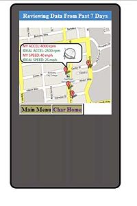 The new format of Review Data can be seen here.
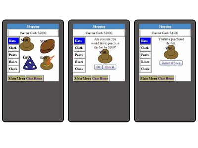
In the shop, we labeled the top left number as ‘Current Cash’. This was done for user clarification, so that they know exactly what that number is for. We also displayed the prices of the items as well as their images. Also, when a user buys an item, he or she will be asked first to confirm the purchase, then secondly will be given a message that says that they have purchased the item. This was done to provide additional feedback that our low-fidelity prototype did not have.
These three screens indicate each process during shopping. First, the user selects an item, second the user is asked to confirm his purchase, third, the user receives a screen confirming that the purchase has been made.
From the main menu, we changed the ‘Your Items’ option to ‘My Items’. This was also done for user clarification.
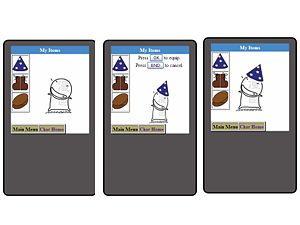
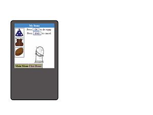
In the inventory screen, we now have a popup that reads ‘Press OK to equip’ (when the user clicks an item). This is so that a user knows how and when they can equip different items. When an item that is already equipped is clicked, another popup will appear that reads ‘Press OK to de-equip’.
Under carpooling, we ordered the tasks that need to be carried out. Instead of initially calling their friends to ask if they could carpool with them, all of our interviewees went directly to ‘Request Carpool Confirmation’. Moreover, there was much confusion over the difference between collecing carpool data individually and directly. As a result, we now ask users to call first, and then click "Collect carpool data" afterwards (instead of "Request Carpool Confirmation"). Once the user has requested carpool data to be collected, his or her carpooling partner will then be asked to confirm by an automated messaging system.
Sketches of Unimplemented Interface
Character Set Up
Collect Data
Reset/Save Picture
Carpool
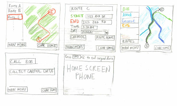
Each box represents a screenshot of the carpooling interface: first, the user selects a route. Second, the user may choose to modify the route or to find people to carpool with. From the list of people to carpool with, he or she will select someone to carpool with. After calling their friend, they may, upon carpooling, then click, "Collect Carpool Data", which will then ask the other person they are carpooling with to confirm that he or she is carpooling.
Storyboard of Tasks
Set Goals
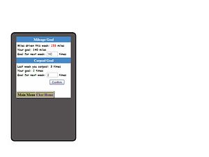
At the start of each week, the user will set his goal of distance to drive and number of times to carpool for that week. Although he will be able to set the goal to any value he wants, the Law of Expectancy is used to persuade the user to meet the goal he or she failed to meet last week, or if he or she has met the goal, have a higher goal (e.g., 90% of the previous week's mileage goal).
Review Data
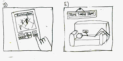
The "Review Data" screen will typically appear after the user has ended data collection, so that they will receive immediate feedback about their drive. However, our contextual inquiry results suggested that users may typically be very busy shortly after driving and choose not to review their data - in this case, they may click end, and at a later date, when they have more leisure time, examine areas where their speed or acceleration was nonideal.
Customize Character (Shop/My Items)
A user may in his or her spare time choose to take advantage of their reward for good driving behavior, first by going to a shop and selecting items to buy. Upon selection, he or she will be asked to confirm the purchase, then will receive feedback informing him or her that the purchase has been made.
Once an item has been purchased, the user may choose to attire his character with this item. Both "equipping" and "de-equipping" options available - this enables the user to purchase multiple hats, for example, and cycle through them on a whim such that the character will not lose a hat that he has previously bought simply because it has been replaced with another one.
Prototype overview
         o Overview of the UI implemented (reference figures or scripts from next section)
         o What was left out and why
         o Any wizard of oz techniques that are required to make it work
Description
Although the interface was designed to work with both keypad and touchpad functionality, the interactive prototype currently focuses on just a touchpad functionality so that the appearance of the user interface can be judged independently of the mechanics of keypad usage.
Main and Menu
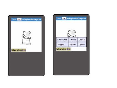
When the user first enters the game from their cell phone, they will see an image of the character, with three possible buttons:
- [OK], which they can click to begin collecting data.
- [Main Menu], and
- [Exit], which will return them to the home screen of their phone.
Clicking on Main Menu will yield a pop up menu with six options - Review Data, Set Goal, Carpool, Shopping, My Items, and Options. The menu can be closed by clicking "Main Menu" again.
The [Main Menu] button remains consistent throughout all pages of the interface.
In all pages of the interface besides home, [Exit] is replaced with [Char Home], which will return to the user to the home screen that shows the image of the character. The application can be existed either from this home screen or by pressing the [END] button on the cell phone.
Set Goals
There are two goals which can be set, as indicated by text boxes - "Mileage goals", the number of miles to be driven in the upcoming week, and "Carpooling goals", the number of times which the user hopes to carpool. The user can then click "Confirm" to set these goals.
Store
The store contains a series of items categorized by type (e.g., "Hats", "Boots", "Scarves", etc.). The user may click one, be asked to confirm the purchase, and then be given feedback regarding this purchase.
My Items
Items that have been purchased are stored in "My Items". The user will select an item (by clicking it with a touch pad) and then be informed that they can choose to press [OK] to equip it or to [Cancel]. Once an item is equipped, the process can be reversed by clicking on the item again. Another window will pop up, asking the user to press [OK] to de-equip or to [Cancel].
Review Data
Data can be reviewed by selecting [Main Menu]. Recent trouble spots will appear numbered, and can be navigated by selecting each number.
Unimplemented Features
There were several features of the game that we chose not to implement. These were largely due to the fact that they were additional features that were not central to the purpose of our game, which could be accomplished primarily by the tasks of setting goals, reviewing data, and customizing the character, as described above.
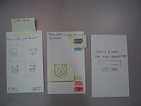
Character Set Up
Set up character was not implemented for several reasons. First, a distinctly individual character for every player, while valuable for increasing pathos, is not a central feature to the game – the game could just as easily be played with a default character. Secondly, if the user were allowed to choose the character’s appearance, color, and name, this task would only be performed once during each “round” of the game (typically once a month). This meant that given that no users had difficulty completing this task during the low-fidelity prototype, any usability problems that occurred during the transition from low-fidelity to high-fidelity would be minor and not detract from the overall experience of playing the game. Third, some of the people we interviewed for the low-fidelity prototype were confused by the fact that the character they had chosen was not the default one that appeared while they were reviewing data or examining their inventory. Thus, for the purposes of an interactive prototype, using the default character instead of going through the motions of selecting one was much better.
Options (Save Picture, Reset Character)
As with set character, the options (saving and resetting the character) were performed rarely and not crucial to game play. Moreover, the interfaces were fairly straightforward – a separate button for each, followed by a confirmation screen, and would be unlikely to change significantly through several rounds of prototype and evaluation.
Collect Data
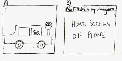
Collecting data, although central to our game play, was not implemented for two reasons – first, as with character set up and options, it had a very simple interface (press [OK] to begin collecting data and [END] twice to stop), second, it relied on several “Wizard of Oz” techniques. This is because it relies largely on accelerometer and GPS data to measure distance traveled and changes in acceleration, and also because we chose to have it run in the background of the primary application of the phone, allowing the user to use their phone while collecting data.
Carpooling
Carpooling was not implemented because it was, although important, more of an additional rather than a central feature to game play. Moreover, carpooling had several components to its interface that were similar to the interface involved in other simpler tasks. Selecting a route from a map was similar to our “Review Data” task, while viewing and selecting among the potential people to carpool with was analogous to choosing among hats in a shop. Both these features suffered slightly from the constraint of the small screen size of the mobile device; for this reason, we chose to limit our initial interactive prototype design to the simpler tasks of “Reviewing Data” and “Character Customization” before embarking on a more complicated task such as carpooling, which would ideally require several more rounds of low-fidelity prototyping before committing the design to a high-fidelity interface.
Miscellaneous
- Ideally the character would be animated, but we felt that this, while capable of eliciting pathos, was not a central aspect to the user interface design.
- Only some of the items in the store may be purchased, as is the case with some of the items in the inventory. We felt that for the purposes of demonstration, only several examples were necessary. A more diverse combination of accessories may be implemented in a more finalized product.
Wizard of Oz Techniques
There are several major Wizard of Oz Techniques required by our interactive prototype.
First, while our intent is to convey a mobile application, it is currently a web simulation of how a phone would appear. This means that it does not interface with a phone and many of the features necessary for it to work - for example, storing goal information, character information, and driving information. Furthermore, the web simulation does not have any access to accelerometers or a GPS, which hinders its abilities to compute speed/acceleration data and store routes. It is also unable to access the address book stored on the phone, which is necessary for finding carpool data.
