InteractivePrototype-Group:!Xobile
From CS 160 Fall 2008
Each team member’s name and role in this assignment
- Mu-Qing Jing Slider Bar, Tasks, Revised interface Design
- Geoffrey Lee Account Box and other coding sections, Problem and solution overview
- Perry Lee Slider Bar, Tasks, Revised Interface Design, PPT Slides
- Shaharyar Muzaffar Purchase Bar, Helped with report
- Bing Wang Purchase Bar, Prototype section of the report, PPT Slides
Interactive Prototype Links
PowerPoint Presentation download: Media:Interactive_Prototype.ppt
Readme file download: Media:README.pdf
Problem and solution overview (1 paragraph)
The goal for this iteration of our user interface design is to construct a high-fidelity prototype that addresses the issues discovered during our low-fidelity prototype testing. During our low-fidelity testing, we discovered that test-users had difficulty identifying the purchase bar, selecting the correct operation for purchasing accounts, and selecting the correct operation for transferring money across accounts. To mitigate problems identifying the purchase bar, we gave it a label. We also believe that the slow responsiveness of the low-fidelity prototype prevented our test-users from picking-up on "mouse-over" cues for drag-and-drop operations. By constructing a high-fidelity prototype, we believe that this will not continue to be a major issue. Lastly, we felt that the educational value of our game could be improved, so we introduced a changing "market indicator" that displays the current interest rate target as set by the Federal Reserve. The goal is to teach players how the interest rate has an impact on various investment options.
Tasks (1/2 page)
3 representative tasks to test your interface (easy, medium, hard). Grading criteria:
- Do the tasks cover the interesting features of the project?
- Do the tasks have an appropriate difficulty/complexity specified?
- Do the tasks altogether form a compelling story for the project?
---
For our three representative tasks, we chose...
- creating an account [Easy]
- rearranging the position of an account [Medium]
- moving money from one account to another [Hard]
... because players' game play actions only consist of these tasks.
Creating an Account [Easy]
To create an account, players may:
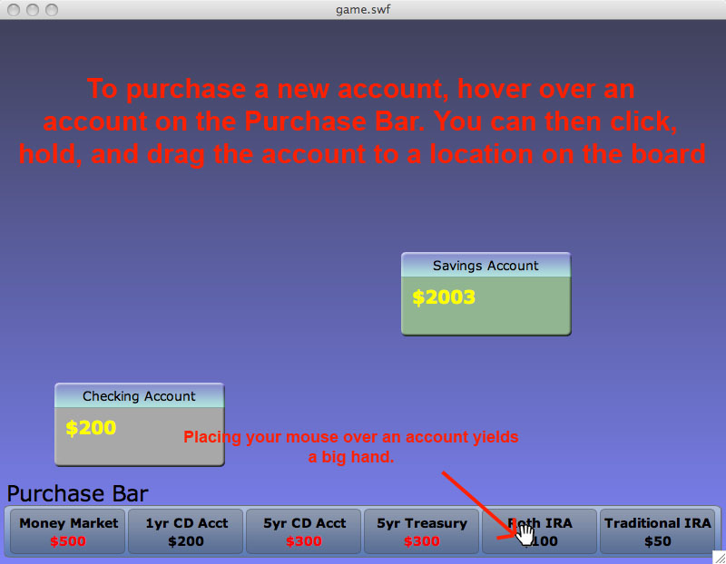
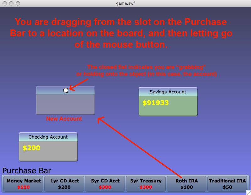
- drag accounts from the purchase bar (at the bottom of the screen) to the main game window
The accounts that are available for purchase vary with time and are randomly selected from a pool of type of accounts (e.g., a savings account, a mutual fund account).
Rearranging the Position of an Account [Medium]
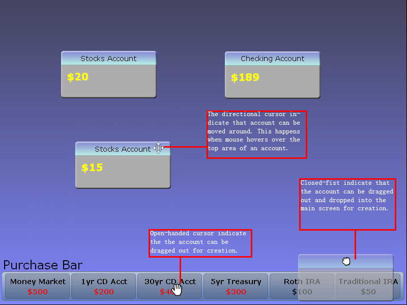
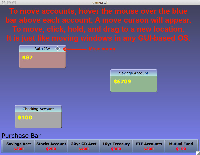
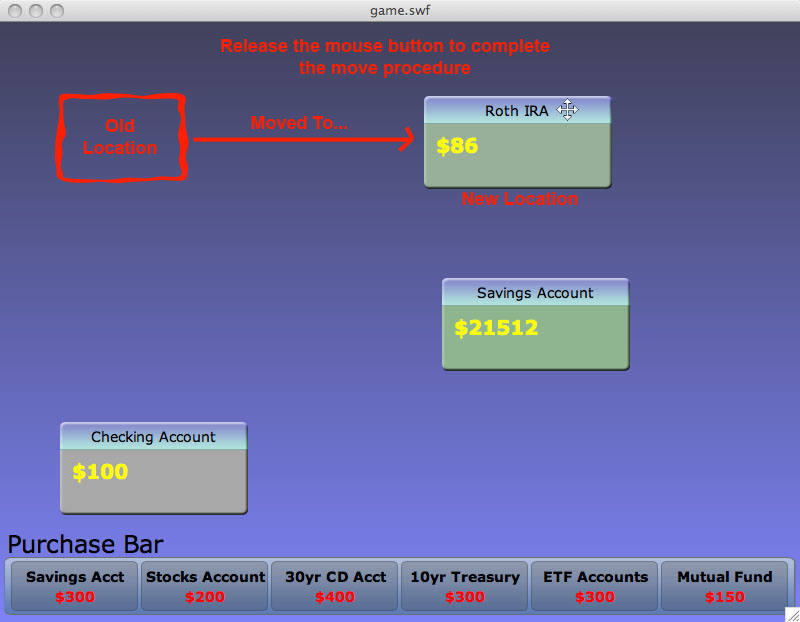
Using the windows analogy, players rearrange accounts by drag-and-drop on the title bar. We use visual cues (the mouse is transformed to a directional pointer) to indicate that an account can be moved.
Rearranging accounts gives players the ability to strategically position accounts:
- minimize the amount of time spent while transferring money
- group accounts with different volatility (or by other criteria)
Moving Money from One Account to Another [Hard]
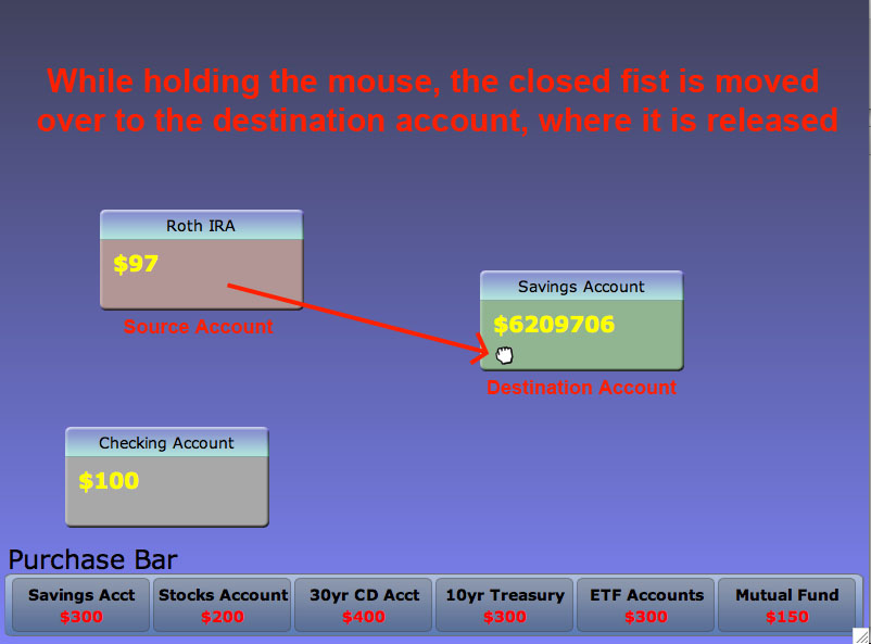
Players move money from one account to another by drag-and-dropping the account balance (as indicated by a dollar amount) from one account to another. Upon dropping the account balance onto another account, two actions occur:
- the source account is "frozen" -- it no longer changes in relation to time
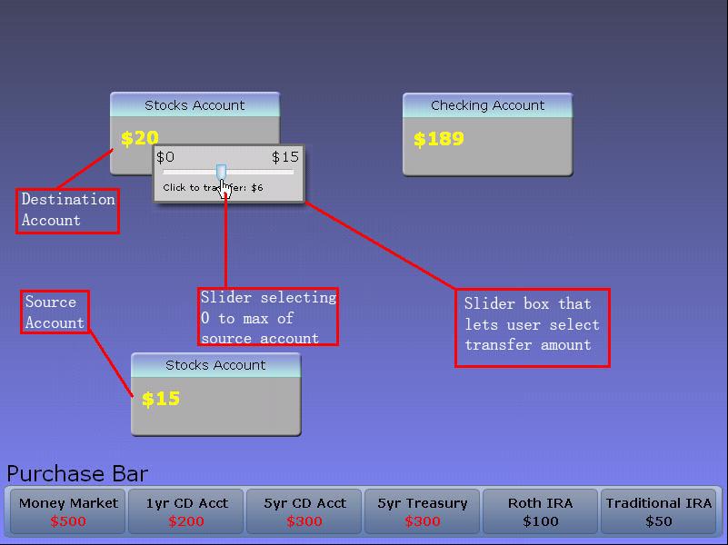
- a slider box indicating the amount of money to transfer is displayed
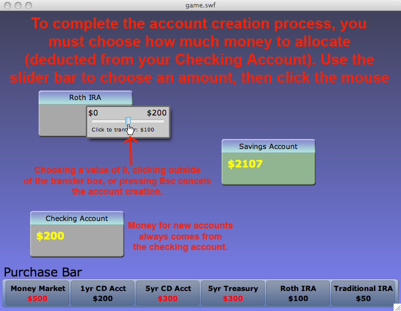
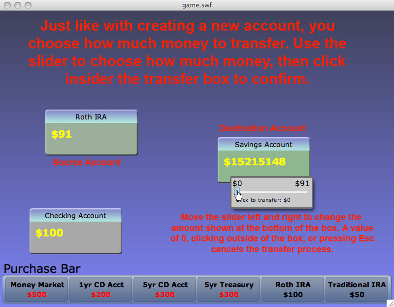
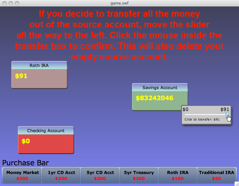
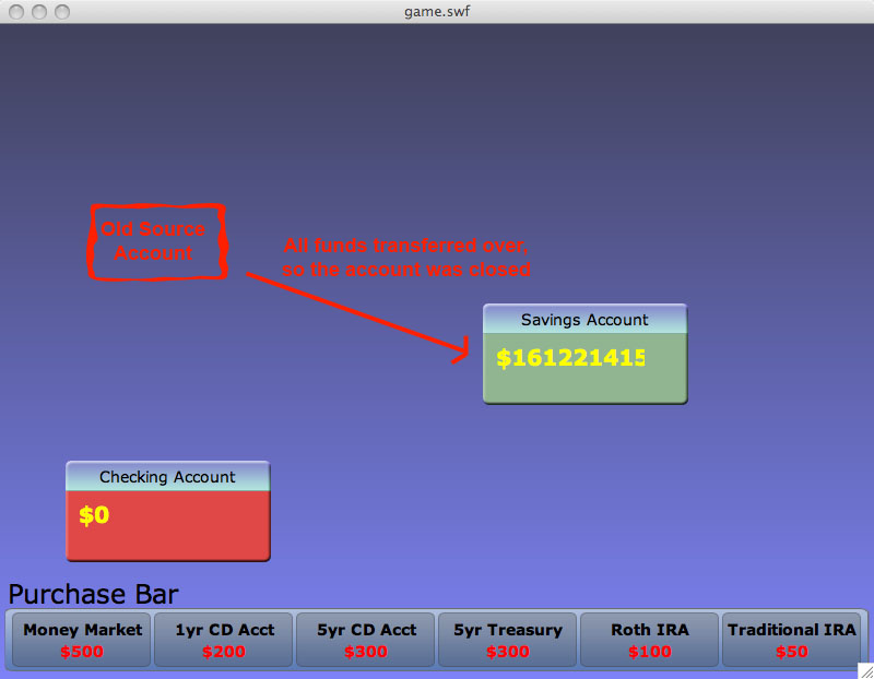
This slider box ranges from $0 (cancel the transfer) to the total balance of the source account. As a player moves his or her mouse from left to right, the amount of money to transfer is updated and displayed. A single-click on the slider box confirms the transfer.
To cancel a transfer, players can either:
- select $0 to transfer
- press the escape key
In our game, players constantly move money from one account to the next in order to maximize their money.
Revised interface design (1 page plus screenshots or scripts)
Changes and rationale
Changes as a result of low-fi testing and rationale behind the changes (refer to screenshots or scripts). Grading criteria:
- Were appropriate changes made to address the important problems discovered?
- Are these changes well illustrated with screenshots or scripts?
---
During our lo-fi testing phase, we surprisingly noticed that:
- our test users had the most trouble purchasing accounts
- e.g., mistaking the main game window for the purchase window, and the purchase bar for already purchased accounts
- e.g., not realizing that purchasing accounts is a drag-and-drop operation rather than a single-click/double-click operation
- when test users were confronted with a slider box during the transfer money operation, they were unsure how to confirm the action or cancel it
- e.g., can I press the escape key?
- e.g., do I double-click or single-click to confirm the operation?
To address these issues, we decided to add more visual cues and to accommodate the other means of input.
- We added a label to the purchase bar indicating its purpose: "Accounts That Are Available For Purchase".
- If players do not care about the position of their newly purchased account, they can double-click an account to purchase it. (this feature will be implemented in the next phase due to some issues with mouse cursors in adobe flash)
- Players can cancel operations via the keyboard (specifically pressing the escape key).
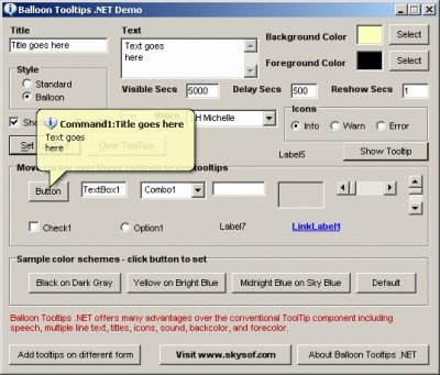
- To address the ambiguity of confirming a transfer, we use tool tips. When a player hovers the cursor over an item without clicking it, a small hover box appears with supplementary information. We will likely be using this method whenever there may be the slightest ambiguity.
Sketches or scripts for unimplemented portions of the interface
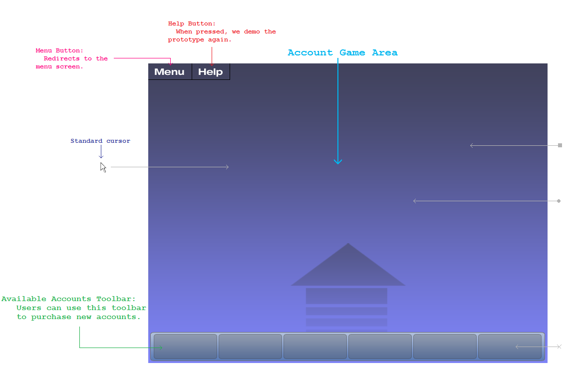
Welcome Screen
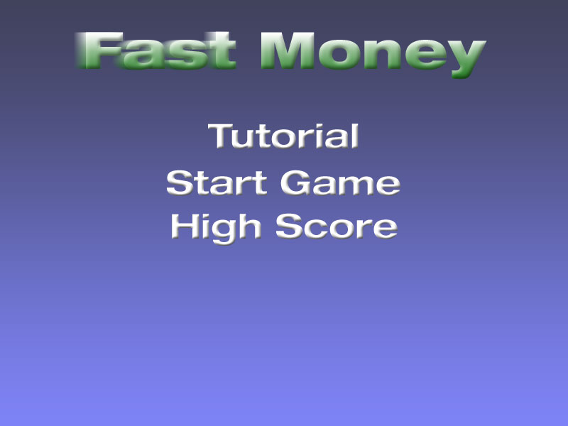
Buttons at the top of the board, like in the following image:
Balloon Tool Tips (such as in the example below):
More cursors for tasks
Improve the logic for change of rate for accounts
Storyboards of tasks (annotated screenshots or scripts)
Creating a new account
Moving Accounts
Transferring Money
![]()
![]()
Prototype overview (2 pages)
Grading criteria:
- Is the prototype accessible and working?
Our prototype is written based on Adobe Flex ActionScript 3 and Adobe Flash. The prototype is accessible and working for the three tasks that we are basing our prototype on. As a whole, the game is not complete, but these three tasks should represent a major portion of the game tasks and cover the core of the project. Our prototype is also versatile in a way that components can be easily incoporated into the game.
- Can users complete the three tasks with the prototype?
We coded our game according to our specifications from the lo-fi prototype with some improvements. We believe that users can complete the task as they were able to do so with a less intuitive paper prototype.
- Were appropriate tradeoffs made between functionality and completeness?
Our prototype is fairly complete in term of prototype and UI functionality. We implemented all the functions that were necessary to carry out the three tasks that it is designed to do so. Some of the things that were left out include a double click function that was recommended by the user. It was coded but we ran into problems with Adobe flash cursors thus will be delivered in the next phase of the project. We also left out the help menu and the welcome menu as they were not necessary for the three prototype tasks. We also left out an improvement that indicated Federal Reserve Interest Rate with the change in each accounts. Since this feature is not required for user interaction for the three tasks, it is not part of our interactive prototype.
- Are the limitations and tradeoffs described and justified in the report?
The prototype currently has no limitations at least for the three tasks that are part of the interactive prototype. All the items that are left out are not necessary to carry out the three interactive tasks required for this report.
- Does the README file summarize these limitations and any other details needed?
The README file has the instructions to carry out the three tasks
Overview of the UI implemented
Reference figures or scripts from next section.
The UI is implemented with intuition in mind. The bar on the bottom is the purchase bar where the user can purchase new accounts. Two functions are available there. One is to double click and purchase an account while another is to buy an account with drag and drop operation. From our lo-fi prototyping and contextual inquiry, we found that these two actions were mostly widely used actions while a person is interacting with a computer program and thus would make most sense in this case as purchasing an account is the first task of the game.
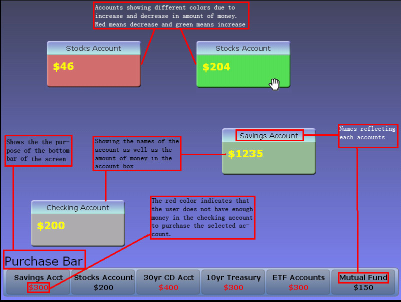
The next item that we implement in terms of UI is account box. We modeled the account box just like a regular window in a program. The top bars contain names of the account while the body of the window contain the contents of the account such as the amount of money that is currently in the account. The top of the account is draggable as do most of the windows in a windowing system. The content portion of the account that display the money amount is also draggable in order to carry out the operations to transfer money.
Another item that is implemented in the UI is a slider bar. The slider bar is used to let the user decide how much money should be transferred. The slider bar locks the mouse onto the slider bar, and horizontal motion of the mouse will move the slider left-and-right. Limiting the control in this manner eliminates the opportunity for accidentally clicking in the wrong area.
Lastly, the game uses mouse cursors to indicate different operations that are available in each stage of the game. While hover the mouse over the top portion of the window, the mouse would change into a directional arrow letting user know that this area is draggable. While the mouse is over the money, the mouse cursor would change into an open hand allowing the user to understand that he/she can grab the money and transfer it into another account. Another instance when the mouse cursor changes is during the slider bar operation. The mouse becomes a slider that sticks to the slider bar.
Our UI also focuses on the familiar visual cues to help user distinguish between tasks. From our lo-fi prototype, our users indicated that they were unsure about the purpose of the list of the accounts on the bottom of the screen. Therefore, we titled it "Purchase Bar" to help user better visualize what the accounts are for. Our changes of mouse cursor types as mentioned earlier is also a visual cue to help users make faster decisions. Lastly, our account box change colors to reflect the amount of money that has changed. We used green to reflect increases in an account and red to reflect decreases in an account as these are the colors indicated by our subjects from contextual inquiry phase of the project. We also showed amount in red to indicate that users need at least a certain amount in the checking account before this other type of account can be purchased.
What was left out and why
We left out the Main Menu and Help Screen. We feel that these were not necessary for the user to complete the three tasks which are all based on actual game play. Also, a few graphics were left out, such as arrows on accounts indicating growth and indicators on the purchase bar showing risk of accounts. The arrows were left out, because another indicator exists for showing growth. The purchase bar indicators were left out, because they were not necessary for completing the three tasks. The full functionality of the account with each reflecting real world interest rate is left out as it is not required for the three prototype tasks.
Lastly, we made some improvements to include a few indicators after we talked to the such as to include a Federal Reserves Interest Rate in our game to reflect changes. This particular improvement would help user understand how Federal Reserve Interest Rate are related to each accounts. This is left out of the game because it is not required for the three tasks that need to be performed.
Any wizard of oz techniques that are required to make it work
Our user interface does not require any wizard of oz techniques to make it work. Everything that needs to be done will be carried out automatically with no need of human intervention.
Prototype screenshots or scripts (as many as needed)
Grading criteria:
- Are important figures referenced and placed inline with the text?
- Are they clearly annotated (i.e. with explanatory captions)?
README
README:
Creating an Account [Easy]
- The user first has to move his/her mouse down to the purchase bar area
- The user can then drag the account out into the main screen # The user will see a slider bar appearing, and the user need to select the amount of money they hope to put into the account via the slider bar. The user can cancel the transfer by selecting $0
Rearranging the Position of an Account [Medium]
- The user has to hover the mouse over the top portion of the account box where the mouse would change into a directional arrow.
- The user can then drag the account around just as if he/she is dragging around a window.
- The account would be placed at the place where it is dropped off by the user.
Moving Money from One Account to Another [Hard]
- The user first hover the mouse over the money.
- The mouse would change into an open hand.
- The user can grab the money and move it to another account
- The slider bar would appear that ask the user the amount he/she wishes to transfer. The user can cancel the transfer by selecting $0
