FinalPrototype-Group:TBD
From CS 160 Fall 2008
Contents |
Files
To run, please unzip all files, including those in folders. Then click on Cellphoneskin11.swf or Cellphoneskin11.html.
Requires ability to play *.swf files.
Team Members
- Kumar Garapaty implemented all Carpooling screens and the animation for Collecting Data. He also did the Design Evolution part of the report.
- Cynthia Hsu implemented "My Items", the main menu/home screen, and the animation for Collecting Data. She also integrated the prototype and made the slides for the powerpoint presentation.
- Paul Im implemented the Review Data task. He also did the last half of the Final Interface (Unimplemented Portions and Wizard of Oz Techniques) part of the report and the introduction part of the report.
- Shyam Vijayakumar implemented the shopping task. He also did the first half of the Final Interface part of the report (User Interface Design and Implementation).
- Wenda Zhao implemented "Set Goals" and designed the poster.
Problem and solution overview
With the recent increase in gasoline prices, the general population has begun to think about conserving as much gasoline as possible. By saving gasoline, each person can keep more money in their own pockets. There is also a rising concern for our atmosphere, as gasoline emissions are beginning to take an obvious toll. We hope to reduce these emissions in order to be more eco-friendly. The solution that we propose is a cellular phone application called Tamagassi. Tamagassi will be a game that allows users to grow their own creature (similar to the game ‘Tamagotchi’). Tamagassi will monitor a user’s driving by measuring a number of factors, namely: speed, acceleration, miles driven per gallon of gasoline, the number of times a user has carpooled, and finally the total number of miles driven per week. By setting weekly goals for themselves, we hope that the user will improve on any gasoline-inefficient driving, start to carpool more often, and find ways to drive less and less each week. Through good driving and goal achievements, players will be rewarded with a healthy creature as well as cash and prizes. We hope that our game will provide enough incentive to help users significantly cut their gasoline usage.
Target user group
Our target user group is anybody within the general driving population who is interested in saving gasoline. These people would want to conserve gas either because they want to save money, or because they wish to help out the environment. In terms of economic status, our users would most likely be in the lower to upper-middle class; of course, these users must own a cellular phone. We understand that this group spans most people above the age of 16. That being said, we attempted to represent this group as best as possible. Most of our interviewees consisted of either full-time workers who commute back and forth to work everyday, or students who drive quite fairly frequently. Both groups of people would definitely want to save some green, both in a monetary and environmental sense.
Tasks
The 3 tasks that we chose to implement in our interactive prototype are essential for users to complete in order to play our game.
Easy Task: Character Shop/Inventory
First, the easy task is the Shop and Inventory. For this task, users obtain cash for meeting goals that they have set. With this cash, they can buy accessories for their characters. They can equip and de-equip these accessories. The reason we chose this task is users need to be able to get rewarded in the game for good driving habits. If users were not rewarded somehow, there would be no incentive in the context of the game for them to drive less or slower. This is an easy difficulty task because it requires the user to know the basic controls of the user interface, which are not too complicated to learn.
Medium Task: Collect/Review Data
Users need to be able to collect and review data on their driving habits. If users were not able to do this, there would be no way for them to learn from their mistakes and improve their driving habits. Hence, this is an equally important task that users need to complete. It involves users choosing a certain option to start collecting data right before they start driving and choosing another option to stop collecting data once they have arrived at their destination. The cell phone’s built-in accelerometer and GPS tracking capabilities allow us to record data on their acceleration and the distance they drive. Once collecting data is done, users can choose locations from a map highlighted with streets that they accelerated too fast. The chosen locations will enable them to see statistics about exactly how fast they were driving and what the ideal statistics should be. This way, users can make adjustments when they arrive at that chosen location in real life. Collecting and reviewing data is of medium difficulty for users to do because it requires the user to know more about the controls of the user interface and to navigate around the map among other things.
Hard Task: Carpooling
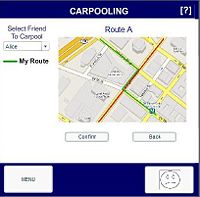
Carpooling consists of two phases. First, the user must determine with whom carpooling is ideal. The ideal procedure is to enter the carpool menu, select a route, and if the user chooses to do so, edit it. The routes uploaded by other users are then displayed in order of closest match, and the user can select the name of the other user of choice. This returns a new screen that allows the user to either call or confirm. Because the other user has not yet been notified of the player's intentions to carpool, the user should click “Call”. This results in a standard cell phone call.
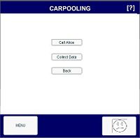
Secondly, the user must be able to receive cash points associated with carpooling. To do so, he or she must go through the process of selecting a route described above, then the person with whom he or she would like to carpool with. Instead of clicking the “Call” button, however, the user must click "Collect Data".
We chose this is a hard task because it is a core part of the game to improve the character's mood. It is also difficult to perform because the user has to choose the right person to confirm carpooling and arrange the carpooling time.
Design Evolution
UI changes
- I refer to the first prototype we presented in class as the "interactive prototype" and the second prototype as the final prototype.
Overall UI Changes
1. Touch screen or keypad usability. Throughout the design process of this course, we were hoping to create an application that is usable with both touch screen and keypad. In our low fidelity testing sessions, our testers were confused about whether to use the prototype with touch screen or keypad methodology. By the time of our final prototype, we settled on using a touch screen application. We decided on this because our game is highly visual and touch screen have a larger screen allowing for us to show all the visual features.
2. Our menu, as in the earliest prototype opens up several other features, however, the feature of options was not implemented in the final prototype. The options was not implemented because it is an extraneous part of the game, saving the image of the avatar is not as important as reviewing data, setting goals, etc.
3. The home button that used to be text in both the low fidelity and interactive prototypes, was changed to the character's face to make it more appealing to the user and always know the current status of the character.
4. In our final prototype we used flash compared to HTML in our interactive prototype. This allowed us to have a cleaner interface with better graphics, and animations. It also allowed us to develop more complicated segments of our prototypes such as rewards after driving and collecting data easily.
Set Goals Changes
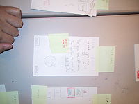
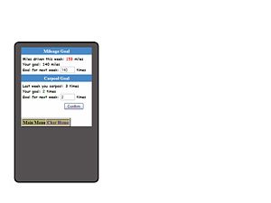
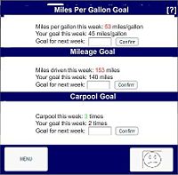
1. Setting the goals was made much more sophisticated. In both the low fidelity and interactive prototypes, setting goals only consisted of setting how much you are going to drive. In the final prototype, we have included miles per gallon as well as number of times the individual will carpool for that week. We did this so it can correspond with the review data task. The stats in review data show the same features, this relation allows the game to be more coherent.
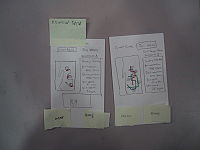
A - Low Fidelity Prototype
B - Interactive Prototype
C - Final Prototype
Character Shop/Inventory Changes
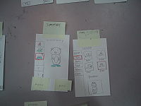
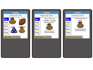
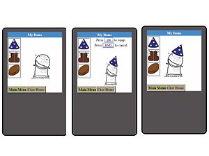
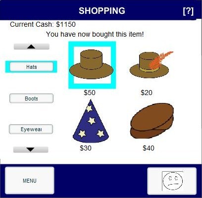
1. For the shop and inventory, we realized the lack of feedback in our low fidelity prototype. When a person, bought the item, they did not know that they actually bought the item. We implemented the feedback that the person actually bought the item in our interactive prototype, and made the feedback appear nicer by putting it in an appropriate location in the final prototype. In the interactive prototype, after we bought a item, we could repeatedly buy the same item again. In the final prototype, we ensured that we give feedback that they have already bought the item and they cannot buy it any longer. In our low fidelity prototype, we also did not have any feedback for equipping or de-equipping the items. The character was also unable to de-equip the item in the low fidelity prototype. In the interactive prototype, we ensured that there was feedback, illustrating that the user has equipped and de-equipped the item and continued it in our final prototype. We added all this feedback to reduce the player's confusion and make the game more coherent.
2. Relation between character shop and inventory was not implemented in our interactive prototype due to time constraints and in the low fidelity prototype it is a static prototype. However, it was implemented in the final prototype. Relation, meaning that once we bought an item in the shop, it will show up in the inventory. Relation between what the character has equipped and what shows up in the home screen has also been added in the final prototype. If a player equips a certain hat, then on the home screen that hat will be equipped on to the character. This was unavailable in our interactive prototype due to the time constraints. We did this so as to improve the playability aspect of the game.
A - Low Fidelity Prototype
B - Interactive Prototype
C - Final Prototype
Collect/Review Data Changes
1. In our final prototype, the character's mood changes after collecting data, showing how certain driving habits can affect the character. This was not available in the interactive or low fidelity prototypes. The mood changes make the game more exciting, and allow the player to increase their emotional investment in the game, which could allow the player to improve their driving.
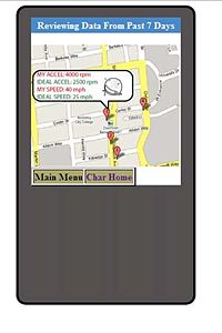
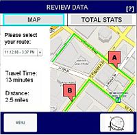
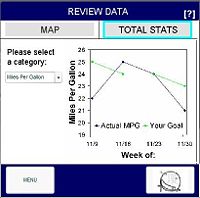
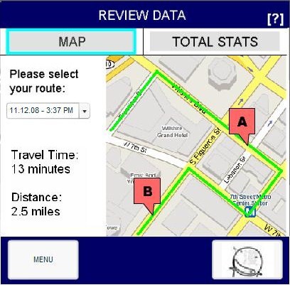
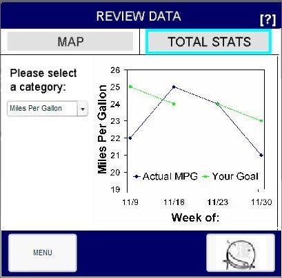
2. In the low fidelity review data, we gave statistics on the current route as well as current week. The statistics were about certain points where the player was accelerating too much and wasting gasoline. A number corresponding to the incident, corresponded to the statistics given on the right. In the interactive prototype, we only had the data for the past week. The data was given with a map, which had clickable pointers that show the data for that particular incident. In our final prototype, we had two options map and total stats. Map was similar to the interactive prototype, except now the player can choose which route to review data on. We chose to have the map aspect of the task in this fashion, because the player can immediately understand how they did at that point rather than trying to connect the number of the incident to the data of the incident. In the total stats, we demonstrated how the player was doing over the play of the game for each one of the goals: Miles per Gallon, Carpool and Mileage. Having, a total stats section allows the player to understand what the main purpose of the game is and what they themselves are trying to improve up, which is why we added this in our final prototype in this method.
A - Low Fidelity Prototype
B - Interactive Prototype
C - Final Prototype
Carpooling Changes
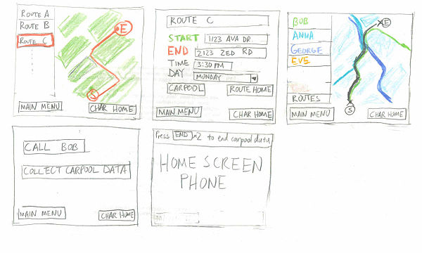
1. Carpooling was not implemented in the interactive prototype due to time constraints, but it was implemented in the low fidelity prototype. We used combo boxes rather than lists to show all the routes and the friends to make the UI more aesthetically pleasing. Clicking on different routes, shows different information rather than the same information in the low fidelity prototype, we intended to make this change because it is intuitive that different routes have different addresses.
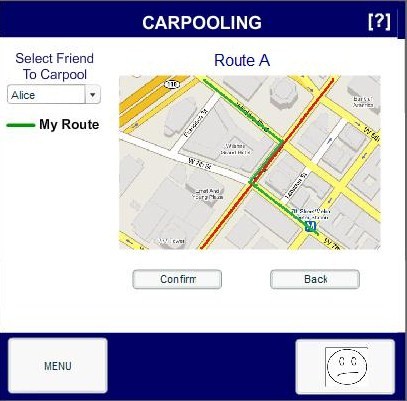
2. Rather than show all the friends' routes at one time, the routes are shown one by one to make the map clearer and easier to understand.
A - Low Fidelity Prototype
B - Interactive Prototype
C - Final Prototype
Most Valuable Evaluation Technique
The low fidelity testing session was the most valuable for the development of our prototype because it identified key aspects of the serious game that we were missing. The amount of feedback that we might have forgotten to implement in our interactive prototype could have been huge, if we hadn't performed the low fidelity testing session. Although, the low fidelity prototype has key limitations, primarily its static nature, we could still see the main problems that the players were facing. Doing the testing session in a group fashion also allowed for multiple observers, this way we could take more notes on each individual tester and have more qualitative data. Although, the slowness of the computer in the low fidelity prototype seemed to be a disadvantage, the fact that the player spent more time on the game allowed for more time to think out loud and identify problems with the prototype. Also, doing it with an individual we were unfamiliar with allowed the session to be more fair and judicious. A main problem we identified in our pilot usability tests was that all the issues identified by the players were issues because certain aspects weren't implemented yet.
Final Interface (4 pages + screen shots- reference figures!)
User Interface Design
User Interface Platform
The game will be on a touch screen cell phone. The user will tap on different parts of the screen to interact with different elements in our game.
Home Screen and Menu
When the user first enters the game from their cell phone, they will see the home screen for the game. This home screen will contain an image of the character, with three possible buttons that they can click on:
- [OK] (The actual text on the page is “Click [OK] to begin collecting data”)
- [Menu]
- button with the character’s picture on it.
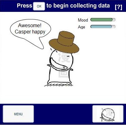
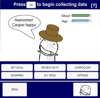
Clicking the [OK] button will take advantage of the phone’s GPS and accelerometer to start collecting data on the user’s driving behavior. Clicking on the [Menu] button will yield a pop up menu with six options - Review Data, Set Goal, Carpool, Shopping, My Items, and Options. The menu can be closed by selecting the "Menu" button again. Selecting one of these options will lead the user to a different page for the selected functionality. The [Menu] button and the button with the character’s picture remain consistent throughout all pages of the interface. Clicking on the button with the character’s picture on it will return the user to the current screen from any other page in the game. For example, while the user is reviewing data on a different page, selecting the button with the character’s picture on will make the game’s home screen appear.
The game’s home screen will also contain two status bars at the top right hand corner of the screen. One will reflect the character’s mood and the other will reflect the character’s development. A text bubble will also appear next to the character, containing something that the character might say regarding its mood.
Set Goals
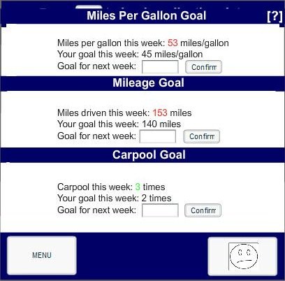
There are three goals that can be set, as indicated by the three titles - "Mileage Goal", the number of miles to be driven in the upcoming week, "Miles Per Gallon Goal", the miles per gallon that the vehicle gets in the upcoming week and "Carpooling goals", the number of times that the user hopes to carpool. Each section under the title will contain the data for the current week, the goal that the user set for the current week and a text box that will let the user type in the goal for the upcoming week. The user can then click "Confirm" to set each of these goals.
Customize Character (Shopping/My Items)
There are two steps that must be taken in order to customize your character. The first is to buy items at the shop and the second is to equip them onto your character (in the My Items page).
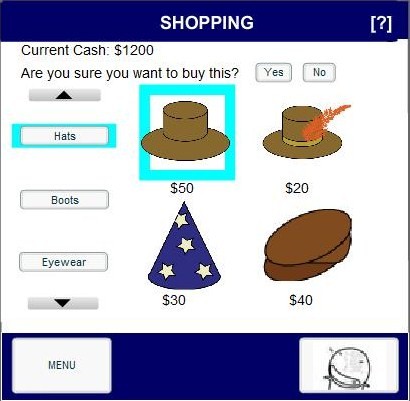
The Shopping page is where a user can go to spend his hard-earned money on his character. The user’s current amount of cash is displayed at the top-left of the screen. Item categories are also listed on the left, and the actual items for each categories (along with the corresponding prices), will populate the right side of the screen. The user can select a certain item to try to purchase it. The item that has been selected by the user will be highlighted in a box. If the user selects an item, a confirmation question will ask the user if he is sure that he wants to buy the item. If the user selects the [Yes] button, the price of the item will be subtracted from the amount of money that he currently has. If the user selects the [No] button, then the confirmation question will disappear. If the user selects an item that he has already bought, a notification will appear at the top of the screen saying that the item has already been bought.
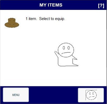
After purchasing items from the shop, the user can equip them on his character by going to the “My Items” page via the menu. This page will list all the items that the user has bought on the left side and their character on the right. Selecting an item will equip the character with it. Selecting the same item again from the list will de-equip the character of that item. The selected item will be highlighted in a box. All the items that a user equips will be carried on to the game’s home screen.
Collecting/Review Data
From the game’s home screen, the user can click on the [OK] button to start collecting data when about to start driving. This will cause a new page to appear. This page will contain a [STOP] button and a notification at the top of the page saying that the user can press the [STOP] button to stop collecting data. This page will also have an animation of the character. Once the user has arrived at the destination, he can select the [STOP] button. This will lead the user to the “Review Data” page with data on the route that the user just took.
There will be two options for the user in the “Review Data” page. These two options are “Map” and “Total Stats”, which appear in form of buttons at the top of the “Review Data” page. The “Map” page will contain a list of routes that the user can choose on the left side of the page. Once the user has chosen a route, a map will appear on the right side of the page with the chosen route highlighted. Along this route, there could be any number of markers. These markers denote the location in the route where the user’s acceleration and speed were not ideal. Clicking on one of these markers will show exactly what the ideal acceleration and speed values are, while showing the acceleration and speed values for the user as well. Choosing a route will also cause the total travel time and distance traveled along that route to be displayed under the list of routes. The “Total Stats” page will contain a list of goals on the left side of the page that the user can select. Once the user has selected one of the goals, statistics in the form of line graph will appear on the right side of the screen. These statistics will let the user see the trend in the actual values for the different goals. For example, if the user selects the “Miles Per Gallon” goal, then the user will be able to see a line graph plotting values for miles per gallon for each week.
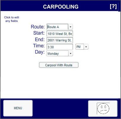
Carpooling
From the menu, the user can choose the Carpooling option. Once that has been chosen, a page will appear where the user can input new routes or modify routes that he has taken. Specifically, a list will appear with a list of routes (Route A, Route B, etc). Also, a set of text fields will also appear underneath the list. They are labeled "Start", "End", "Time", and "Day" from top to bottom. From the list of routes, the user can scroll up or down and choose to input a new route (using the Add Route list item) or modify an already existing one (by selecting Route A, for example). Then the user can input new values into the text fields corresponding to the start address, destination, time of day, and the day to carpool in if he wants to add a new route.
If the user does not want to add a new route, values for the chosen route will already be filled in the text field for the user to modify. Once, a route’s information is in the text fields, the user can select the [Carpool with Route] button. A new page will appear. This page will contain a list of contacts on the left side of the page ranked by most similar route to the user’s chosen route. The right side of the page will contain a map that will highlight the chosen route. The user can then choose a contact from the list. This will cause another route to appear on the map. This route will be that which the selected contact takes that is most similar to the route that the user chose. A [Confirm] button and a [Back] button will appear below the map. Clicking on the [Back] button will lead the user back to the page where he can choose another route or input a new route. Selecting the [Confirm] button before choosing a contact will cause a notification message to appear asking the user to select a contact first. If the [Confirm] button is selected after choosing a contact, the user will be directed to a new page.
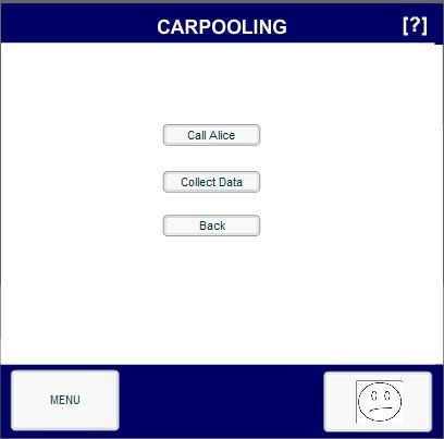
This new page will contain three buttons: [Call Contact], [Collect Data], and [Back]. The [Back] button will lead the user back to the page where the user can choose a contact. The [Call Contact] button will make a call to the chosen contact. This will allow the user and the chosen contact to communicate and set up everything needed to actually carpool. Once that is done, the user can select the [Collect Data] button to start collecting data on the user’s driving behavior. Before that happens, however, the phone will make a call to an automated service which will communicate with the contact's phone. At this point, both the user and the contact will be asked by the automated service to press 1 on their phones in order to confirm the carpooling session. After this is done, a new page will appear containing the contact’s character and the user’s character. There will also be a [STOP] button and a message at the top of the page that informs the user that he can press the [STOP] button to stop collecting data. Once they have arrived at their destination, the user can then press the [STOP] button, which will take the user to the “Review Data” page to review the route that he just went on.
Help Pages
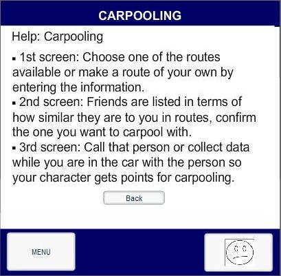
Each page in our game has a question mark at the top right hand corner. Selecting this question mark will lead the user to a "Help" page with guidelines to completing the task that the user is currently trying to do. This page will have a [Back] button at the bottom which will lead the user to the page that he was previously on.
Implementation
We used Flash to implement our game. In the previous iteration, we implemented our game in HTML. However, HTML did lend itself to inserting buttons, lists, and animations. Simply put, the HTML version did not look very pleasing to the eye. With the Flash version, we were able to take advantage of Flash’s capabilities to insert complex objects and have them interact with the user.
Home Screen and Menu
The initial image of the character was implemented as a separate flash video and loaded into the cellphone skin using the Loader class. In the *.swf for the character, dynamic text was used for the text in the quote bubble, while Loaders were used to load the images of the sad versus the happy character, your characters emotional development, and the accessories you equip your character with.
The [OK], [Menu], and the button with the character’s picture (in the bottom right hand corner) are all buttons that Flash has built in. Each option on the menu that pops up is also a Flash button. In order to make the menu appear when only selecting the menu button, we made all the menu option buttons invisible. When the menu button is selected, we made the menu option buttons visible. The invisible/visible options can be set through ActionScript 2.0, which is the language that Flash uses to allow its users to control the various objects.
Set Goals
This was easy to do with Flash. We simply used various text boxes to insert text of different fonts, color, and size. In order to display the goals, we used text boxes. We inserted TextInput boxes so that the user can type in the goal value in this object. Finally, we used buttons to make sure the user can confirm the goal value entered. All of these objects were made to be invisible initially. Once the user selects the “Set Goals” option from the menu, we made the objects visible. This covered up the home screen and essentially made it look like a new page has appeared.
Review Data
The main component of the “Review Data” page is the combo box. When the user clicks on the down arrow of this box, a list of options will be displayed. Based on the user selection, the contentPath of the Loader class is set to the specific map. Flash lets its users control the loading of objects to a specified part of the screen based on if another object is selected. The Combo Box and Loader class were similarly used to load the three different graphs relating to the "Total Statistics."
Collect Data
If the [OK] button in the game’s home screen was selected, the loader class would load a Flash animation of the character and a new message asking the user to press the [STOP] button to stop collecting data. The Loader class was again used to load the “Review Data” page if the [STOP] button was selected.
Carpooling
Combo boxes and TextInput boxes were used in the initial page that appears when the user chooses the “Carpooling” option. A different capability of flash was used to implement this section. Frames represent all the objects contained in a single page. If one object in a page is selected, I can tell Flash to load frames from a different page. That was exactly what was done to implement the navigation between the series of pages in the Carpooling section. In the page where the user sees the route for each contact, the Loader class was used to load a certain map when a certain option in the combo box was selected.
Shopping
We used Flash buttons to represent each item category. If a certain item category button was selected, then we used the Loader class to load all the images under that category. We placed invisible buttons on top of each spot in the page where item images were placed. If the user clicked on a certain image, then we would make the confirmation message visible. Initially, this message was set to be invisible. If the user clicked the [Yes] button, then we would subtract the corresponding price from an integer variable in the ActionScript. Then we can display that variable in the dynamic text at the top of the page as the current amount of cash that the user has. If the user clicked the [No] button, then we simply set the confirmation message to be invisible again. We used Boolean variables to keep track of which items were bought. If a certain item was already bought and the user selects that item, then based on the Boolean variable associated with that item we would display a message that informs the user that he has already bought the item.
My Items
We used the loader class here to tell Flash to load the image of the character with the hat on if the image of the hat was selected. We used the SharedObject class to synchronize the “My Items” page and the “Shopping” page. For example, based on the Boolean variables from the shopping section, we would know which hats were bought. Then we could display those hats in the “My Items” page and have the user equip and de-equip the character. The information regarding which accessories were equipped was also sent to the home screen of the character by way of the SharedObject class.
Most Difficult to Implement
It was not too difficult to come up with the individual pages for each component of our game. However, it was extremely difficult to link all of these pages together so that it does not look disconnected. For example, we had to link together the "Shopping" and "My Items" pages such that any bought items from the shop would be included in the "My Items" page. Even within a single task of our game, if that task involved going to multiple pages, it was difficult to link together those pages in a way that looks like all those pages are part of one task. It involved understanding the Loader class in order to decide how to load different objects based on the selection of other objects. It also involved understanding how to set objects to be invisible or visible.
What was left unimplemented
What was left out and why
There are a couple of features that we did not implement for our final prototype. These last remaining features include Character Set Up and Options. Since our interactive prototype, however, we have been able to implement both Collect Data as well as Carpooling. We chose to implement these features over Character Set Up and Options, as we felt that these two features (Collect Data and Carpooling) were more central to the purpose of our game.
Character Set Up
This feature was left unimplemented for a variety of reasons. As previously stated, we did not feel as though Character Set Up was a central part of our game. Although this feature may have spruced up the game a little more, the functionality of our game would have been the same regardless of what kind of character the user creates. Another reason was that Character Set Up would rarely occur within the actual game. This feature would only be used after long periods of time, when a user wishes to reset the game and start over, or when a user’s character perishes. Thus, as one of the less-commonly used features, we decided it was not as important to implement. Lastly, as our interviewees were able to get through the task of setting up their character without any trouble at all, we felt as though this was not the most challenging task to look into and improve upon. Thus, the other features: Collect Data and Carpooling, which are the two more crucial elements of our game, were implemented first.
Options (Save Picture, Reset Character)
Many of the reasons why we did not feel it was necessary to implement the Options feature are exactly the same as to why we did not implement Character Set Up. Namely, saving the picture of your character as well as resetting the character, are both features that would be used extremely rarely. Again, these things would only occur when a user’s character is full grown or when it dies. They are simply less crucial to our game play. On another note, these features would have had very simple implementation without any new challenges (perhaps a couple of buttons). These changes would not have made much of an impact throughout our design and evaluation stages.
Any wizard of oz techniques that are required to make it work
Unfortunately, due to both time constraints as well as inaccessible technologies, we were forced to implement some of our features using Wizard of Oz techniques. These features included Collect Data, Review Data, and Carpooling.
Collect Data
Without an accelerometer or a GPS system integrated into our Flash files, we were unable to provide a real life simulation of how our application would collect driving and carpooling data. Thus far, our prototype is simply a Flash interface of what our application would look like to the user. Currently, our game displays that it is collecting data, but is only a display; we used Wizard of Oz techniques and hard coded the information in Review Data.
Review Data
The Wizard of Oz techniques used here are related to the ones used in Collect Data. As stated before, there is no actual collection of data that is recorded and given to Review Data. Thus, all of the routes and graphs that we present in our final prototype are not dynamically created. These have all been previously made, and thus they would be considered Wizard of Oz techniques.
Carpooling
The carpooling section also has its own share of Wizard of Oz techniques. For example, we display a couple of maps that correspond to the routes of people in the user’s address book. Both the names of the user’s friends, as well as their related routes have been pre-coded into our flash files. Because our application is still a prototype, we obviously cannot connect to another instance of our game (on a friend’s cellular phone) and search for their saved routes. Also, similar to Collect Data, we cannot realistically collect carpooling data. This would also require phone to phone connection. However, even with these integrated Wizard of Oz techniques, we have still been able to implement the main functionality of carpooling.
