FinalPrototype-Group:!Xobile
From CS 160 Fall 2008
Team
- Mu-Qing Jing: Graph (Class), Poster, PPT Presentation, Write-Up
- Geoffrey Lee: Coding (scenarios, account logic, account visuals, purchase bar, error messages, custom mouse cursors), Game Graphics
- Perry Lee: Graph (Class), Poster, PPT Presentation, Write-Up
- Shaharyar Muzaffar: Coding(graph, indicator algorithms, help)
- Bing Wang: Write-up, Coding(indicators, help)
Problem and Solution Overview (1 Paragraph - 2 Points)
The problem at hand is a large number of Americans (1) do not prepare for or (2) incorrectly prepare for retirement. Misinformed, some place the majority of their liquid assets into simple checking or savings accounts; while others blindly listen to their financial advisers without any or little understanding. The clear problem is that the rate of inflation often outpace the interest rate they get.
Fast Money is a stage-based game that raises players' awareness of the different types of investments that are appropriate for retirement. Players are challenged to meet certain goals (e.g., increase your overall earnings by X%) that ultimately (1) raises players' awareness of the different types of investments; (2) teaches players the impact of the rates (Federal Reserve and Inflation) and Volatility Index on these investments; and (3) shows players how they might best invest their money in periods of recession, growth, etc. For example, in periods of recession, the Federal Reserve Rate, the Inflation Rate and Volatility Index typically have values of X, Y and Z -- you should invest in accounts A, B and C because they typically perform well given these values. Essentially, we hope to teach our players that there are better options to safely accrue more interest than a savings account.
Target User Group (1 Paragraph - 3 Points)
Fast Money targets working individuals who are (1) unaware of and (2) would like to learn more about the different types of investments. Little to no financial background is assumed. For example, a student fresh out of school and newly initiated to the work force is a target user. We hope to target these individuals because they fit many of the personas that our game is looking for. We want people who play a lot of flash based games which many college students or young working individuals often do. On the other hand, we also hope to target a group where many of the individuals don't have much knowledge regarding retirement options. We confirmed that the target user group that we picked had many of the personas we looked for through our contextual inquiries and task analysis as well as latter parts of design evolutions.
Tasks (1/2 Page - 5 Points)
3 representative tasks to test your interface (easy, medium, hard). Remind us why you chose these tasks.
Since the Pilot Usability Study, we have changed the three representative tasks to reflect the improvements we made in this Final Prototype. Our last study showed that players have little trouble performing the "simple" game operations (e.g., purchasing an account), but have significantly more trouble assessing how well they are performing and the conditions for victory and loss. The following tasks test whether we have addressed these problems.
Task 1: "Pass Stage 1 (the Tutorial)" [Easy]
- Tests a player's ability to identify a stage's objective/goals
- Tests "simple" game mechanics (purchasing an account, transferring money from one account to another, etc.)
This task is representative of an easy task in our game as this is the task that will help the users navigate the screen and get themselves familiar with the game. Our Pilot Usability Study showed that our tooltips can easily guide them through the stages. This also emphasizes the idea that we want to focus the tasks more on the game play, goals and successes.
We picked this task as it consists of the most basic game element. This can help user get more familiar with the game.
Task 2: "Purchase the account that would 'best' perform given the Volatility Index is at X" [Medium]
- Tests a player's ability to use the help information found in the sidebar
As we implemented a help sidebar on the left of our game to increase its educational values to the players. We hope to see if the sidebar does in fact achieve the purpose. We hope that the player would make the association of the sidebar's recommended accounts with the indicators on the top left.
We chose this task because we hope to see if the users can make associations of the help with game play indicators. We also hope to validate the educational value of the game through this task as the main objective of the game is to ask users to not only play this simulated environment but also relate different accounts with the different indicators especially when these accounts are performing well.
Task 3: (Scenario) Refer to the description. [Hard]
The player is shown a game with three already purchased accounts. After witnessing 30 seconds of game time, he/she is asked to sell the account that he/she identifies as the "worst" account.
- Tests a player's ability to use the graphs to compare an account's performance against others.
The graph is a feature that we implemented in the final phase of the project. The graph helps with comparison of indicators as well as each of the accounts with one another. This enhances users' ability to make comparison across the board easily, and it also helps the user track historical the trends of these indicators.
We chose this task because of our shift from simple individual tasks to more comprehensive game and goal tasks. We want to test out the intuitiveness of the graphs to our users as well as to encourage them to make comparisons. This models the real world where players can choose between different accounts and see which one performs better over time. This task ties in the game playing objectives and educational value of making appropriate account comparisons.
Design Evolution (2 pages + sketches & screen shots - 15 points)
- How did your UI change from initial sketches, low-fi testing and pilot usability test?
- Show what the major changes were and why they were made
- Explain which evaluation technique was most valuable to your prototype's usability and why.
Initial Sketches
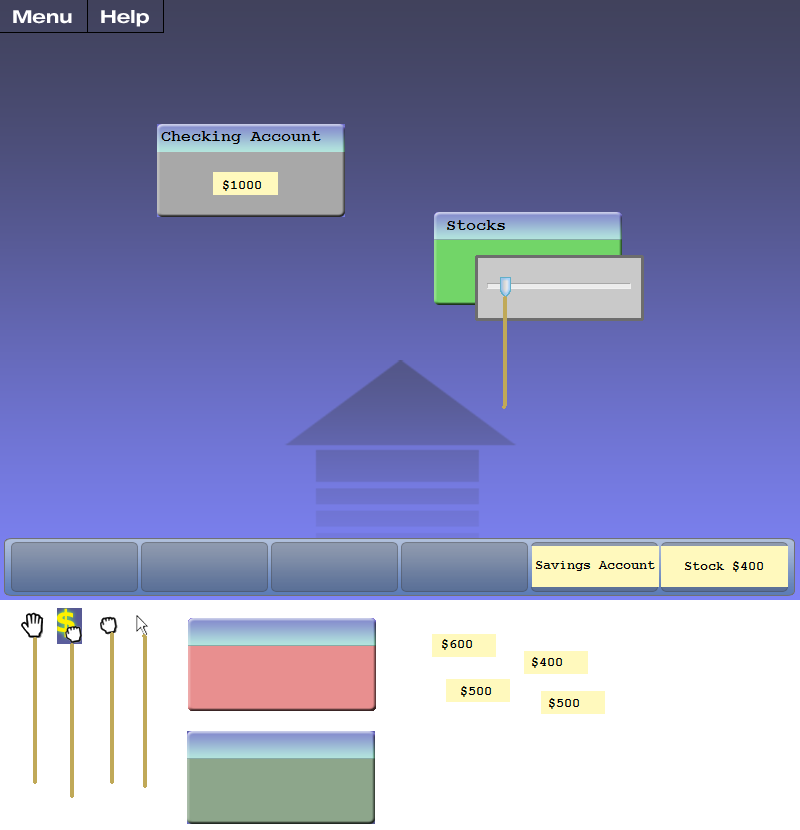
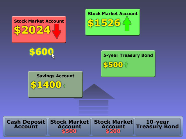
In the initial sketches, the majority of the screen was to be made up by the actual gameplay area. We wanted to go down the path of having a simple yet effective user interface to allow the player to focus on learning the information, rather than getting bogged down by cumbersome controls. Essentially, we had a rudimentary purchase bar and a large playing area above it. Accounts, which are purchasable on the account bar, have different icons associated with their characteristics (for example, a safe or bomb to portray volatility). We also incorporated the use of different types of mouse cursors to represent different actions associated with them (i.e. moving, grabbing, etc). This allows for a more intuitive understanding of the game mechanisms by the player because it allows them to recognize common hand gestures rather than try to remember what different placements on the gameboard maps to. We decided that to transfer money, the user would need to click and hold the mouse over an account (queuing up the transfer amount next to the cursor) and release the mouse on another account to deposit it (much like moving liquid from one container to another with a syringe). We felt that this implementation is the most intuitive for the player to use, as most people have had experience with this process in real life.
Note how the method of money transfer evolved between this stage and the low-fi testing stage.
Low-fidelity Testing
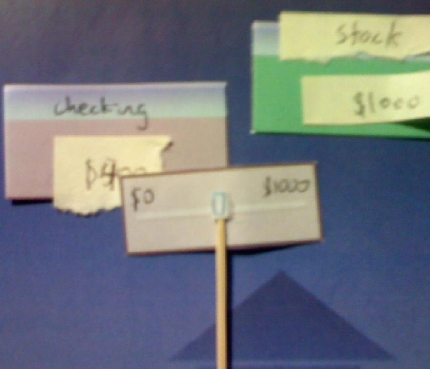
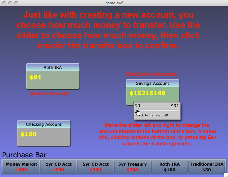
With the low-fi testing, we expanded on the purchase bar idea by making it more elaborate (for example, including the use of scrolling to allow for more purchasable accounts). This gave us the flexibility to throw in more specific accounts, rather than generalized account types. With that in mind, we are able to provide more useful and applicable information for the players to gain experience in working with. Account boxes are now designed to look like windowed applications, with the title bar mapped to movement. This allows for more intuitive movement; most people recognize that the title bar on a window is used to move things around (recognition versus recall). We also decided to change the way players transfer money; now, instead, a dialog box with a moveable slider is presented to allow players to determine how much money to move from one account to another. We felt that this method would allow players to move money in a faster fashion, which is critical in a speed-based game. Also, it is a more direct interaction for the player, which removed some of the ambiguity and confusion players initially faced with the syringe-style money-transferring method.
Transferring money is now managed by a slider box rather than the "syringe" method previously.
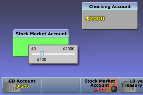
We also decided to make the account boxes look "windowed" (adding a title bar that is used to drag and move accounts). Examples of different types of mouse cursors are also shown.
A demonstration of the actual low-fi product.
Interactive Prototype
A concern that we had uncovered from the low-fidelity testing was that players had trouble initially discerning what the actual playing field is and what the accounts at the bottom purchase bar are there for. To address this issue, we added a label to the purchase bar indicating its purpose. With this, the ambiguity regarding what each area on the screen is for has been resovled. Also, if players do not care about the position of their newly purchased account, they can double-click on an account to purchase it (this was something that players wanted to see from the low-fidelity testing as well). From our subjects, we also realized that they would like keyboard commands to cancel operations; in response, we mapped the escape key to cancel actions, since this is consistent with many other programs. Overall, most of the changes we have are not visual; the vast majority of the modifications we made were in terms of usability to help players successfully and quickly complete the tasks that we felt were most important.
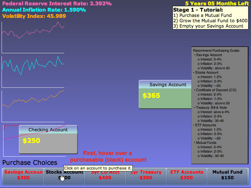
Here, you can see the added labels for the purchase bar
Usability Testing
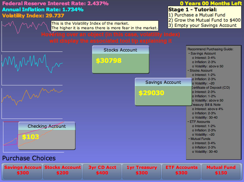
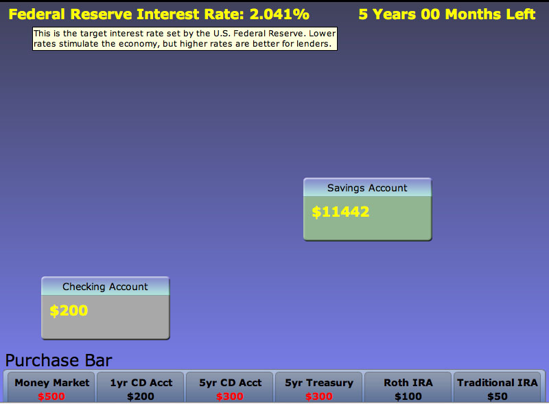
For the pilot usability test, we incorporated markers on the top of the screen to display the Federal Reserve Interest Rate and time. One of our critical complaints from the interactive prototype testing was that there was no time mapping. The time display allows players to visually see the direct translation of game-speed to the passing of time in real life. The Interest Rate throws in another facet of learning; it incorporates the process of analyzing current market trends based off of indicators. Also, more importantly, we utilized tool tips in order to give the player more in-game help and suggestions. This allows us to provide the player with more information without using a cumbersome documentation file. We also removed the scrolling feature of the purchase bar, allowing us to streamline the account types we provide as well as making the game simpler.
Note the addition of tooltips, markers for Fed Rate and Time at the top, as well as an overall smoother feel.
Final Prototype
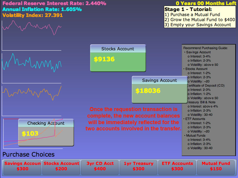
The biggest change to the game and the UI is that the game is now stage-based rather than a speed-based. We realized that the education value and effectiveness of a game suffers if the gameplay is based off of speed and muscle-memory than analytical processing and decision-making. We also added two new indicators: Inflation Rate and Volatility Index. These two variables allow for more analysis to be done by the player, in effect allowing them to practice their market analysis skills. We have also finally mapped all the indicators to the logic that determines account balance fluctuations. This means that the indicators now actually have an effect on the gameplay.
Another aspect that we added to the game is the new implementation of help information. This allows for the player to more effectively learn the game through playing it by incorporating help dialogue in the actual gameplay itself. From the gameplay perspective, we removed the ability to drag and drop purchasable accounts from the purchase bar. Rather, the player now single clicks on the account, which creates the new account somewhere on the board. This is based on the results from our usability studies where users found odd for drag and drop to make account purchases.
Lastly, we implemented graphs, which are able to help players and allow them to identify historical trends. We feel that this is a portion of market analysis that most, if not all, financial websites currently provide, and that it is an extremely useful tool to help visualize market trends effectively. Furthermore, the graphs help with comparison of accounts across the board. This will make players be aware the savings account generate a very small slope while slopes for other accounts can be much steeper. We hope that the users will learn to make associations and grasp the idea we try to convey which is to find appropriate accounts for appropriate times depending on the global indicators.
Explain which evaluation technique was most valuable to your prototype's usability and why.
All of the evaluation techniques were valuable to our prototype's usability. While the paper prototypes provided us feedbacks very early and heuristic evaluation gave us critiques based on existing models, we found Pilot Usability Study to be the most useful.
The Pilot Usability Study was useful because each of us were able to interview our participants and spend a fairly large amount of time with him/her. It is also the first time that we really had a working prototype targeted towards our users. We received both positive and negative feedbacks from our users. The positive feedback were the addition of tooltips. The negatives were mainly the game play elements, educational values, and goal stages. This was helpful to us because it lead us to change many of the existing elements so that the game became more educational and more goal-oriented rather than speed and reflex oriented. It also made us more focused on delivering educational value to our users. Through the one-to-one interaction, we could really observe the users and the troubles that they had. This was more helpful than other evaluation methods for our group because before this stage, many users did not interact with the prototype and could not provide as detailed of a feedback.
Final Interface (4 pages + screen shots- reference figures!)
Describe the final UI design
Describe the functionality (i.e., what are the operations you can do with it) (5 points)
For the final interface, we added many new additional features that were recommended by both the GSI and the professor. Some of the new functionalities that were added include:
- Including new indicators for game play such as the
- Federal Reserve Interest Rate
- Inflation
- Volatility Index
- Including graphs for easy comparison among different accounts along with indicators
- Including goals for the game so that it not only increases replay values but also trains players to become better with financial knowledge.
- Including a help menu that tells users when different indicators are good signs to purchase the desired accounts.
In terms of the functionality, here's an overview:
- Game play
- Click an account on the purchase bar to purchase it
- Drag accounts to adjust their placement on the screen
- Read the help document on the right to help make decisions
- Use global indicators to make associations with accounts
- Transfer money between accounts
- Learn:
- Use stage-based goals to make appropriate adjustments to the accounts that you currently hold.
- Use the help menu on the right to make decisions depending on the global indicator
- Make associations of the global indicator with different accounts to make purchasing decisions.
- Use the graph to make active comparisons between the global indicator and the money growth in different accounts.
- Fun factor:
- Completing scenarios
- Need to engage actively to make money in an appropriate amount of time
Describe the user interface design (i.e., how you use the functionality) (5 points)
Throughout our user interface design, we tried to keep the layout and functions simplistic and intuitive. Listed below are the final functions and methods to perform them:
Purchase an account
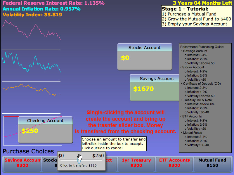
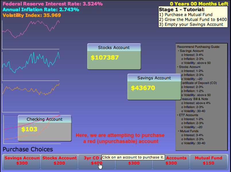
- To purchase an account, all that you have to do now is single-click on a purchasable account from the purchase bar. This creates an account in a random location on the board with an initial value of zero. A slider box will appear on the purchase bar where the account resides, and there you can set how much money to transfer from your checking account to the newly created account. A value of 0, pressing the Escape key, or clicking outside of the box will cancel the command and destroy the new account. Accounts that cannot be purchased are labeled in red.
Moving an account
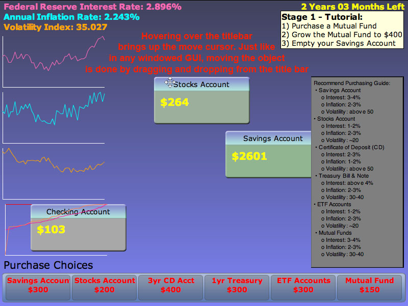
- Moving an account is a very intuitive action. If you hover your mouse cursor over the title bar of each account box, it will turn into a 4-directional-arrow, similar to how Microsoft Windows treats the cursor when it is in move mode. Similarly, you can move accounts around by holding the mouse button down on the title bar, dragging the box to another location, and releasing the mouse button. This action should be very simple for those who are familiar with modern home computers.
Transferring money
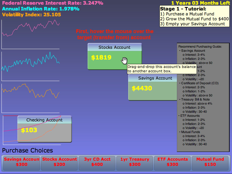
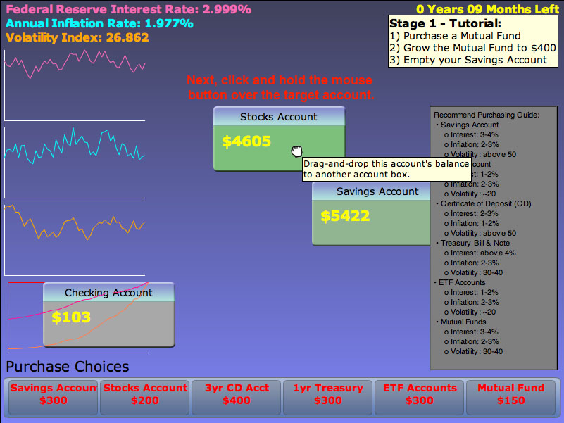
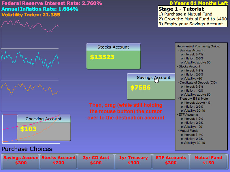
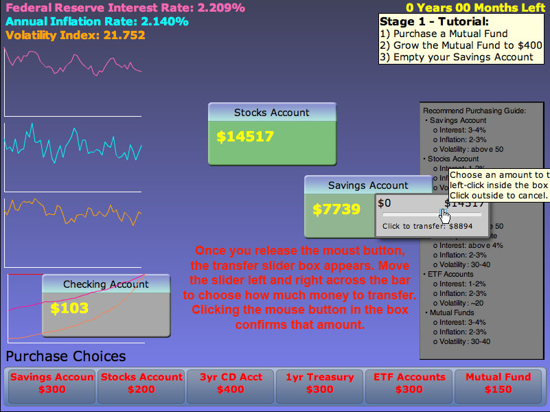
- To transfer money, the player needs to press and hold the mouse button over the main body of the target account box, drag the cursor over the destination account box, and release it there. That action produces a slider box, which can be used to determine how much money to transfer from the target account to the destination account. Clicking on the slider bar will confirm the amount of money transferred. A value of 0, pressing the Escape key, or clicking outside of the slider box results in a cancellation of the transfer. Until the transfer is complete, the amount of money in both accounts are frozen (those accounts cannot gain or lose any money in the meantime).
Getting help
- In order to get help in-game, the player can hover the mouse over an object that they are confused about. A tool tip will appear describing the purpose and usage of the object in question.
Error feedback
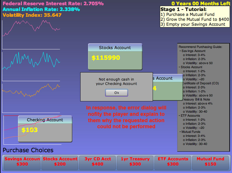
- To get feedback from erroneous actions, the player needs to try to perform an illegal action (for example, trying to purchase an account that you do not have enough money to buy). A dialog box explaining the error is displayed.
Graphs
- Graphs are provided to allow the player to visually gauge the performance of their accounts, as well as keep track of historical trends from the three indicators. These graphs are already embedded into the game board; the player does not need to actually do anything to get these to display.
Goals and Stage Completion
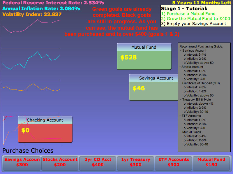
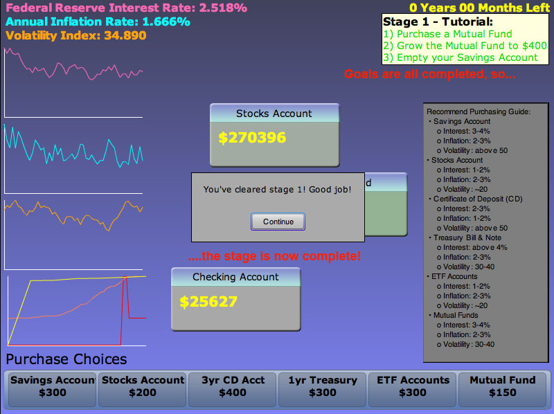
- To complete each stage (essentially a set of scenarios), the player must first complete all the goals associated with that stage. Goals that are completed are in green, and those that are yet to be completed are in black. The first stage also helps the player learn the basic controls of the game, to make sure that they are not overwhelmed by the demands and goals of the later stages. Once all the tasks are completed, a stage completion dialog box appears, notifying the player of their success.
Describe your implementation. What was most difficult to implement and why? (10 points)
Many parts of this project were difficult to implement because we had to do research for financial related instruments as well as designing a user interface tailored to our target audience.
On the game-play side, we felt that tying all the accounts together with their appropriate values were a little difficult to figure out in the beginning. The dilemma we had was that we wanted to model after the real world where accounts only accrue possibly 3-4% of interest each year, however, our game changes in terms of month; such small increment would decrease the fun factor as the player would simply stare at the screen and wait for an account to slowly accrue interest. However, we still decided to model after the real world as we think the emphasis on the real world is more important than the fun factor for this game. We hope that the player will notice the low-interest accounts and switch to more aggressive investment options.
We also felt that it was hard to come up with indicators that tie all the accounts together to bring educational value to our target group. We implemented them in such a way that it somewhat models after the real world but still differs in some sense.
On the user-interface implementation side, we thought the graphs were a little hard to implement. It was not so much of a coding issue but a user-interface issue. In our final design, we had to include many more elements on the game screen. We felt that placing these elements in the appropriate section were a little troublesome for us. We did not want to clutter the screen with too much information (causing information overload), but we also wanted to clearly express what each item represented. This probably would be fixed if we had additional user studies.
On the coding side, we did not have any real trouble converting a piece of information into code. For some of us, flash was a completely new platform to work with. We had some trouble with the event model and syntax issues in the beginning, but we quickly got over that with help from our experienced team members and online documentations.
Provide clear and well-referenced screenshots and figures (5 points)
Screenshots and references are included in each of the appropriate sections.
What was left unimplemented
What was left out and why (5 points)
We were unable to implement a game-speed slider that would allow players to change how quickly time passes. This is because we don't have a global timer; by the time we thought of this consideration, we did not have enough time to successfully implement it in our code.
We also don't have a legend or key for the graphs. Time constraints prevented us from implementing this, as the graph feature itself took more time than we had expected; namely, linking and mapping them to the markers and accounts while still being able to scale appropriately took much longer than we had hoped.
We could have implemented a high score or welcome screen, but we felt that it was unnecessary as it did not effect the overall gameplay and seemed extraneous for our educational purposes.
From the game logic perspective, Certificate of Deposit accounts and Treasury Bonds currently don't utilize a fixed rate (like they would in real life). We discovered that it was too difficult to keep track of the initial interest rate that the accounts were associated with when they were first purchased; to counteract that, we keep the fluctuation of these two account types at a minimum to prevent the player from noticing it.
Any wizard of oz techniques that are required to make it work (5 points)
We do not have any wizard of oz techniques. Our game is 100% playable and functional in the final prototype. A fully functional copy of the game is located at http://bionicdreamer.com/cs160_demo/.
